


.jpg)
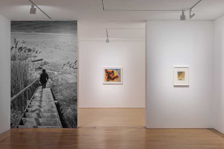
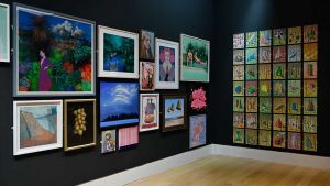
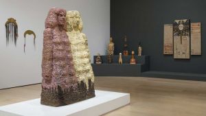
Betty Parsons: Sheer Energy, 2025, installation view, De La Warr Pavilion, Bexhill-On-Sea. Photo: Rob Harris. Courtesy Alison Jacques, London and Alexander Grey Associates, New York.
De La Warr Pavilion, Bexhill-on-Sea
4 October – 18 January 2026
by TOM DENMAN
As with many critics, it is often the case that people who set up galleries start out as artists, often going to art school. Then, sooner or later, they decide they would rather be working with or near artists than making art themselves. Not so for Betty Parsons, who was arguably just as good at both – or almost as good, only because it is hard to surmount her influence as a gallerist. When she set up her Manhattan gallery in 1946, Parsons was already a fairly successful watercolourist and sculptor, and for a decade had worked at several of New York’s galleries, including a three-year stint with Mary Quinn Sullivan, co-founder of the Museum of Modern Art. It is no understatement to say that Betty Parsons Gallery sent shockwaves through the world of modern art on an international level, as the commercial hub of the movement that would be known as abstract expressionism: it was where Jackson Pollock first showed his groundbreaking all-over drip paintings in 1948, where Barnett Newman had his first solo show in 1950, and where Robert Rauschenberg had his first solo show in 1951. It also represented the just as gigantic Mark Rothko and Clyfford Still. At weekends, in order to cool off from the hustle, Parsons continued to make art.
, framed. Courtesy Alison Jacques, London and Alexander Gray Associates, New York. © The Betty Parsons Foundation. Photo: Michael Brzezinski.")
Betty Parsons, Found Forms, 1978, Oil on canvas, 109 x 125.3 x 6 cm (42 7/8 x 49 3/8 x 2 3/8 in), framed. Courtesy Alison Jacques, London and Alexander Gray Associates, New York. © The Betty Parsons Foundation. Photo: Michael Brzezinski.
It is this lesser-known side to Parsons that her solo exhibition at Bexhill’s De La Warr Pavilion chooses as its subject. And what we learn is that, even as a hobby, even as an escape from ambition, art can be pretty good. Or perhaps it is truer to say that Parsons’ freedom from careerism coupled with her professional ties with some of the greatest artists of her day fostered an inclination to invent something. The watercolours, paintings and sculptures here mainly span the 1950s to her death in 1982 – that is, following the founding and all but immediate success of her gallery, which seems to have corresponded with her move to abstraction and, yes, her best work. In her paintings – and it is her paintings that make up the bulk of this show and attest to her originality – she honed a style characterised by soft-edged, membranous forms floating in or bracketing fields of colour. The abstractionist Parsons might bear closest comparison to Rothko while he was moving away from surrealism (and before he reached the breathy rectangles for which he is best known), but with a notable eye for pattern – perhaps inspired by her encounters with Native American and Mexican art – as she rhythmically repeated specific shapes, often clawed or serpentine lines and stripes, throughout her surfaces.
-(c)-The-Betty-Parsons-Foundation.-Photo_-Michael-Brzezinski.jpg "Betty Parsons, Moonshot, 1972. Acrylic on canvas, 122 x 122 cm (48 x 48 in), framed. © The Betty Parsons Foundation.")
Betty Parsons, Moonshot, 1972. Acrylic on canvas, 122 x 122 cm (48 x 48 in), framed. © The Betty Parsons Foundation.
One of the first works we see is an early, pre-gallery watercolour that points to how Parsons’ figurative beginnings might have paved the way to her abstractions. Old Fort – Nassau (1939) has all the imminent turmoil of a brewing storm: palm branches arch in the wind under a greying sky. The strokes are frantic, as if the artist wants to finish quickly and find some shelter. The tree trunk to the right is all bowlike lines, one of which – capturing its stippled bark – has patchy horizontal stripes, and the overall movement of the bending palm, married with the arches in the fort in the background, is intently curvilinear while the tree’s trunk (or perhaps an additional tree, behind it) and some of its darker, leafless branches form a dark right angle framing our view to the cannon-rigged, castellated building. In this work are some of the formal motifs dearest to Parsons: the curved or jagged angle, and the stripe.
.jpg "Betty Parsons: Sheer Energy, 2025, installation view, De La Warr Pavilion, Bexhill-On-Sea. Photo: Rob Harris. Courtesy Alison Jacques, London and Alexander Grey Associates, New York.")
Betty Parsons: Sheer Energy, 2025, installation view, De La Warr Pavilion, Bexhill-On-Sea. Photo: Rob Harris. Courtesy Alison Jacques, London and Alexander Grey Associates, New York.
Parsons had a way of hinting at depiction as if by accident, her sensitively deployed, ambiguous interactions between forms leading the mind’s eye – should the viewer’s imagination be so inclined – down any number of archetypal or emblematic passages. Take, for example, Summer Fire (1959), one of the larger paintings in the show: rendered in an unctuous green, a foetal form hunches within a much bigger one, whose toes touch those of another (whose legs are kind of bovine), the configuration surrounding a lavalike, archipelagic puddle within a blue sea. Maybe it’s an oceanic volcano seen from above, maybe some alien womb world. Parsons’ painterly sophistication is in her ability to render elemental simplicity with such chromatic richness. And textural, too – note the graffitilike scratches in the littlest, central creature, animating an anxious frailty; or the chipped, worn surface of Sand with Shapes (1964) that recalls ancient murals, putting an archaic spin on its golden, emblematic figures. Some myth, long forgotten, was encoded here.
 framed. Courtesy Alison Jacques, London and Alexander Gray Associates, New York. © The Betty Parsons Foundation. Photo: Michael Brzezinski.")
Betty Parsons, Circles, 1967. Acrylic on canvas, 117 x 239 x 6 cm (46 x 94 1/8 x 2 3/8 in) framed. Courtesy Alison Jacques, London and Alexander Gray Associates, New York. © The Betty Parsons Foundation. Photo: Michael Brzezinski.
Parsons liked to tease pictorial thresholds. Where does a shape end? How does it? The questions come to mind when looking at Circles (1967), a canvas elongated lengthways with six targets consisting of a brown circle banded in coral, blue and orange, moving about on a skylike background. A couple of them seem to be crumbling apart as they abut the bottom of the frame; three of the circles have black radial lines upsetting their rotational unity. Parsons has narrowed the light blue expanse by painting in a brown frame (on the sides, asymmetrically), a device she frequently deploys in various ways. In Untitled (1970), for instance, she includes a raspberry rim, its corners defined with painted-in, bright red struts – only, it seems, to allow the central unruly contortion to burst into it. At the risk of overinterpretation, what seems to emerge here is the artist’s inclination to make up her own rules, or at least to question what a rule is, and to take charge of her own orientation within and outside of an existing structure – which Parsons did, quite famously. As the story goes, in 1951, when her gallery’s “giants” asked her to stop taking on new artists, she replied: “Sorry, I have to follow my own lights – no.”
, framed. Courtesy Alison Jacques, London and Alexander Gray Associates, New York. © The Betty Parsons Foundation. Photo: Michael Brzezinski.")
Betty Parsons, Untitled, 1969, Acrylic on canvas, 50.8 x 40.6 x 3 cm (20 x 16 x 1 1/8 in), framed. Courtesy Alison Jacques, London and Alexander Gray Associates, New York. © The Betty Parsons Foundation. Photo: Michael Brzezinski.
It is difficult to sketch a stylistic trajectory of Parsons’s practice, as she continued to mine the aesthetic fecundity of similar motifs and techniques. But some of the later works from towards the end of the 1970s and early 80s are distinguished by a more defined use of line and restrained approach to composition. In Found Forms (1978), three loosely outlined ochre rectangles sit on a background of bluish grey, and on the rectangles sit six variously patterned shapes angled inwards as if for a seance. But – as the title insinuates – the “forms” resemble things that have been placed rather than painted. They closely correspond, therefore, with Parsons’s sculptures. She would make these with pieces of wood discarded by the carpenters and architects who worked near her Long Island studio, painting them in brightly coloured, often striped patterns and nailing them together. The fetishlike objects might remind you of some of Kurt Schwitters’ folksier assemblages, except for having a simpler, more hobbyistic feel – respite from the respite, perhaps. Nonetheless, their marionette-like animism – conjured in the clunky human outline of Beach Police (1968), for instance, and highlighted in a photograph of them lined up on the beach like characters in a play – sheds light on her paintings: we are probably “right” when we think we can “see things” in them. Seriously not bad for a weekender.
Click on the pictures below to enlarge
.jpg)
.jpg)
.jpg)

Copyright © 1893–2026 Studio International Foundation.
The title Studio International is the property of the Studio International Foundation and, together with the content, are bound by copyright. All rights reserved.


 Robert Rauschenberg: Combines
 Documenting the Obvious: Picasso and American Art
 Barnett Newman at Tate Modern
 Ettore Sottsass: Architect & Designer – book review
 Book review: Photo Art: The New World of Photography