


Bard Graduate Center Gallery, New York
14 February – 7 July 2019
by ANNE BLOOD
In 1928, the year he turned 26, the German-born calligrapher and typographer Jan Tschichold (1902-74) published his landmark book Die Neue Typographie (The New Typography). At a moment when manifestos proclaiming the death of the old and heralding a brave new age proliferated, Tschichold’s book stood out for its clarity and utility. While the poet and art theorist Filippo Tommaso Marinetti railed against “the bestial, nauseating” books of the past, and Kurt Schwitters decried the “barbaric advertising” of old, Tschichold offered a plan for the implementation of modernism’s radical new style in the field of graphic design, with guidelines on composition, layout, paper size, typefaces and the integration of photography with text.
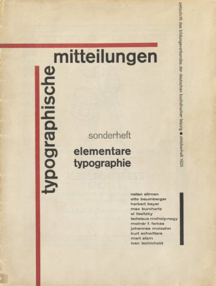
, 1928. Published by Bildungsverband der deutschen Buchdrucker, Berlin. Bard Graduate Center. Photo: Bruce White.")
Jan Tschichold. Title page of Die neue Typographie (The New Typography), 1928. Published by Bildungsverband der deutschen Buchdrucker, Berlin. Bard Graduate Center. Photo: Bruce White.
In his text, Tschichold synthesised the most recent discourses on graphic design, drawing on a cache of material he had collected throughout the 1920s through correspondence and visits with like-minded designers from across Europe and the Soviet Union. It is here that the current exhibition at the Bard Graduate Center Gallery devoted to Tschichold’s influence on graphic design between the world wars begins, with 14 examples of works, including Marinetti’s visual poem Après la Marne, Joffre Visita le Front en Auto (After the Marne, Joffre Visited the Front by Car; 1919), John Heartfield’s book jacket for the 1922 German edition of Upton Sinclair’s The Swamp, and Aleksandr Rodchenko’s book cover for Vladimir Mayakovsky’s poem Pro Eto (About This; 1923). What emerges initially from this grouping is not so much a sense of a uniform style – chaos and disruption reign supreme in futurism and dadaism, while precision shines forth in De Stijl – but a shared desire to liberate typography from the traditional conventions of book design. Layouts are asymmetrical, yet balanced; the empty spaces are considered, and sometimes even equally dynamic.
Unlike many of the colleagues he most admired, who had studied fine art or architecture, Tschichold trained as a calligrapher and typesetter in Leipzig, a major centre of publishing. After his training and his early work in the trade, he became dissatisfied with the prevailing German arts and crafts tradition and was drawn to the developments in avant-garde circles, in particular the constructivist style from Soviet Russia and the Netherlands. Although it is unclear exactly when he first encountered constructivist work, it was likely to have been through the pages of the radical journals that championed the latest artistic and graphic experiments. Like many others during this interwar period, Tschichold believed that design should emulate the dynamism and movement of modern life, which was being dramatically transformed by the machine, and held to the idea that design was a force for social change as well as a medium of aesthetic innovation. Design should be efficient and affordable, fully integrated into all aspects and at all levels of society. Radical developments in printing technology in the early-20th century had allowed for the incorporation of text with images derived from photographs into a single printing matrix, a change that expanded the compositional possibilities for mass-produced printed materials and gave birth to the field of graphic design as its own practice. While the changes in modernist architecture and product design may have been flashier, few could afford to redecorate an apartment in the new style, let alone finance the building of such a home. Graphic design offered a means for disseminating modernist ideals into everything from the billboard to the business card.
 by El Lissitzky, 1920. Printed by E. Haberland, Leipzig, and published by Skythen, Berlin, 1922. Letterpress. The Museum of Modern Art, New York, Jan Tschichold Collection, Gift of Philip Johnson, 562.1977. Digital Image © The Museum of Modern Art/Licensed by SCALA / Art Resource, NY. © 2018 Artists Rights Society (ARS), New York.")
El Lissitzky. Pro dva kvadrata (About Two Squares) by El Lissitzky, 1920. Printed by E. Haberland, Leipzig, and published by Skythen, Berlin, 1922. Letterpress. The Museum of Modern Art, New York, Jan Tschichold Collection, Gift of Philip Johnson, 562.1977. Digital Image © The Museum of Modern Art/Licensed by SCALA / Art Resource, NY. © 2018 Artists Rights Society (ARS), New York.
The main gallery at Bard highlights the breadth of the dissemination of modernism into graphic design. It is drawn largely from Tschichold’s personal collection, which he began to assemble while researching the newest design developments for articles that would lead to the publication of The New Typography, and which he continued to amass throughout the late 20s and early 30s. He referred to his collection as “my museum”, and it included a range of examples from trade catalogues and advertisements to magazine covers, posters and headed notepaper. As a whole, the collection highlighted the inroads the modernist revolution was making across a wide front; it equally championed the work of leading figures and the innovative designs being produced by little-known and often anonymous designer-printers active in print workshops, classrooms and studios. In his design for the cover of the 1930 brochure for the Wehag metal goods firm, Max Burchartz employs photomontage to entice the viewer: the arguably mundane products –metal door handles, hooks and nameplates – glisten, their slick metal surfaces are contrasted against the matte surface of a cracked egg, a juxtaposition that suggests their strength and durability.
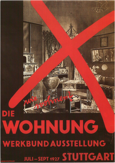
 poster, 1929. Printed by Druckerei Schenkalowsky, A.G., Breslau. Lithograph. The Museum of Modern Art, New York, Purchase Fund, Jan Tschichold Collection, 346.1937. Digital Image © The Museum of Modern Art/Licensed by SCALA / Art Resource, NY.")
Johannes Molzahn. Wohnung und Werkraum (Dwelling and Workplace) poster, 1929. Printed by Druckerei Schenkalowsky, A.G., Breslau. Lithograph. The Museum of Modern Art, New York, Purchase Fund, Jan Tschichold Collection, 346.1937. Digital Image © The Museum of Modern Art/Licensed by SCALA / Art Resource, NY.
When creating the publicity material for the 1929 exhibition Wohnung und Werkraum (Dwelling and Workplace), held in Breslau (now Wrocław, Poland), Johannes Molzahn used a distinctive logotype, an orange ground and uppercase sans-serif lettering as the unifying elements across posters, brochures, notepaper and even envelopes. In the marvellous large exhibition poster, the three core elements are collaged with a series of photographs of hands variously holding a masonry tool or checking measurements against a plan, all set against images of modern houses in different states of construction. While the tightly cropped photographs of hands leave the workers behind them anonymous, the overall composition of the poster foregrounds the care, precision and craft behind building projects, conveying hundreds of hours of labour in an instant.
Some of the most memorable works from the exhibition are the movie posters Tschichold produced for Phoebus-Palast cinema in Munich. The company gave the designer considerable freedom, but he often had to work very quickly as there was frequently little time between the announcement of the film and the first screening. The poster for the 1927 film Die Hose (The Trousers) is clearly indebted to the lessons of constructivism with its adherence to strong diagonals and simple geometry, which balances the arrangement of image and text, and its use of a single colour (red), which quickly draws the eye to the film’s title and the name of the cinema.
 poster, 1927. Printed by Gebrüder Obpacher AG, Munich. Photolithograph. The Museum of Modern Art, New York, Peter Stone Poster Fund, 225.1978. Digital Image © The Museum of Modern Art/Licensed by SCALA / Art Resource, NY.")
Jan Tschichold. Die Frau ohne Namen (The Woman Without a Name) poster, 1927. Printed by Gebrüder Obpacher AG, Munich. Photolithograph. The Museum of Modern Art, New York, Peter Stone Poster Fund, 225.1978. Digital Image © The Museum of Modern Art/Licensed by SCALA / Art Resource, NY.
In his film poster designs, Tschichold repeatedly structured his compositions around the motif of the conical beam of light that propelled the moving image to the screen. This evocation of cinematic projection is heightened in his design for the poster for the 1927 film Die Frau ohne Namen (The Woman Without a Name), in which several photographs appear in increasing size in a descending diagonal from the upper-right corner, culminating in a charging steam engine that seems ready to burst out of the two-dimensional frame.
In 1933, after the Nazis’ rise to power, Tschichold, who was known as a communist sympathiser, was arrested. Released after four weeks in prison, he was able to leave the country, moving first to Switzerland and later England. By the end of the decade, the designer was no longer confident about the aesthetic ideals he had promoted, and while in Switzerland, he began to return to more conventional forms of graphic design, employing historic typefaces and symmetrical layouts. This return to tradition is found in the designs he produced and oversaw when at Penguin Books in London from 1947. A sampling of this work is on view at Bard as a coda of sorts. While the dynamism of the interwar period is clearly absent in these late works, an interest in clarity, utility and affordable design remain ever present.
Click on the pictures below to enlarge

Copyright © 1893–2026 Studio International Foundation.
The title Studio International is the property of the Studio International Foundation and, together with the content, are bound by copyright. All rights reserved.


 Anni Albers: Touching Vision
 Moholy-Nagy: Future Present
 Dutch Design Week
 The Power of Pictures: Early Soviet Photography, Early Soviet Film
 Adventures of the Black Square: Abstract Art and Society 1915 – 2015