


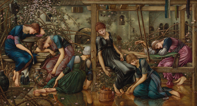
Edward Burne-Jones. The Garden Court, 1874-84. The Faringdon Collection Trust.
Tate Britain, London
24 October 2018 – 24 February 2019
by EMILY SPICER
Ah, the pre-Raphaelites. Critics love to hate them, but they always pull in the crowds. Tate Britain’s exhibition on the work of Edward Burne-Jones is no exception. When I visited, the galleries were heaving with slowly turning circles of people shuffling for a closer look at the pallid face of Merlin languishing under Nimue’s spell, or at the sinister mermaid dragging a man down to his death with a coy smile on her face. These are gothic fantasies, the product of a deeply Victorian notion of romance.

Edward Burne-Jones. Love among the Ruins, 1870-73. Watercolour, bodycolour and gum arabic on paper, 96 x 152 cm. Private collection.
So why do so many art critics dislike Burne-Jones? There has been no shortage of reviews in the broadsheets articulating a yawning distaste for this painter. He has been called “boring”; Jonathan Jones of the Guardian even called him a “stupid artist”. Jackie Wullschlager, in the Financial Times, concluded that his work is “monotonous” and a “dead end”. He, was, according to these writers, too wrapped up in his own fantasy world, too inward-looking, to see past the end of his nose. But since when were topical paintings a prerequisite for artistic brilliance, or even artistic aptitude?

Edward Burne-Jones. Phyllis and Demophoön, 1870. Watercolour on paper, 93 x 47 cm. © Birmingham Museums Trust.
I must admit, I did not linger over Burne-Jones’s Legend of Briar Rose series (1885-90), a collection of works depicting the bewitched court of Sleeping Beauty. Nor did his portraits detain me long. But I found plenty among this showcase of his greatest hits to keep me thinking. The Pilgrim Outside the Garden of Idleness (1893-8) was the first to really draw me in. The preliminary work was done by his studio assistants, and it remains unfinished, but has that eerie Burne-Jones-esque quiet about it. The eponymous pilgrim, resembling a dashing incarnation of Dante, contemplates bronze personifications of the vices. The earth cracks beneath his feet and the ossified remains of trees tangle the foreground of this strangely theatrical painting.

Edward Burne-Jones and William Morris by Frederick Hollyer, 1874. Platinum print. © National Portrait Gallery.
Burne-Jones was a latecomer to the pre-Raphaelite party. He studied theology at Oxford, where he met William Morris. The two men intended to become clerics but, after a crisis of faith, turned instead to the arts. Theirs became a lifelong and often collaborative relationship and, included in this exhibition, is a humorous sketch Burne-Jones made of himself, rake-thin and downcast, slumping next to his animated and portly friend. That he had a sense of humour is evident in his illustrated letters to a string of female correspondents, and in life he was known to play elaborate practical jokes. Burnes-Jones, it seems, was a whimsical fellow and a difficult personality to get the measure of. John Ruskin said of him: “I want to reckon you up and it’s like counting clouds.” But one thing is for sure – he loved women. His wife, Georgiana Macdonald, also an artist, is invariably described in the literature as “long suffering”.

Edward Burne-Jones. The Doom Fulfilled, 1888. Oil on canvas, 155 x 140 cm. Staatsgalerie, Stuttgart.
The godfather of the pre-Raphaelites, Dante Gabriel Rossetti, recognised the young pretender’s talents and took him under his wing, but, on the whole (there are exceptions), Burne-Jones failed to adopt his mentor’s jaunty palette. Instead, he opted for more sombre hues. This is off-putting for some, it seems, but I prefer these unsaturated colours. And I prefer him to Rossetti. His work, while still idealising the nude, especially the female nude, is less sentimental than his teacher’s. He replaces Rossetti’s coy, red-lipped, flame-haired, largely vacuous muses, with solemn, strong-faced women. They have the almost ethereal distance of JRR Tolkien’s heroines, at times aloof and invariably elfin. Take The Wheel of Fortune (1883). A sombre, statuesque personification of Fortune wears a brilliantly inventive pewter-coloured dress. She turns the giant wheel that decides the fates of men – in this painting a poet, a king and a slave, who are represented here with the muscular sensuality of Michelangelo’s dying slave. (When Burne-Jones first saw the Sistine Chapel, he lay on his back with a pair of opera glasses to fully appreciate the ceiling.)

Edward Burne-Jones. Atlas Turned to Stone, c1878. Bodycolour on paper, 150.2 x 190.2 cm. Southampton City Art Gallery.
Some of the works in this exhibition look remarkably modern. Souls on the Banks of the River Styx (1873) is a pared-back, monotone offering in dry white paint and would look perfectly at home in an exhibition of interwar art. And the strange landscape in Atlas Turned to Stone (1878) reminds me a little of a surrealist work.
There is a whole room dedicated to Burne-Jones’s paintings of the magic-sandalled Perseus. In one, he slays the monster that threatens the imperilled Andromeda, who seems to have casually freed herself from her manacles, every bit the calm, pre-Raphaelite woman. Still, the serpentine creature is a thoroughly modern invention. Gone is the scaly, bulldog face prevalent in Renaissance versions of the scene. Instead, Burne-Jones’s soulless creature is the stuff of nightmares and would look at home in a 20th-century horror film. Death by this marine devil would play out like a scene from Alien.
.jpg "Edward Burne-Jones. Perseus and the Sea Nymphs (The Arming of Perseus), 1877. Bodycolour on paper, 152.8 x 126.4 cm. Southampton City Art Gallery.")
Edward Burne-Jones. Perseus and the Sea Nymphs (The Arming of Perseus), 1877. Bodycolour on paper, 152.8 x 126.4 cm. Southampton City Art Gallery.
It is true that Burne-Jones painted his fair share of sweet-faced maidens and lovelorn heroes, but his painstakingly rendered worlds could also be strange, dark places. To say that he was not concerned with the real world is the laziest of criticisms. His was a darker, more grounded take on the earlier pre-Raphaelite vision. His paintings are littered with the faces of friends, some of whom died tragically. That mischievous mermaid at the bottom of the ocean is based on a friend who died in childbirth. He wrote an inscription for her on an earlier painting. Burne-Jones wasn’t unaware of the real world, or the problems of his times. Look closely enough and the modern angst is there, seeped in symbolism and the metallic hues of the industrialising times.
Click on the pictures below to enlarge

Copyright © 1893–2026 Studio International Foundation.
The title Studio International is the property of the Studio International Foundation and, together with the content, are bound by copyright. All rights reserved.


 Eadweard Muybridge: Shaping and Shifting Our Point of View
 Rewinding personalities: Van Dyck at Tate Britain
 Bridget Riley at Tate Britain
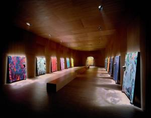 Chris Ofili at Tate Britain
 Millais