


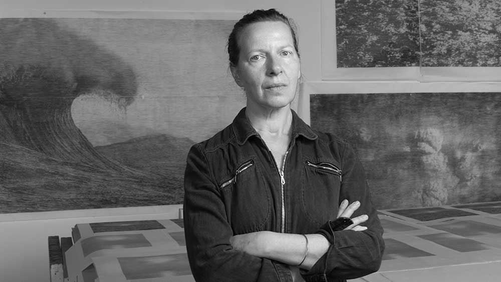
Christiane Baumgartner in her studio, Leipzig, 2021. Photo: Werner Lieberknecht.
by DAVID TRIGG
Known for her monumental black-and-white woodcuts based on video stills, Christiane Baumgartner (b1967, Leipzig) melds contemporary forms of image-making with centuries-old printmaking technology. Themes of speed and stasis, the flow of time and motion and the associated challenges of depicting such concepts are central to her practice, explored through images of urban environments, motorways, military hardware and, increasingly, the natural world. Her masterly prints, derived from her own videos and photographs, comprise patterns of swelling and tapering horizontal lines formulated in Photoshop, transferred on to wooden boards and then painstakingly carved before being hand-printed on to Japanese paper. Move too close and their surfaces dissolve into an abstract mass of inky, striated lines; step back and they coalesce once more into cognisable images.
. Courtesy Christiane Baumgartner and Cristea Roberts Gallery, London. Christiane Baumgartner © VG Bild-Kunst Bonn e.V. 2021")
Christiane Baumgartner. Weddeort I, 2006. Woodcut Diptych on Kozo paper, 90 x 120 cm/ 110 x 140 cm (image size / paper size). Courtesy Christiane Baumgartner and Cristea Roberts Gallery, London. Christiane Baumgartner © VG Bild-Kunst Bonn e.V. 2021
Baumgartner was trained in traditional printmaking at Leipzig’s Hochschule für Grafik und Buchkunst in the late 1980s. It was her interest in Albrecht Dürer’s woodcuts that drew her back to the medium in 1999, after a period spent exploring digital media at the Royal College of Art in London. She has been reconciling these two approaches ever since, working from her studio at the Spinnerei, a former cotton mill in Leipzig.
Earlier works saw silhouetted cars racing through tenebrous road tunnels and streaming lines of traffic on the asphalt arteries that crisscross Germany. Having been raised in East Germany, Baumgartner associates road travel with freedom and liberation, and the autobahn was once a prominent subject. Her frequent trips from Leipzig to the Baltic coast continue to provide much of her source imagery, though she has since moved away from technological subjects towards a study of natural phenomena, such as the play of light on water, sunrises and sunsets, and coastal views. Colour has also crept into her prints, while her recent “reverse drawings” depart from the woodcut tradition to explore new creative territory. In this interview for Studio International, Baumgartner discusses her major new body of prints and drawings on show at Cristea Roberts Gallery in London.

Christiane Baumgartner. Wish you were here, 2020. Woodcut, paper and image 150 x 213 cm. Courtesy Christiane Baumgartner and Cristea Roberts Gallery, London. Christiane Baumgartner © VG Bild-Kunst Bonn e.V. 2021
David Trigg: The exhibition at Cristea Roberts is titled after your woodcut Wish You Were Here (2020), which derives from a photograph you took while travelling to Hiddensee, an island in the Baltic Sea with which you have a profound connection. What role does autobiography play in your work?
Christiane Baumgartner: Autobiography is becoming more important. My recent works are certainly more personal than the speed-related images I was producing previously. Landscapes such as Wish You Were Here have a lot to do with the idea of nostalgic longing – Sehnsucht in German. When I was growing up in the German Democratic Republic, we regularly went camping on the Baltic coast and would visit Hiddensee on day trips. It’s a tiny island and was like a dreamland for me, a place where I wanted to stay but always had to leave. So the print is about the idea of something you wanted but weren’t able to have. I’ve been going back there every year for about 15 years now.

Christiane Baumgartner. Weststrand, 2020. Woodcut, paper and image 106 x 136 cm. Courtesy Christiane Baumgartner and Cristea Roberts Gallery, London. Christiane Baumgartner © VG Bild-Kunst Bonn e.V. 2021
DT: Another print in the show, Weststrand (2020), is based on a photograph you took on the island.
CB: During lockdown I became interested in creating a “nice” landscape image that would fit above a couch. The image shows the view from Hiddensee, looking towards the west. I took the photograph that the print is based on just before a big thunderstorm, so the sea is very white, and you can see some waves, some movement and the dark sky above. I like the interplay between these three elements of the composition. I printed and framed it and actually hung it above my own couch at home.
DT: You say you wanted to make a “nice image”, but the notion of looking westwards recalls your upbringing in East Germany and the longing for freedom that the west represented.
CB: Being on this beach, facing the west and seeing the sunset, definitely evokes memories for many East Germans. In the daytime, we could sometimes see the Danish island of Møn, but we were not allowed on the beach after sunset because we could have built a boat there and escaped. I recently met a person who escaped to the west with his father by paddle boat in 1984. They did this in February, so it must have been freezing cold, but they survived. They were found by a Swedish ship, but more than 80% of the people who tried to escape via the Baltic were discovered and arrested or did not survive the escape. So, Weststrand is a nice landscape, but, yes, it’s about more than that.
DT: Is it important that the viewer knows a bit more about that history and your backstory?
CB: Not really. When I talk about my work, I’ll explain the history, but my works need to make their way out into the world without me having to give an explanation. It either rings a bell or it doesn’t.

Christiane Baumgartner. Stairway to Heaven, 2019. Woodcut on Kozo paper in five parts, paper and image 140 x 180 cm. Courtesy Christiane Baumgartner and Cristea Roberts Gallery, London. Christiane Baumgartner © VG Bild-Kunst Bonn e.V. 2021
DT: Stairway to Heaven (2019) is the largest work you have ever made. It comprises five monochrome woodcuts depicting sequential views of Chaudière Falls in Québec, Canada. What drew you to this subject?
CB: I was invited to participate in Manif d’Art 2019 in Québec by the British curator Jonathan Watkins. He suggested that I do something context specific. At the time, I was exploring the interplay between light and water and he told me about the waterfalls in the city. I went over and was shown at least four or five different waterfalls. I got a bicycle and went back several times, sometimes in the morning, sometimes in the evening, and took a lot of photos. I also visited a place that was storing a huge amount of snow from the previous winter – it had been cleared out of the city and piled up. The mound was maybe 10 metres high and 100 metres long, and this was in June. It was black, smelly and disgusting. Because it was warm, the snow was melting, and out came a lot of dirty disgusting water. I asked what was going to happen to all this water and found out that it was being filtered and going to be fed back into the domestic water supply as drinking water! You imagine Canada to be clean and pristine, but the pollution is really bad there. I saw this from the aeroplane – the Saint Lawrence River and the smaller subsidiaries, including the Chaudière, all looked really dirty.
DT: So there is an ecological element to this work?
CB: Yes and no. The ecological aspect was in the back of my mind, but when I went to the waterfalls, I was really struck by the never-ending, ongoing, continuing falling of the water. Of course, the water might be very dirty, but I was thinking more about nature as a force. The water had made this huge hole over thousands of years and it made me think of a hellmouth or maelstrom. Yes, we are destroying our world with pollution, but it felt like this waterfall, this natural process would carry on for ever, so in a way it is also about renewal.
DT: The five prints are hung so that the lines created by the light on the water’s surface are all aligned, recalling the horizon of Wish You Were Here and Weststrand. It also emphasises the horizontal lines that characterise your woodcuts. These lines are derived from the halftone filter that you apply to your original image in the computer. What led you to settle on the horizontal line?
CB: When I started making woodcuts from video stills, I experimented with different angles of line: vertical, horizontal and also 45º angle. The vertical line made my images too narrow and the diagonal gave them the wrong dynamic. The horizontal line felt calmer and more harmonious. It also has to do with handwriting because we write horizontally, so it has the feeling of an information line, or a line of code. I find it really amazing that the human brain can make sense of these lines, which are a kind of abstraction. For me, it’s a kind of magic.
.jpg "Christiane Baumgartner. Französische Suite I – in 16 Teilen – 2019. Oil on 16 sheets of Japanese paper 24 × 32 cm (each). Courtesy Christiane Baumgartner and Cristea Roberts Gallery, London. Christiane Baumgartner © VG Bild-Kunst Bonn e.V. 2021")
Christiane Baumgartner. Französische Suite I – in 16 Teilen – 2019. Oil on 16 sheets of Japanese paper 24 × 32 cm (each). Courtesy Christiane Baumgartner and Cristea Roberts Gallery, London. Christiane Baumgartner © VG Bild-Kunst Bonn e.V. 2021
DT: The carving process seems quite precarious – accuracy is essential so that the image is legible. How do you rectify mistakes?
CB: With some images, it’s not so precarious. For instance, if the image has a lot of information, I am allowed to make small mistakes. But if the image has only a little information I have to be really careful. Sometimes if I cut a little bit outside of my guide line, your eye will allow for this, but sometimes when I have a very even sky, for example, then it is more difficult. If I lose a bit of wood, I can usually fix it by gluing it back on, but if it can’t be fixed then I have to cut away more wood from another section to make the image balance.
DT: Have you ever had to abandon a woodcut?
CB: Yes, and thrown the entire block away. It doesn’t happen often, but sometimes I’ll try to fix it and it gets worse and worse. In that instance, as soon as I decide to start again, I feel really relieved.
DT: Are you still using domestic knives to carve rather than specialist woodcutting tools?
CB: Yes, I don’t use specialist woodcutting tools. I use kitchen knives which are chopped and specially sharpened. I also use scalpels.
DT: And that goes back to your training in East Germany?
CB: Yes, because we could not get proper woodcut tools in those days. I could use proper tools now if I wanted, but these knives work just fine.
, 1999. Artist")
Christiane Baumgartner. Paul Virilio, Speed (Geschwindigkeit = Stillstand), 1999. Artist's book, 16,5 x 22 cm. Courtesy Christiane Baumgartner and Cristea Roberts Gallery, London. Christiane Baumgartner © VG Bild-Kunst Bonn e.V. 2021
DT: For many years you were preoccupied with urban spaces, motorways, road tunnels, wind turbines and other signs of technological progress. Nature has always been present in your work, but recently it has become more prominent, particularly your focus on sunlight and water. What led you to move away from subjects of modern urban life?
CB: I didn’t want to work on technological subjects for the rest of my life. Because the technique I have chosen is so time-consuming and painstaking – sometimes my body really hurts – I really have to want an image to exist in the world in order to create it. I became less interested in the technological subjects. Landscape and nature has always been a part my work, ever since my artist book Speed (Geschwindigkeit = Stillstand) (1999), and with prints such as Weddeort I + II (2006), and Deutscher Wald (2007), the series of nine woodcuts where I explored the limits of perception by using a low resolution of just 3dpi. More recently, I’ve become interested in exploring the effects of natural light in nature.
. Courtesy Christiane Baumgartner and Cristea Roberts Gallery, London. Christiane Baumgartner © VG Bild-Kunst Bonn e.V. 2021")
Christiane Baumgartner. Deutscher Wald, 2007. Series of 9 Woodcuts on Kozo paper, 56 x 74 cm/ 70 x 90 cm (image size / paper size). Courtesy Christiane Baumgartner and Cristea Roberts Gallery, London. Christiane Baumgartner © VG Bild-Kunst Bonn e.V. 2021
DT: Are the themes of speed and standstill and the flow of time and motion still important?
CB: These are still important, yes, even if now they are not so obvious. With Weststrand there is the motion of the waves, and in the waterfalls, of course, you have the terrific speed of the water.

Christiane Baumgartner. Totes Meer, 2020. Woodcut, paper and image 59.0 x 45.5 cm. Courtesy Christiane Baumgartner and Cristea Roberts Gallery, London. Christiane Baumgartner © VG Bild-Kunst Bonn e.V. 2021
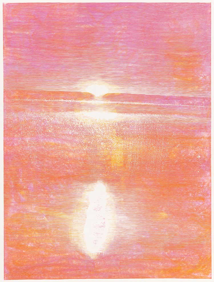
DT: What about works such as Totes Meer (2021) and Prometheus I-III (2021), the sunsets and sunrises you have been making? Do they refer to the movement of celestial bodies?
CB: They are more about the slowing down of the person who watches them. Innehalten would be the German word, to slow down, to pause. I often sit and watch the sunset. A sunset lasts just for a short time. I remember my father saying that when the sun hits the horizon, there’s just four minutes until it vanishes. Every sunset is different, they’re never the same, and every day the sun sets at a different time and also in a different place in the sky depending on the time of year.
. Courtesy Christiane Baumgartner and Cristea Roberts Gallery, London. Christiane Baumgartner © VG Bild-Kunst Bonn e.V. 2021")
Christiane Baumgartner. Weisse Sonne / Schwarze Sonne, 2016. Woodcut Diptych on Kozo paper, 85 x 110 cm / 105 x 130 cm (image size / paper size). Courtesy Christiane Baumgartner and Cristea Roberts Gallery, London. Christiane Baumgartner © VG Bild-Kunst Bonn e.V. 2021
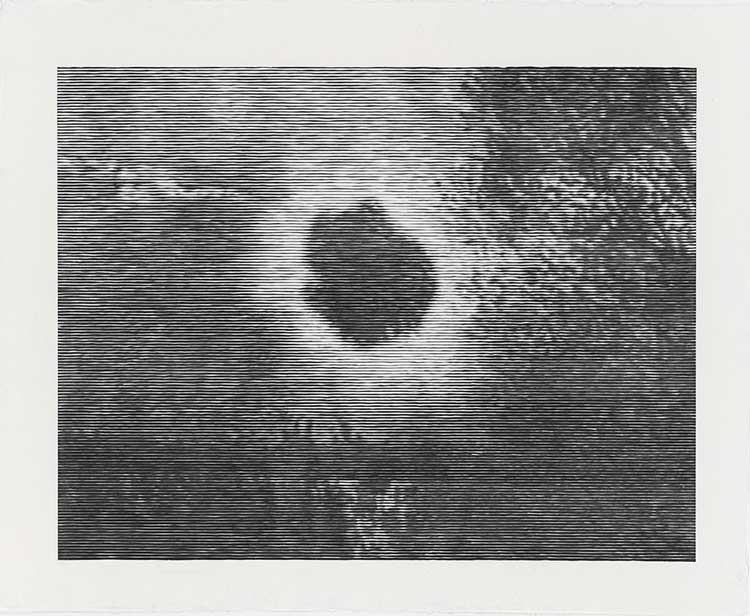
The first print I made of the sun was Weisse Sonne (2016), which was also one of the first prints to include colours other than black – I used a bluish ink underneath the white sun. Schwarze Sonne (2016) tried to show the effect of staring at the sun, when it burns on your retina and suddenly starts to turn dark. That image also recalls an eclipse or perhaps even something mythologically dark.

Christiane Baumgartner. Contre-jour 1, 2019. Woodcut, paper and Image 201.5 x 151 cm. Courtesy Christiane Baumgartner and Cristea Roberts Gallery, London. Christiane Baumgartner © VG Bild-Kunst Bonn e.V. 2021
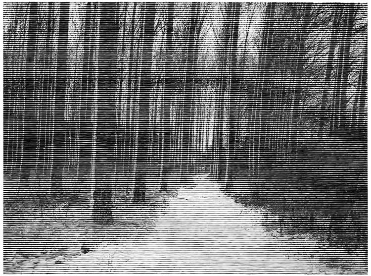
DT: Your Contre-jour series (2019), the title of which translates as “against daylight”, also takes the sun as its subject, but here the sunlight shines through trees in a wooded landscape.
CB: The images are from the Baltic Coast again. There is a tremendous light near the sea. It was in December, the sun was low in the sky, and was reflecting on the water behind the trees, so there are two suns in the images. The light came streaming through the trees and I took many photographs. The original photograph had this golden bronze tone and was really romantic, like a Caspar David Friedrich painting. But I couldn’t reproduce the effect in woodcut. I had fought with those prints, but in the end they weren’t quite what I had in mind and they became something else. So far, I’ve done four in the Contre-jour series. The first two are in red. For this show, I’m showing the third in the series, which is blue. The fourth one is yellow and red. Each print is from the same carved matrix and it takes me a day to do a single print.
DT: In 2019, you started making your “reverse drawings”, which developed into seven suites of works under the collective title Französische Suiten. What prompted this radically different way of working?
CB: It seems very different, but it’s really not because the process is quite similar to the way I print my woodcuts. I don’t use a press for my woodcuts, I’m using a baren – I ink up the wooden block, put the paper on top and then, using the baren, I rub the back of the paper to transfer the ink. I’ve been doing it this way for more than 20 years. When I began introducing colours into the prints, I would lift the paper up, change the colour on the wood, put the paper back down and begin rubbing again. After a while I began to question whether I actually needed my carved matrix at all. With the coloured prints from my Happy Hour series (2018), I began to make the marks more obvious, so it began to look like a drawing, and that’s how the Französische Suiten began.
DT: These prints use a very different visual language. How did they develop?
CB: I used a small piece of wood, inked it up, put the paper on top, and made some marks with a baren, a piece of wood or an etching needle. I then took the paper off, put down a new colour and repeated the process. Some of them had about 20 different layers. I call them reverse drawings because when I’m making them I can’t see what I’m drawing, they’re done in reverse and upside down – everything is always the wrong way round. For me, they are all landscape-related; they’re not meant to be read as landscapes, but landscape was in the back of my mind when I was making them. It was in the summer of 2019, which was very hot and dry. My husband and I went to France and the French landscape was really burnt, everything was very orange and yellow, nothing was green anymore. So the colours were inspired by that summer in France and I chose the title Französische Suiten after Johann Sebastian Bach’s French Suites.
DT: Was it liberating to be making work without the aid of the computer?
CB: Yes, it was a pleasure. The black-and-white prints are really hard work and very planned out, but with these reverse drawings its more experimental and spontaneous. I never quite know what will happen.
DT: Japanese papers are integral to your work. Can you explain their significance?
CB: The paper I use needs to be very soft because I’m not printing with a press. It has to have a very particular character so that it can capture all the detail. The Japanese kozo paper I use is made for me by Gangolf Ulbricht, an artisan papermaker in Berlin. He made the paper for Stairway to Heaven. I also sometimes use a Korean paper, which is much whiter and works better for coloured prints. If I need something very large, I’ll go to Gangolf, though for smaller works I use Japanese paper that you can buy in a store.
DT: You once said that good art should leave space for the viewer. What did you mean by that?
CB: Everyone sees my work differently and people bring their own experiences to it. I don’t want my own ideas to shut down interpretations. If the piece describes too much, or wants to tell you too much, then there is no space left for the viewer to explore. A few years ago at an exhibition opening, a woman came up to me and said: “I bought a piece of your work and hung it opposite my bed, I’ve been looking at it every morning for several years and I’m still not bored!” I thought it was a great thing to say to an artist. I believe that a good piece of work should not bore you; each time you look at it, there should be something else to discover.
• Christiane Baumgartner: Wish You Were Here is at Cristea Roberts Gallery, London, until 4 December 2021.
Click on the pictures below to enlarge
_2021.jpg)
_2021.jpg)

Copyright © 1893–2026 Studio International Foundation.
The title Studio International is the property of the Studio International Foundation and, together with the content, are bound by copyright. All rights reserved.


 Bruegel to Freud: Prints from the Courtauld Gallery
 United Visual Artists: Vanishing Point
 Renaissance Impressions: Chiaroscuro Woodcuts from the Collections of Georg Baselitz and the Albertina, Vienna
 Strange Beauty: Masters of the Renaissance
 Ancient Wisdom And Modern Knowhow: Learning to Live With Uncertainty