


by Don Judd
Studio International, February 1970, Volume 179 Number 919
Newman was born in New York City in 1905 and has lived there ever since. He studied art at the Art Students’ League. Before 1950 his paintings were shown infrequently in group shows, notably one in 1947 of Abstract Surrealism at the Chicago Art Institute which, for the first time, included all of the artists, Pollock, Still and Rothko for example, who were on the verge of radically changing American art and art as a whole. The term ‘Abstract Surrealism’ is more or less descriptive of Newman's work then. In 1948 he painted the first painting like his work since, a small one with a stripe down the middle. Late in 1949 or early in 1950 he did a painting with two stripes. Newman's first one-man show was at the Betty Parsons Gallery in 1950. There was a second show there a year later. Since then, other than single paintings in group shows, he has shown three times. In 1959, at the impermanent but important gallery directed by Clement Greenberg for French and Co., there was a large and magnificent show of paintings done between 1946 and 1952, including Vir Heroicus Sublimis and Cathedra, two large ones. In 1958 this work had been shown at Bennington College. Some of Newman's recent paintings, as well as a few earlier ones, including The Wild of 1950, an eight foot vertical an inch and a half wide, were shown in 1962 with De Kooning's work at the Allan Stone Gallery.
Shining Forth (To George), done in 1961, was shown in New York this year. It's nine and a half feet high and fourteen and a half long. The rectangle is unprimed cotton canvas except for two stripes and the edges of a third. Slightly to the left of the centre there is a vertical black stripe three inches wide. All of the stripes run to the upper and lower edges. Slightly less than a foot in from the left edge there is a black stripe an inch wide. This hasn't been painted directly and evenly like the central stripe, but has been laid in between two stripes of masking tape. The paint has run under the tape some, making the stripe a little rough. A foot in from the right edge there is another stripe an inch wide, but this is one of reserved canvas, made by scraping black paint across a strip of masking tape and then removing it. There isn't much paint on either side of the white stripe; the two edges are sharp just against the stripe and break into sharp palette knife marks just away from it. Some of the marks have been lightly brushed. The three stripes are fairly sharp but none are perfectly even and straight. It's a complex painting.
Many of Newman's recent paintings are black and white. Noon-light is another great one shown recently. It's nine and a half feet high and seven wide. There is a stripe of black about four inches wide along the left edge and there is a black stripe a quarter of an inch wide four inches in from the right edge. The rest is unprimed canvas.
Vir Heroicus Sublimis was done in 1950 and the colour of one stripe was changed in 1951. It's eight feet high and eighteen long. Except for five stripes it's a red near cadmium red medium. From the left, a few feet in, there is an inch stripe of a red close in colour but different in tone; a few feet further there is an inch of white; across the widest area there is an inch and a half of a dark, slightly maroon brown that looks black in the red; a few feet further there is a stripe like the first one on the left; a foot or so before the right edge there is a dark yellow, almost raw sienna stripe, the colour that was changed. These stripes are described in sequence but of course are seen at once, and with the areas.
Shining Forth is symmetrical, but obviously isn't thoroughly symmetrical: the widest black stripe runs down the centre; two large, nearly equal halves lie left and right, each including a large area of canvas, a narrow stripe and a narrow area of canvas. The two halves and their parts are very different. The central line is not simply a dividing line. Like all the areas and lines it can be discrete and it can also be part of the lines and areas to either side. The two narrow stripes are symmetrical, but one is black, thin paint on canvas, and one is white, bare canvas bounded by marks on the canvas; the black stripe is symmetrical to the same surface it's on. The white stripe needs and supports larger areas, on either side, than the black stripe; the right half extends furthest from the central stripe; it's cantilevered but still matches the left half. Both outlying stripes are surprisingly far from the centre and the right one is even further. The narrow black stripe and the wider one are on the canvas surface but the white stripe is that surface. The marks along the white stripe are even more intimately on the canvas than the black stripes. The position of the white stripe is highly ambiguous. It is, approximately, a negative area that comes forward. Since it is the same surface as the rectangle of the painting, that is forced forward. The white stripe is like the rest of the white but it's underneath it and yet forward of it. The whole surface has to come forward. If this didn't occur the black lines would lie slightly in front of the canvas, as most marks do, and the areas would stand back slightly. The areas are as forward and as definite as the stripes. This description may have been dry reading but that's what's there.
It's important that Newman's paintings are large, but it's even more important that they are large scaled. His first painting with a stripe, a small one, is large scaled. The single stripe allowed this and the scale allowed the prominence and assertion of the stripe and the two areas. This scale is one of the most important developments in the twentieth-century art. Pollock seems to have been involved in the problem of this scale first. Newman shared attitudes which were leading to the scale and developed it on his own in 1950. A few others, a little later, recognized its importance. All of the best American art, to this moment, has this scale. The form and qualities of the work couldn't exist otherwise. The major division in contemporary art is between that involving the smaller, older scale. There is a lot of uninteresting art in the United States based on the smaller scale and a little that is interesting. The most interesting European art, except for Klein's which is broad, is relatively small scaled, judging of course by what has been seen in New York.
The large scale is involved with several important qualities, each of which forces the existence of the others. Obviously Newman's paintings are open, as is much recent work, though not all in the same way. The areas are very broad and are not tightly delimited by either the stripes or the edges of the canvas, both of which are similar. The stripes are not dominant, thoroughly discrete, stopped before the edge or opposed against an area. Newman's openness and freedom are credible now; the earlier closed and somewhat naturalistic form is not. Ordinary abstract painting and expressionistic painting are bound in the rectangle by their composition. Their space and colour are recessed by a residual naturalism. They are still pictures. If forms run off the edges to imply a continuum, the painting is a segment of that continuum, which isn't true of Newman's paintings. They are whole and aren't part of another whole. There is no implication that the parts extend beyond the edges, just as there is none that they occur within the edges. Everything is specifically where it is. This wholeness is also new and important. It is why the stripes and the edges correspond. Mondrian's work, taking it as representative of his generation, if greater, clearly has traditional and naturalistic aspects. The lines are dominant and the white is secondary, volume and space once removed. The white is both comparatively frontal, only recessed a few inches, and infinitely recessive. The lines form a bound structure and one that is very ordered. Newman's work is not geometric in this sense, just as neither his nor Pollock's is expressionistic. Mondrian's fixed platonic order is no longer credible. ‘Hard-edge-painting,’ primarily defined by Ellsworth Kelly's work, is mainly old abstraction. It employs, though somewhat abridged, the new scale and simplicity and has some of the new specificity of colour but also uses the old abstract space, composition and colour. The openness of Newman's work is concomitant with chance and one person's knowledge; the work doesn't suggest a great scheme of knowledge; it doesn't claim more than anyone can know; it doesn't imply a social order. Newman is asserting his concerns and knowledge. He couldn't do this without the openness, wholeness and scale that he has developed. The colour, areas and stripes are not obscured or diluted by a hierarchy of composition and a range of associations. The few parts, all equally primary, comprise the quality of a painting.
‘We are reasserting man's natural desire for the exalted, for a concern with our relationship to the absolute emotions. We do not need the obsolete props of an outmoded and antiquated legend. We are creating images whose reality is self-evident and which are devoid of the props and crutches that evoke associations with outmoded images, both sublime and beautiful. We are freeing ourselves of the impediments of memory, association, nostalgia, legend, myth, or what have you, that have been the devices of Western European painting. Instead of making cathedrals out of Christ, man, or ‘life’, we are making it out of ourselves, out of our own feelings. The image we produce is the self-evident one of revelation, real and concrete, that can be understood by anyone who will look at it without the nostalgic glasses of history.’
We are making it out of ourselves.
The colour or bare canvas of Newman's paintings is very frontal and is necessarily spreading, lateral. The doubled frontality of Shining Forth is an example. The colour is usually applied flatly and thinly. Infrequently it is thin enough to show brushmarks and becomes a little illusionistic. Newman's colour is itself a major and influential achievement. It is full, rich and somewhat austere, for example, a lot of maroon and a little orange or a full blue and a whitened cerulean blue. Vir Heroicus Sublimis is a good example of the colour. The black and white is also colour. Obviously neither this colour nor the handling of the paint is pure and geometric. As with the canvas, there is much that is specific about what Newman does with the paint, much that is particular to it, such as the way it bled under the masking tape along the narrow black stripe in Shining Forth or the effect of stencilling in the white stripe. Similarly, Newman sometimes leaves brushstrokes along an area, since that is the way the paint was applied. A good deal more could be said about Newman's work, but there isn't space. Shining Forth, Noon-light and Vir Heroicus Sublimis are great paintings.

Copyright © 1893–2026 Studio International Foundation.
The title Studio International is the property of the Studio International Foundation and, together with the content, are bound by copyright. All rights reserved.


 Karin Schneider: Situational Diagram
 Interview with Dorothea Rockburne
 Anish Kapoor: Artist of Smoke, Air and Space
 The Possibilities of Paint: An Interview with John Zinsser by Cindi Di Marzo
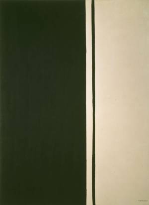 Barnett Newman at Tate Modern