


Parasol Unit, London
9 September – 6 December 2015
by ALEXANDER GLOVER
During a talk at Parasol Unit about this exhibition, Luc Tuymans (b1958) quotes Ken Pratt – who wrote the exhibition catalogue – when he says: “Of course it’s abstract; Belgium is abstract.” Tuymans then goes on to say: “Belgian people are great individuals, but pretty bad as a group.” Pratt’s belief that “Belgium is abstract” carries some validity. In terms of geography, it shares borders with France, Germany, Luxembourg and the Netherlands. Politically speaking, Belgium is a constitutional, popular monarchy and a federal parliamentary democracy. It also has three official languages – French, German and Dutch – with a host of various dialects. You can begin to understand Pratt’s belief here. Perhaps Belgian art – since the beginning of modernism anyway – is somehow destined to be abstract given the circumstances from which it derives. If we take Tuymans’ statement from an art perspective, he may have a point here, too. Just think of René Magritte (1898-1967), Tuymans himself, Paul Delvaux (1897-1994) and Carsten Höller (b1961). It has to be said, however, that in this exhibition, the individual artists work phenomenally well together as a group.
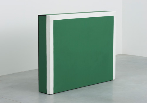
The show is called The Gap because it is about the artworks of two successive generations. The oldest works in the show are by Gaston Bertrand (1910-1994) whose painting incorporates architectural planes disguised as colour studies. His are perhaps the most traditional abstract works featured. If we compare Bertrand with the youngest artist in the show – Timothy Segers (b1983) – we can begin to understand the purpose of the show. With its two-dimensional flatness and jet-black colour, Segers’ wall-mounted, stainless-steel sculptures are an exercise in restraint, creating a dark negative space. What Bertrand and Segers share in their work is flatness. The shapes of both artists’ works are also very suggestive. Bertrand’s architectural planes suggest something more three-dimensional while Segers’ work suggests hints of sunburst and something more colourful than black. So, in a way, both artists are striving for qualities that the other has in his work.
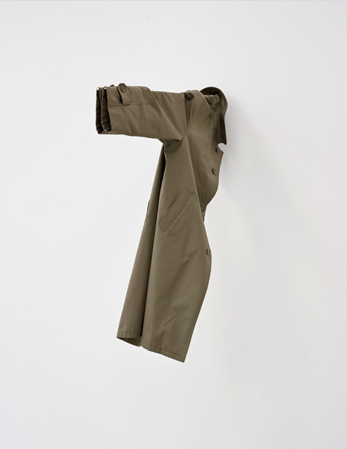
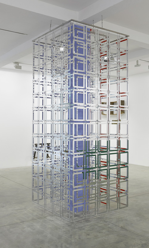
The use of the gallery space brings together the duo Carla Arocha & Stéphane Schraenen’s (b1961 and b1971) and Gert Robijns (b1972). Arocha and Schraenen’s site-specific work entitled Column (2015) consists of Plexiglas veils that feature in both floors of the gallery and appears as though it goes through the ceiling of the bottom floor and into the top of the second floor. Robijns’ work Jeun’homme (2012) features a coat hanging on one side of a wall with a pair of suspended shoes hanging on the other side. The coat and shoes, found objects taken from his grandfather’s house, have been displaced within the gallery space and it is in this way that they are abstracted. Like Jeun’homme, Column achieves the same level of abstraction by using the gallery space itself. Column is also an abstract work in that the various acrylic colours that lie behind the Plexiglas become distorted as you encircle it. The Plexiglas also absorbs and reflects the light surrounding it so that the work provides a washy illusionary image despite its extremely defined and rigorous structure.
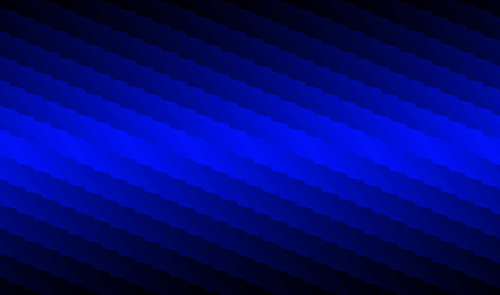
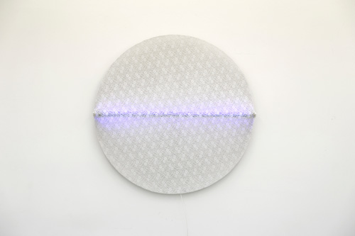
Another theme that seems to permeate both rooms is the feeling of sensuality. Untitled (1965) by Guy Mees (1935-2003) is a circular neon light installation. The blue neon light is wrapped with lace so that it appears as if the light is almost gently humming. The lace places the piece on the more sexual side of the sensuality scale. Twisted Strings PFX 225 (1972) by Walter Leblanc (1932-86) is a piece that has cotton thread running diagonally across a bed of latex on cotton canvas within a cushion-shaped frame. The piece is very sensual texturally speaking because of the careful alignment of the cotton thread. Boy & Erik Stappaerts’ (b1969) Polarisation (2015) paintings also possess a sensual quality. They are a panel of eight high-gloss paintings that are created using hand-mixed car lacquers. The sensuality expressed here can be found in the reflective properties of the high-gloss paint but also in the gradated patterns the artist uses. Like Arocha & Schraenen’s Column, Polarisation is rigid in shape but because of the arrangement, it has the capacity to become optically abstracted. Other works that possess a sensual quality are by Jef Verheyen (1932-84) and Pieter Vermeersch (b1973), both artists using a faded, misty, gradation of a single colour.
Although The Gap refers to the generational gap of these selected Belgian artists, it is clear that Tuymans, through careful selection, has bridged the gap between them, proving that the only gap between these two successive generations is their age.
Click on the pictures below to enlarge

Copyright © 1893–2026 Studio International Foundation.
The title Studio International is the property of the Studio International Foundation and, together with the content, are bound by copyright. All rights reserved.


 Rik Wouters: A Retrospective
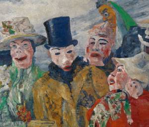 Intrigue: James Ensor by Luc Tuymans
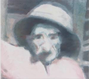 Luc Tuymans: The Shore
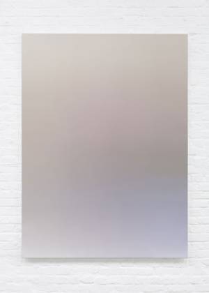 Pieter Vermeersch
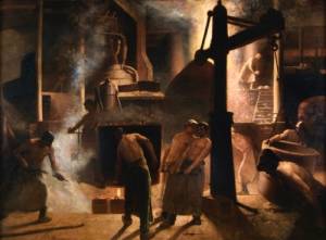 Retrospective Exhibition Constantin Meunier (1831-1905)