


by JANET McKENZIE
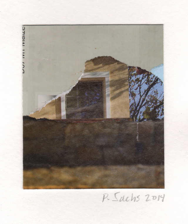
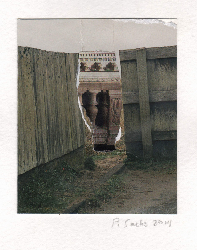
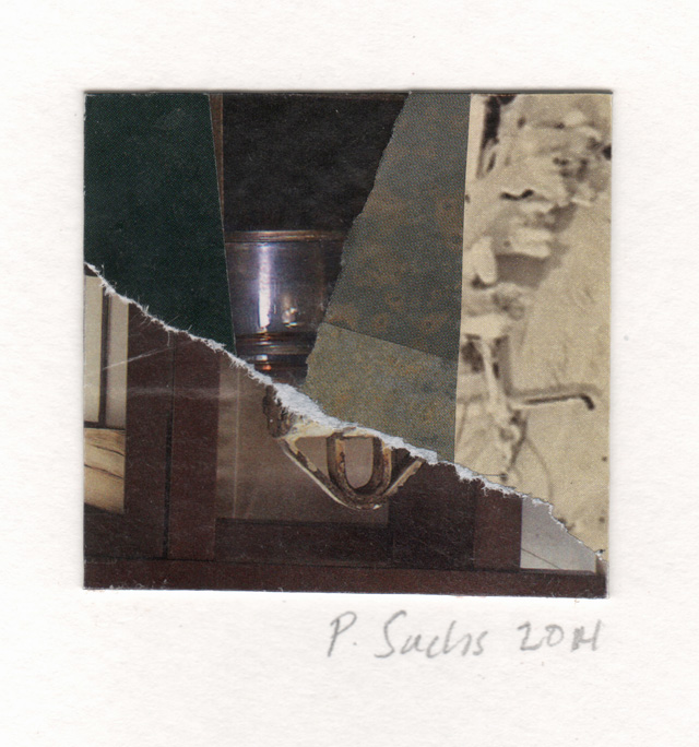
New Jersey-born Pat Sachs has been making tiny collages since the 1980s and is currently exhibiting at Treacy & Eagleburger Architects in Washington DC. Perhaps her training in printmaking informs the way she approaches the picture plane, where, using torn paper, she explores landscapes and architectural forms. Juxtaposing unlikely elements and challenging normal notions of concept and scale, Sachs combines gravitas with irony; mass media with Renaissance architecture; the historic old world of Florence and Rome with the US of the present-day. Lilliputian in scale and employing a quirky range of subjects, her work resonates emotionally in unexpected ways.
Janet McKenzie: You chose to make tiny collages in the 1980s when artists in New York were working big. Museums were acquiring enormous, at times indelicate, canvases and the artist’s ego was particularly evident. Was your choice reactive?
Pat Sachs: My work is small. If you hung one of my collages next to an enormous Anselm Kiefer painting, the collage’s 3½in x 4in dimension might look tiny, ant-like. It’s pretty much relative. If you captured the average North American backyard ant and glued him on a piece of paper and hung it next to my collage, the ant would win the “Tiny Award”. I’ve always liked working on varying scales (including some very large pastel drawings), but from the start of my art career, the small, intimate scale has felt ideally suited for my visual language.
So, no, I wasn’t reacting to those enormous, ego-evident works of the 1980s. No matter what was being loudly broadcast from New York, I just naturally chose to draw, paint, print-make, and collage in a lower voice. Often, if you speak quieter, people lean in towards you to listen more closely.
JMcK: Historically, from Pablo Picasso and Georges Braque to Kurt Schwitters or Hannah Höch, collage is seen as post-heroic, a deliberate clash between high art and social parody and mass media with apposite juxtaposition and harsh incongruity.
PS: Yes, well, on the cusp of the first world war, Picasso and Braque brought out their own ordnance, in the form of fabric, rope and newspaper, and launched a successful sortie against the Paris art establishment. When Picasso painted his Still Life with Chair (1912), a composition of shattered planes, he subverted the then accepted notion of a still life. By gluing that piece of mass-produced oilcloth on to his canvas, he let the peasantry into the gated community of high art. And when he adhered a length of rope around the oval canvas, he announced – in a further playful gesture – that a painting no longer needed a wooden frame either. And that the frame and content were of one piece. Picasso got a lot done with Still Life with Chair; he changed the game.
Picasso and Braque stuck those first bits on their canvases, but collage was just a layover in their respective art-making journeys. For me, Schwitters was a genius, the undisputed architect of the art form and of its enduring aesthetic. In the winter of 1918-19, the year that bridged war and peace, he started energetically making what he called his Merz pictures, “building” his collages from the litter that can fly by our faces in a brisk wind – newspapers, bus tickets, empty cigarette packs, and so on – and his Merzbau, his assemblages (the predecessors of installations), from other sturdier urban street detritus – cardboard cartons and fragments of wood or metal.
So Schwitters paved the way – with all kinds of trash – for those of us who love working in this medium.
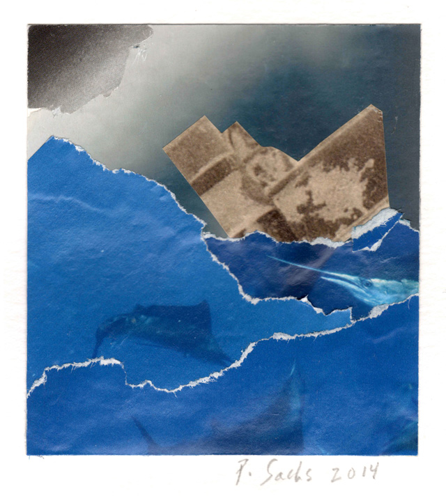
JMcK: Conceptual and subjective are both key elements of art in the present: how does a work such as The Perfect Storm (2014) reference both?
PS: OK, to answer this question, I have to talk about process. If I’m working on collages, I generally spend the workday sitting at my table. A shallow box containing a pile, a hillock, of paper fragments or whole pages torn from magazines (most particularly architectural magazine, such as Dwell) sits in front of me, handy for image excavating. A finished collage, composed of those scraps, hides somewhere in the pile of paper images. I don’t trawl in the mound with a specific concept in mind. For example, with The Perfect Storm, I found a page (ripped from a National Geographic?) with a photo of a fishing boat bobbing in a cerulean sea, with many (Photoshopped-looking) swordfish playing beneath the waves. I thought of the 19th-century Japanese artist Katsushika Hokusai, whose iconic print The Great Wave, I continue to mine for images. And I also thought of Victorian stagecraft; for example, if a show required a seaside scene, they playfully portrayed the waves with tiered, laterally moving, painted scenery, creating three-dimensionality. I didn’t want a representative image of a ship riding my cerulean waves, so I found one that, when properly tilted, worked as an abstract element. I’m also a big believer in “the rip”, the white edge that works in a number of ways as an element: it announces the material – paper; it can define and create tension. So in The Perfect Storm, I used the rips to define the waves and to suggest “white caps”. The final collage is, I hope, a small visual drama containing enough dynamism and ambiguity to make it interesting.
JMcK: Where did you study and who were your influential teachers?
PS: I graduated from the School of the Museum of Fine Arts, Boston, and I did some postgraduate work at the Royal College of Art in the UK. Unfortunately, I didn’t have a mentor during my school years. I have to say that my late husband, the architect and architectural scholar Tom Schumacher, was my best teacher.
JMcK: Did the work of Höch or Addie Herder influence your choice of medium?
PS: I admire both of these artists. I was familiar with Höch because she was a Dadaist. Herder I came to, much later, years after I’d been working in the medium. Her influences included two of my own – Schwitters and Joseph Cornell. Her work from the 50s, during which she and her husband had a commercial design firm, kind of reminds me of some of that era’s textile designers – say, Lucienne Day. I like the wide range of Herder’s work, from those diagrammatic-like pieces to the assemblages, all constructed in that intimate scale; she had a nimble way with the medium. (I wish could afford to buy one of her pieces.)
I’d say that Höch influenced me to some degree; I relate to her sensibility. I’ve got a propensity for joining disparate images to make a humorous, pointed whole. But Höch was a prominent Dada collagist, a woman in the Dada movement, and I think her imagery is often more striking, expressive, probing and politically sharp than that of her male contemporaries. Throughout the 20s and into the 30s, she explored perceptions of beauty and race (Half Caste, 1924), producing her series of photomontages – “Aus einem ethnographischen” – in whose imagery she symbolically “integrated” races and cultures. She was kind of an armchair collagist – a cultural anthropologist busily producing these contra Aryan images, even as the sound of jackboots grew louder in the streets. I mean, she was fantastic.
JMcK: Your collages can be seen both as stage sets and as formal abstract works.
PS: Yes, that’s true. They work both ways. In 2008, I had a big show in Como, Italy. These two young women excitedly came up to me during the opening. They were theatre majors at a Milan university, and they loved the collages whose compositions resonated of stage scenery. I only know this because my late husband spoke fluent Italian and could translate. Anyway, their excitement needed no translation. That was cool. I smiled at that.
In general, though, most people see them more in terms of formal abstraction.
JMcK: Your images sometimes resemble film stills. How important are photography and film to your art practice?
PS: Both photography and film figure prominently in my art practice. I flat out love film, and some of my collages do resemble (mostly) abstract-like film sets, with lots of spatial ambiguity. The tonal values I often use reference film noir, high on my list of film genres. Silent German expressionist films have also influenced me, for example, the classic The Cabinet of Doctor Caligari (1920), in which director Robert Wiene uses that fabulous low-key lighting to great psychological effect.
I love photography, too, especially the work of Garry Winogrand, Cindy Sherman, Edward Weston, Paul Strand, Irving Penn, Brassaï, Nadar (AKA Gaspard-Félix Tournachon), Jacques-Henri Lartigue – the list goes on. There’s so much to learn when you tap into someone else’s vision.
JMcK: You seem to pursue monumentality on an intimate scale, a form of poetry?
PS: Well, although I know that a viewer often has to get within a nose of my intimately scaled work, I like to think that, when viewed from a distance – say, a few feet away – the collages can paradoxically read “large”.
JMcK: Who are your favourite artists and architects historically?
PS: It’s hard to choose favorites. The artists: Édouard Manet, Claude Monet, Lyonel Feininger, Cornell, Henri Matisse, Camille Pissarro, Paul Cézanne, Lucian Freud, Otto Dix, Donatello, Masaccio, Giovanni Bellini, Fra Angelico, Paolo Uccello, Paolo Veronese, Filippo Lippi, Filippo Brunelleschi, Francis Bacon, JMW Turner, Schwitters, Sylvia Molloy, Emmy Bridgwater, Leonora Carrington, Max Ernst, Carlo Carrà, Giacomo Balla, Stanley Spencer, Edward Hopper, Childe Hassam, and many more.
The architects: Andrea Palladio, Brunelleschi, Le Corbusier, Giuseppe Terragni, Frank Lloyd Wright, Marcel Breuer, Louis Kahn, Walter Gropius, Eero Saarinen, and Mies van der Rohe.
Contemporary artists: Ai Weiwei, Anselm Kiefer, Odd Nerdrum, Marlene Dumas, and Charles LeDray.
Contemporary architects: Mikko Heikkinen, Markku Komonen, Peter Zumthor, Renzo Piano, Richard Meier, Santiago Calatrava and César Pelli.
JMcK: You have returned to drawing. Can you describe your methods and materials? What are you planning next?
PS: I try to alternate between collage and drawing, otherwise I get burnt out on the collages. Working on them can get very frustrating. It’s hard to spend day in and day out sitting at a desk, head down, building them. Drawing is a good, mental shift from the intense focus it takes to do the collages. Drawing loosens me up both physically and creatively; the scale is much larger, too. I’ve always especially liked line, letting it loose on the page. In fact, after working on a collage – average size 4in x 3½in – facing a large sheet of paper is like taking a gallop through a vast field.
I’m currently working on a series using trees as figurative elements. I've been studying trees. For this series, I’m rolling out the coloured pencils – mostly Derwents, but I may try to mix it up a bit, say, coloured pencils, oil stick –whatever I feel the imagery calls for. I usually make lots of loose sketches, working out the composition. Sometimes, if I have a particular sketch I like, but want to alter certain parts of the composition, I’ll use the light table and some trace to visualise the changes. Whatever the drawing, I’m guaranteed multiple trips back to the drawing table before I’m satisfied with the finished piece. I always hope that I won’t overwork it, that whatever freshness and energy existed at the beginning of the journey, remains at the end.
Click on the pictures below to enlarge

Copyright © 1893–2026 Studio International Foundation.
The title Studio International is the property of the Studio International Foundation and, together with the content, are bound by copyright. All rights reserved.

-18-300.jpg)


 This Is What It Is to Be Happy
 John Stezaker: ‘I was trying to create a sort of photographic cubism’
 Alexey Titarenko: ‘I wanted to capture my inner perception of the world around me’
 James Richards: ‘I was really into making an exhibition space where there would be nothing to look at’
 Jockum Nordström: ‘There’s a self-portrait in every single thing I do. Even if I make a tree or a sex-scene, I can play the both of them’