


Victoria Miro, London
9 October–7 November 2009
by SAM ROSE
The pots are still a part of his art, of course, with the shapes and basic technique of layering paint, photography, carving and glazing still familiar from the works displayed in 2003. Before that show he noted he had ‘come out as a craftsmen because, after more than 15 years, I can’t admit that I make [pots] badly any more’,1 and if anything these works are even more extreme evidence of that statement. Though still creating pots by traditional ‘coiling’ (rather than on a potter’s wheel) Perry has now travelled far from the English folk art that first interested him, further developing his exploration of Eighteenth and Nineteenth Century porcelain that began in the late 1990s. The late 1990s also saw a shift to more contemporary issues as subject matter, and it is this incongruity between the high craft value and low subject matter that continues to create one of the many binaries around which the works operate.
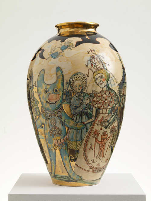
This craftsmanship, and the approach to meaning, is laid out strikingly in The Westfield Vase (2009). Here the blue-green glazed vase takes on the semblance of a piece of ancient Chinese ware, the luxury and apparent age intensified by the gold that seems to fill in the ‘cracks’ that have spread around the work. On closer inspection one sees a crudely drawn floor plan of the Westfield shopping centre, conflictingly mocking the pretentious luxury of the vase, and perhaps suggesting a new status for it as contemporary ‘artefact’. This play of old and new, high and low, is ingrained in the subject matter itself in more figurative works such as Jane Austen in E17 (2009), where romantic figures in dresses walk among pasted photographs of CCTV warning signs and National Lottery signs.
As someone who once complained of being too afraid to tackle Islamism head on, it is interesting to see terrorism now cropping up directly in Perry’s art. Moving from pot to tapestry, Vote Alan Measles for God (2007) casts Perry’s childhood teddy bear and mascot in a kind of ‘third world political banner’.2 Jumping up with Kalashnikov raised and surrounded by explosions, bullets and dollar signs, Measles appears to be a comic parody of the violence and simplicity of the Islamic terrorist world-view (while also recalling the photograph Clare as the Mother of all Battles (1996), where Perry’s transvestite alter-ego Clare stands in elaborately embroidered dress clutching, again, a Kalashnikov rifle). The figures of Clare and Measles, and Perry’s desire to build a mythology around the two, appear again more recently in World Leaders Attend the Marriage of Alan Measles and Clare Perry (2009). Again, the work takes on a comic note here, as Gordon Brown, Nicholas Sarkozy, Angela Merkel and others gather round for a wedding in a manner recalling earlier Christian iconography; Perry used to say that “no matter how brash a statement I make, on a pot it will always have a certain humility”,3 yet given the now general acceptance of his work and it’s current high craft levels, it is in fact the knowing ridiculousness of the statement that keeps such a work from lapsing into straight faced Hirst-like farce.
On the wall facing The Walthamstow Tapestry (2009) are two large etchings that act as a prelude to the work: Print for a Politician (2005) and Map of Nowhere (2008). The sources for the Print are numerous, as well as the Chinese scrolls and Henry Darger paintings cited one could also see elements of Renaissance allegories of good and bad government, Venetian battle scenes, and Jacopo de’ Barbari’s Map of Venice (1497–1500) (Perry’s print was originally made with Venice in mind).4 Similarly, the Map of Nowhere is based on The Ebstorf Map, a German mappa mundi destroyed during the war, yet the combination of Perry’s style and the blue and white of the coloured etching gives a result strikingly close to blue glazed Dutch or English tiling. As with the Tapestry, both works play on a multitude of images apparently randomly named by words next to them. This has been a recurring theme in Perry’s work since The Names of Flowers (1994), where twenty pictures of flowers were overlaid with the names of theatres of war, and has the general effect of a meditation on the separation between our language and the things behind (or if you prefer, the gap between signifier and signified, sign and referent).
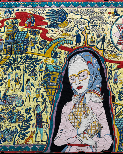
More specifically, in The Walthamstow Tapestry, the device is turned to focus on the brands and brand names that make up much of our lives. Combining the influences of Malysian batik fabrics, Eastern European folk art, and William Morris – one of Walthamstow’s most famous former residents – the monumental tapestry echoes the ‘mapping’ of the etchings as it charts the journey from birth to death. Christian symbolism is imparted by the haloed figure holding a flick-knife (‘Ford’) and the Madonna-like central figure tearfully clutching a handbag (‘Sony’). The images and words themselves are sometimes only imaginatively connected (‘Bollinger’ as a monk meditating under a tree, with ‘Tate’ a butterfly flying above), and sometimes more didactically so (the blind lady ‘Guggenheim’ being led by her dog ‘Sothebys’, or the contemporary ship of fools containing ‘Enron’ and various banks). All this is rendered in a disarmingly simple style, belied by the quite beautiful colour and complexity of the work when one stops for a closer look.
Beyond the simple critique of consumer life in the work – as with the basic critique of society in much of Perry’s work – meaning becomes harder to extrapolate. When Perry curated the Charms of Linconshire show in 2006 he showed an almost nostalgic love of rural England and the ‘charms’ of it’s folk art, yet he also mocked the blindness of such naïveté, citing Carl Jung’s famous phrase “Sentimentality is a superstructure covering brutality”.5 For all his cynicism about consumerism and modernity then, it is hard to imagine Perry truly advocating a return to rural utopia, a right wing politics of traditionalism, body and blood. This aporia at the heart of the issue means that the work often is best left half spoken, with meaning suggested, rather than didactically laid-out. Such seems to be the point of the medium-content conflict, with deeper meaning always left slightly, playfully, unsaid, while the constant emphasis on craft and ‘folk’ art forces one into actually ‘reading’ the work closely and repeatedly. These are undoubtedly works that invite, and reward, a close and prolonged reading.
References
1. Quoted in Louisa Buck, ‘The Personal Political Pots of Grayson Perry’, in Marjan Boot (Ed.), Grayson Perry – Guerilla Tactics, Amsterdam, 2002, p. 99.
2. Jack Klein, Grayson Perry, London, 2009, p. 90.
3. Quoted in Buck, Ibid, p. 93 Klein, Ibid, p. 82.
4. Klein, Ibid, p. 82.
5. Quoted in Grayson Perry, The Charms of Lincolnshire, Lincoln, 2006, p. 13.
Click on the pictures below to enlarge

Copyright © 1893–2026 Studio International Foundation.
The title Studio International is the property of the Studio International Foundation and, together with the content, are bound by copyright. All rights reserved.


 Abstract America: New Painting and Sculpture
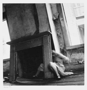 Francesca Woodman
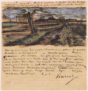 The Real Van Gogh: The Artist and His Letters
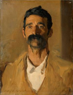 Sargent, Sickert & Spencer