


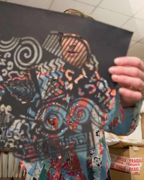
Charlotte Hodes in her studio, London, May 2013. Photograph: Nick Howard.
by JANET McKENZIE
Using it as a platform from which to interrogate both 21st-century design and feminism, Hodes dismantles idea and form by using collage and paper-cut techniques to disrupt images, thus creating multifarious new directions and possibilities. The female form occupies each of the 37 paper works, and in the ceramic dishes is languid and idle, an ironic aside to the painstaking and time-consuming techniques employed by the artist herself. As Hodes’s first dialogue with text, The Grammar of Ornament provides a natural extension to her practice, which has included working intermittently at the Spode factory in Stoke from 1996 to 2004; a residency at the Wallace Collection (2005-7), which inspired sumptuously decorated classical urns; and her current position as professor of fine art at London College of Fashion. Hers is a pragmatic assertion of the important yet threatened English tradition of decorative arts, and of female independence in the art world, culminating in an elegant yet contemporary baroque.
A design bible for students and practitioners alike, it comes as no surprise that Hodes has embraced the marvellous potential of The Grammar of Ornament, since her work has long occupied and addressed the interface between painting and design. She recalls that, while at the Slade School of Art in the 1970s, she experienced a sense of isolation from feminist activity in the arts: feminist artists, she says, “tended to prefer performance, sculpture and video”. As a student of painting, she was interested in the work of Sonia Delaunay and Odilon Redon, who were decidedly out of favour at the time. There were, she says, very few female role models, and she experienced a strong sense of not being able to do what she wanted. Indeed, there was a disjuncture between her interests and her art practice. She found the earnestness of much feminist art extremely oppressive; her recent work reveals that a playful irreverence is important for her in addressing serious issues.

Charlotte Hodes. Grammar of Ornament: Proposition 14, The Colour Blue, 2014. Papercut, 56 x 83 cm.
Janet McKenzie: Perceptual drawing, particularly life drawing, underpins all your work.
Charlotte Hodes: Drawing directly from what is around me has always been the starting point and so certainly much of the first couple of years I spent at art school was centred on figure drawing. I found it hugely problematical to make the transition from perceptual drawing to constructing images. As a young artist I did not have a formed vision and so, although I had the drive to take in information visually and to reflect on the world through drawing, I did not then know what to do. It was only when I started to find strategies to manipulate the material that I was able to formulate my ideas rather than just being a cipher. At the Slade there was a sharp division between the “studios”, to which a number of tutors were attached. There was the abstract studio, the figurative studio, the experimental studio and the life rooms. I knew at that early stage that to work in the life rooms would be to stifle any hope of developing a vision. The figurative studio tended not to embrace much colour so, after a while, I worked in the abstract studios where colour had a place – abstract expressionism was in full swing, and John Hoyland and Mick Moon taught there. I also escaped to the print room where the processes of print created a logical step away from perceptual drawing. From the beginning, I was perplexed about the hierarchy that was attributed to life drawing, as I believed that the intensity and focus that is sacrosanct in life drawing should be equal for anything that is drawn. I continue to begin projects by drawing directly from what I see, and that includes drawing from photographs, drawings and diagrams. I never invent.
JMcK: Your females are portrayed in silhouette form, draped over, or dancing on, large collaged works and ceramic pots. Can you explain how you came to work in a range of forms, from paper cut-outs and collage to ceramics?
CH: Although my work takes a range of forms, I continue to consider my approach as that of a painter both in terms of my references and in the formal way that I construct images. My shift into other forms (collage from about 1989, ceramics from 1998, glass from 2007) was partly by chance (an invitation to visit the ceramic factories in Stoke in 1996 with my ceramics students at Camberwell, to whom I taught drawing; a 2007 commission by the UK agency Arts and Business to work in a glass studio in Murano, Italy), but I was also having difficulties in completing my paintings. Delighting in the tactility and richness of paint is not enough. It flows quickly and it is possible to find that every element is continually in flux, with nothing anchored. The handcraft process of collage, the clarity and simplicity of a cut shape, enabled me to play and fix images in a different way from painting. In addition, the time that the activity itself takes slowed down my thinking process.

Charlotte Hodes. Grammar of Ornament: Proposition 15, Light and Shade, Red, 2014. Papercut, 53 x 75 cm.
JMcK: Your female figures are dressed in Grecian robes, corsets, hooped skirts or flapper dresses; the images are placed within and alongside textiles, forming a blaze of colour. They constitute both a complex language of patterning and concealment. Why have you portrayed women historically in this way?
CH: I think that a lot of my work is about finding a place in the world and making sense of it, creating an order. My female figure is centred in the here and now, but she is an element in a constructed pictorial world and part of an historic continuum. My intention is that she should acknowledge her historical incarnations and, to that end, I draw liberally on both the fine and decorative arts. The motifs I use are both of the clothed figure and the nude. I seek to place them in a non-specific time, so I choose the kind of dress that can be seen as both contemporary and historical, unlike more overtly contemporary fashion profiles.
JMcK: In contrast to Grayson Perry, who constructs his own large ceramics, you commission dishes to be made according to your design, then work on the pots as a painter.
CH: I am not a ceramicist and have no desire to be a “maker”. I work with studio ceramicists or factories to create my forms, as well as using pre-existing forms such as tableware. I can, therefore, focus on the surfaces that, for me, are extensions of the “canvas”. Unlike a canvas, however, ceramic forms such as a vase connote a particular history, and reference the female form and domesticity. I usually choose vases that are archetypal shapes with the largest uninterrupted surface area. Recently, I worked in a small pottery factory in Bridlington, Yorkshire to produce a group of vases: A Concise History of Vessels. The factory produced predominantly low-end vases and lamp bases, one of the last factories to manufacture this kind of product in England. It made three large vase moulds for me (the shapes originate from vases that I had drawn in the Frick Collection) and slip cast a number of them, which I then worked on both at the factory using its underglaze colours (I took advantage of its fantastic expertise in glazing) and in my studio (collaged fragments of enamel transfers), which the factory then fired. It is always a privilege to be the recipient of such craft expertise.
A Concise History of Vessels consisted of approximately 30 vases, each 58cm high, completed in 2014, which take the ceramic vase, with its female connotations, as a 3D canvas around which are juxtaposed both images of vases, from the classical through to the everyday, such as an amphora, coffee pot and watering can, each alongside the female motif.
. Papercut, 53 x 74.5 cm.")
Charlotte Hodes. Grammar of Ornament: Proposition 18, Field of Squares I, 2014 (detail). Papercut, 53 x 74.5 cm.
JMcK: Can you tell me about the processes?
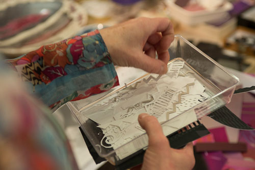
CH: My method of working through drawing and collage is fairly consistent, even though the form, substrate and technique change. The hand collage process of using fragments of paper that I cut and paste to create the paper cuts, is echoed in the “cut” and “paste” functions of the computer, which I often use as a precursor to working on the paper cuts in the studio. The imagery for the ceramics is also made up of individually cut fragments of silkscreened or digitally printed ceramic transfers applied across the ceramic surfaces. The application of these is similar to kids’ slide-on tattoos, which are soaked briefly in warm water and placed on to the skin, with the backing paper coming away leaving the transfer on the skin. My “bank” of images is made up of pencil drawings and tracings, printed patterns, photographs and magazine cuttings. I continually multiply these to serve at any moment for a new piece of work. For example, a simple pencil drawing of a figure can be adjusted, refined and altered in scale, on the computer or by hand, to suit its purpose. I have two ever-increasing archives of interchangeable imagery, one in the studio and one on the computer. In addition, I also make new drawings and source new references every time I start a new project.
, London, May 2013. Photograph: Nick Howard.")
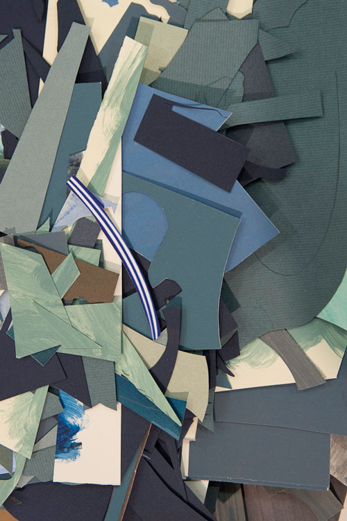
Charlotte Hodes. Studio interior with collage materials (2), London, May 2013. Photograph: Nick Howard.
JMcK: So you have a cache of design elements – coloured paper, linear marks, handmade, appropriated – that serve as a stockpile to create patterned surfaces in advance of the process of decorating a piece? And the amassed elements are themselves a byproduct or an extension of your collage methods?
CH: Mostly the patterns are generated and appropriated from existing patterns; recently, I have sourced some from the Victoria and Albert Museum’s textile collection and others from swatches in the Hayes Archive at London College of Fashion. The patterns are reworked on the computer, rescaled, and repeated in a number of ways with colours changed to serve my purposes. Some patterns, such as dots and little motifs, I hand draw to generate a pattern using the computer, which is such a brilliant tool for generating any number of patterns (as opposed to hand drawing). My work is very process-led, the images emerge out of the hand and digital drawing and collage activity; they are not preconceived.
JMcK: Thus creating an irregular, unique finish?
CH: For me, the density of the colour and the physicality of the surfaces of my work is important, as I think is evident when you see it in the flesh. I intend for the paper cuts to have the quality of an embroidery, where you are acutely aware of a close “hand-eye” activity across the surface and are also reminded of those “female” activities such as sewing and quilting. For me, the pleasure factor – and this is where colour and pattern and the decorative arts come in – is central, and it is through this that I hope something epic and serious can be communicated.
The ceramic surface is somewhat different, as it is very glass-like and smooth. I am interested in the way that the form is quite rigid, but the collaged imagery is also fragile and there is a sense evoked that the fragments have simply floated down and are momentarily held; a precariousness even, that they may slide off.

Charlotte Hodes. Grammar of Ornament: Proposition 18, Field of Squares I, 2014. Papercut, 53 x 74.5 cm.
JMcK: It is a terrible sadness that the Spode factory, such a wonderful resource in England, closed down.
CH: I have worked at a number of workshops and factories, including the ceramic factory Spode, where I was first invited in 1996 and where I subsequently worked on a number of short artist placements until 2004. I was seduced by the vast image bank of enamel transfers and copper engraving tissue transfers, such as Italian Blue and Willow Pattern that we see as quintessentially English. I immediately realised that this archive of images was potential “collage” material and that the factory ware could assume the role of substrate. I was given unprecedented and privileged access, as well as support from the technical experts in the factory, as long as I followed existing factory procedures. This was perfect for me because, as a non-ceramicist, I could focus entirely on creating the imagery. My approach at the factory echoed my own evolving studio working collage methodology. The Spode factory closed in 2008, but I have recently returned to the Spode Museum Trust Archive with my colleague Dr Paul Scott with the support of an Arts Council England grant. I am very excited about this new project, which will enable us to research more deeply into the copper engravings with the aim of creating new artworks.

Charlotte Hodes. Grammar of Ornament: Proposition 25, Lethargy, 2014. Papercut, 75.4 x 54.6 cm.
JMcK: Although you use historic vases for inspiration for your fleshy nudes (Jean-Antoine Watteau’s fête galante painting in the Wallace Collection), your females are quite rebellious, aren’t they? The idle figure on the pots and dishes – you have made a number of dinner services – can be read as players disengaged from traditional female responsibilities – a case of not doing the dishes, perhaps?
CH: You said it, not me! My figures, on the dinner services especially, are there to interrupt domestic order and expectations. I delight in the domestic, but I like to think that the female figure does not need to adhere to the role attributed to her. And I want to show that the domestic can be an empowered space: a place where serious ideas can be communicated. The home has traditionally been the domain of the feminine and of female creativity, where women have had a degree of control. I use the figure to disrupt the formal order of tableware and social discourse that are implied by the traditional “function versus decorative” relationship. A nude languishing across a dinner plate in my work is an act of provocation. In my work, the female figure is in control.
JMcK: In challenging Owen Jones’s design principles, you are also embracing his pleasure of patterning, as fundamental to human civilisation. In your drawing research, however, you are focusing on conceptual notions of process. What will your next body of work explore?
CH: That is absolutely true. I am not sure that my preoccupation with the Grammar of Ornamentis yet complete. One of the aspects of the Grammar of Ornament, and a group of large paper cuts that I made prior to this, is the idea of the female figure on a pedestal as a monument. This interests me, as it is such an absurd place for you, or me, to be; it is not a contemporary concept. I would like to bring ideas such as this to my new work. It will also be informed by my research into the copper engravings at the Spode Museum Trust. At this point, I do not know what form they will take, but I continue to believe that, as I start to draw, the conceptual and formal issues will be addressed and that the images will take shape in my mind.
Reference
1. The Grammar of Ornament by Owen Jones. Illustrated by examples from various styles of ornament. One hundred folio plates, drawn on stone by F Bedford, and printed in colours by Day and Son, London, 1856.
Click on the pictures below to enlarge

Copyright © 1893–2026 Studio International Foundation.
The title Studio International is the property of the Studio International Foundation and, together with the content, are bound by copyright. All rights reserved.

-1000-300.jpg)
,-Red-Devil-(soul-2),-Drifting-Leaves,-1972-300.jpg)
-Cecily-Brown-Photo-(c)-Jo-Underhill-300.jpg)
 ARCHITECTURE + CERAMICS = SCULPTURE
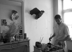 A Delicate Game of Cat-and-Mouse
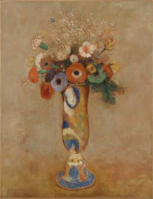 Beyond the Visible: The Art of Odilon Redon
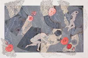 Inscription: drawing, making, thinking
 Grayson Perry: The Walthamstow Tapestry