


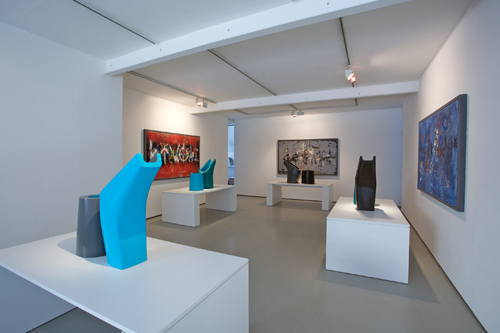
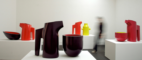
Nicholas Rena and Matthew Smith: Proving Ground
New ceramic vessels by Nicholas Rena with paintings by Matthew Smith
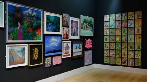
Marsden Woo Gallery, London
6 May–19 June 2010
by Dr JANET McKENZIE
Nicholas Rena’s choice of ceramic methods and product dates back to school, where his art master at Eton, was Gordon Baldwin, whose highly influential career as one of Britain’s most important ceramic artists made a lasting impact on Rena’s subsequent career. Baldwin’s recent exhibitions indicate his experimental, highly inventive career, which indicates the manner in which Baldwin has long approached ceramics, and how he has traversed the categories that Rena believes can often “ghettoize ceramics”. For Baldwin, clay as a material and the ceramic form itself is infused with an equal intellectual rigour to the fine arts themselves, thus blurring distinctions between applied and fine art. It is appropriate that Rena should be awarded the Art Fund Award at the same time that Gordon Baldwin’s work is included in an exhibition, at Contemporary Applied Arts (CAA) in London, Drawing with Objects (7 May–12 June 2010).
The present position for ceramics should be viewed against the development of studio pottery, which has strong roots in England, but which has increasingly opted for non-functional and sculptural items at least since the middle of the twentieth century. From the 1960s onwards, a new generation of potters, influenced by Camberwell School of Art including Gordon Baldwin, began to experiment with surfaces, glazes and abstract ceramic objects, to new critical acclaim.
For Rena himself, the promising direction that he took as an architectural student and subsequently a graduate at Cambridge University School of Architecture, allowed his creativity to benefit from the teaching of Colin St John Wilson, himself an outstanding international architect with a broad understanding and engagement in the visual arts. However Rena’s subsequent period at the Royal College of the Arts (RCA), London, studying ceramics and glass opened further new horizons for him which fulfilled his search for materiality, a quality not always much evident latterly in modern architecture, and less so in practice as he had personally discovered.
In ceramics, since the 1980s and more so in the 1990s, there has been a distinct trend away from functional pottery, with ceramics now evolving closer to sculpture, making it more appropriate for artists such as Gordon Baldwin, Nicholas Rena and Grayson Perry, who won the Turner Prize in 2003, to call themselves ceramic artists, or simply artists. Even today, Rena observes:
I can imagine ceramics being a lively field, but not in the way it is presently constituted. It is taught and exhibited within ‘the applied arts’ yet for various historical reasons has become detached from that to which it was applied, that is, architecture. This is the divide the Arts and Crafts movement sought, with no lasting success, to heal. The situation now is that ceramics objects exist outside of any disciplining context. As a field it has become merely a curio or vestige. Certainly ‘the vessel’ as a theme in relation to architecture seems almost moribund.2
Rena was in fact conceptualizing a different, distinctively sculptural kind of ceramics. One problem had been that although ceramics continues to become more highly valued in the art world, in terms of exhibitions and sales, it is mostly appraised for the consumer and for students too, in a separate craft bracketed camp. Waldemar Januszczak (The Sunday Times) is less polite than most commentators when he admits: “I have long suspected one of the chief reasons [Grayson] Perry became a potter was that he knew how much it would annoy the monks and purists of the art world. There is no way to put this kindly, so let me blurt it out: if you’re in the art world, you hate pots. Vicars’ wives make pots. But not artists. …In fact, it’s a toss-up as to which of Perry’s defining characteristics is less aesthetically seemly, his showy transvestism or his showy pottery. Put them together and you have an artistic career of such towering lack of acceptability, it really ought not to be happening.”3 Rena likewise, has had to contend with this categorical marginalisation, to the shock/horror of new realisations by art galleries and curators and collectors alike.
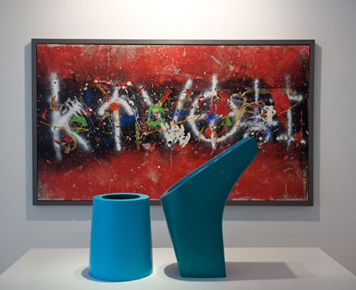
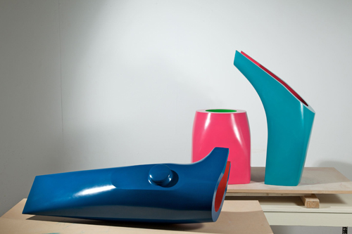
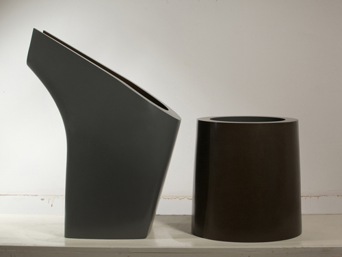
So by contrast Rena’s ceramic works are disciplined, “rigorous and uncompromising”. “He chooses to work with a limited number of rules to bring each pairing of jug and bowl into harmonic relationship; the inside colour of one becomes the outside colour of its counterpart; the essentially opposing formal characteristics of the circular, tapering bowls and the gently rounded square shapes of the jugs are closely related at the rim. Each form displays his concern for perfection in the absolute precision of their making and in their meticulously smooth and sensuously coloured surfaces. The works are composed, calm and authoritative”.4 Rena’s architectural grounding has materialised in this way. The choice of jug and bowl places Rena within the rich historic tradition that forms a bridge between art and function; similarly, where the Japanese do not separate form and function, or art from everyday life. Rena’s work should be viewed from the perspective described by David Whiting for Galerie Besson, London on the occasion of their exhibition, The Jug Show (2007).
The great Cycladic, Minoan and Mycenaean exemplars, the superb pitchers of medieval Europe, the slipware of North Devon, the elegant creamware ewers of Wedgwood – they all show how sculpturally expressive the jug can be. Such objects have also had an important symbolic, ceremonial and narrative significance. The jug, with this embedded cultural history, remains a powerful statement of the potter’s credo.5
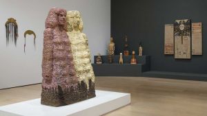
The scale chosen by Rena makes his work exclusively both sculptural and ornamental.
These pots are more emblematic than utilitarian, just as some jugs in the past had a more decorative or ritualistic purpose. Like the teapot, the apparent simplicity of the jug belies the complex thinking and skill that goes into its making, the balance of the handle and the lip, the achieving of an overall fluidity of form is a real challenge, one that continues to test and intrigue modern studio potters. So, far from being an anachronism, the jug remains, technically and aesthetically, a conundrum and a touchstone.6
The sculptural abstraction of Nicholas Rena shows how the vessel continues to evolve as an object “to interrogate, refine and re-invent”. One might also add that this also describes an architectural process, in parallel, being reminded of Louis Kahn’s praise for the pure form of an egg.
Nicholas Rena trained first as an architect at Cambridge, completing the course there in 1986.
In terms of modern architecture, my main influences were architects who revelled in the mass of buildings – Louis Kahn and late Le Corbusier, for example, or Aldo Rossi and James Stirling. I never thought light-weight/ high-tech was the way to go – I thought even at this early stage that the interior of a building needed protecting. The trademark very thick walls, designed to emphasise mass, that characterise my ceramics which are a development of that position.7
But architecture itself was by now (1980s and 1990s) in a state of confusion over theoretical issues. Rena’s Cambridge grounding through Wilson’s tutelage, however, gave him an existential, philosophical discipline of content and form that has since stood him in good stead. The rationale behind any formal solution became inherently necessary. Finding himself unenthusiastic about the realities of architectural practice, he retrained in ceramics at the Royal College of Art, graduating in 1995. He explains;
I missed real involvement with real materials on a 1:1 scale. I retrained in ceramics (RCA) and found that certain themes persisted. Both architecture and ceramics are concerned with containment, with the inner and the outer; both concern ‘the vessel’ in some way.
A strong tension exists within my work, between organic form and geometric form, and this tension comes from two tutors who occupied those opposite poles: Gordon Baldwin (Eton) and Martin Smith (RCA).
Whereas Baldwin’s work is complex and soft in construction, and based ultimately on instinct, Martin Smith’s is hard and architectural. Thick walls are formed using plaster casting and diamond cutting; colour is kept to a minimum and used for highlighting. In terms of influence, the work comes very much out of the American minimalists, notably Donald Judd and Richard Serra – both artists who employ a blunt visual language. From his example I learnt that clay could be made to appear like steel, that it had this capacity to be both curvilinear and ‘stretching’ in effect yet also have the precision and determination of steel.
Martin Smith is a generation younger than Gordon Baldwin; his pieces are very much more of this present world, in the sense that the industrially designed world surrounding us is also hard-edged and precise. Acknowledging the nature and visual language of the world as it is now made is important to me – to that extent Gordon Baldwin’s work now seems like a dream I loved but can no longer share.8
Rena is currently working on a major allegorical piece: The Supper at Emmaus (after Caravaggio) a homage to the painting by Carravaggio (1571–1610) of the same title (1601).
On the one hand, a group of figures around a plate of bread; on the other, two jugs around a vase; in both cases, the use of light and axis to emphasise the central feature. And in both cases an aesthetic attempt to elevate the mundane (the vessel and its contents) to something of critical value. With all the force of Counter Reformation evangelism, Caravaggio’s work makes as real as is pictorially possible the central Catholic doctrine of the sacrament. Now that those days are gone, what if anything do we put in its place? The table at the inn became the altar in the church, and that in turn became the secular plinth in the gallery. I hope that this piece suggests that, even if the ‘bread’ is no longer on the table, the vessel is still there, still implying a world that gives more than it takes.9
Rena’s work can be interpreted as a large, three-dimensional Giorgio Morandi in saturated colour, with all of the metaphysical associations, but amplified in colour and scale.
I think that Morandi has been a great influence on the dominant strand of British ceramics, such as: Edmund de Waal, Julian Stair, Gwyn Hansen Pigott et al. This could be called the quietist strand, strongly Eastern in tone. While Morandi’s pictures have a moving stillness, I find their effect somewhat funereal; for me, the still lives of Matisse occupy a more important position – he wants to make the gifts of life as vivid and palpable as possible.10
Of his distinctive use of colour, Rena explains:
In the installation The Ecstasy of St Teresa (2008) the theme was, as in the Bernini original, the ardent pouring of love from the metaphysical into the worldly. Bernini used the whole gamut of gilding and coloured marble to make his point; in a similar manner I used colours of the most highly pitched kind – ‘emergency’ yellows and oranges, purples and pinks. It is always a question of finding a colour mix that matches the sculptural tone of the work. In Proving Ground (2010) I was exhibiting with a painter whose colourfield works are complex and quite defiant so it seemed right to go for an overall colour effect that was more jarring and unusual – ice blue, coffee brown, grey and emerald green.11
It is evident today that just as Grayson Perry has re-conceived the role of ceramics in art, so in a different manner Nicholas Rena is powerfully now re-defining through his own work the contemporary role and meaning of ceramic art, via architecture to an artform closely akin to sculpture. Too bad the Arts and Crafts Movement failed to bridge the gap: Rena is succeeding, to growing acclaim, to make this transition, in no uncertain way.
References
1. Tessa Peters, Nicholas Rena and Matthew Smith, Proving Ground, Marsden Woo Gallery, London, May 2010.
2. Nicholas Rena, Interview with Janet McKenzie, May-June 2010.
3. Waldemar Januszczak, “Walthamstow Tapestry at Victoria Miro Gallery”, The Sunday Times, October 18, 2009.
5. David Whiting, The Jug Show, 14 March -19 April 2007, Galerie Besson, London.
7. Nicholas Rena, Interview, op.cit.
Click on the pictures below to enlarge

Copyright © 1893–2026 Studio International Foundation.
The title Studio International is the property of the Studio International Foundation and, together with the content, are bound by copyright. All rights reserved.


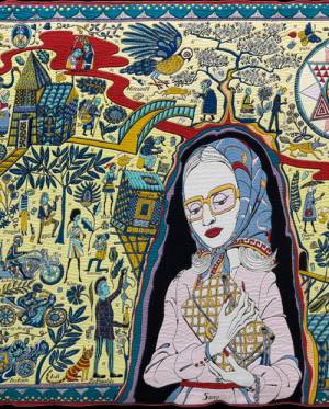 Grayson Perry: The Walthamstow Tapestry
 Grayson Perry: Visual Dialogues
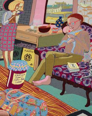 Grayson Perry. The Vanity of Small Differences
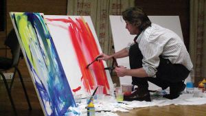 Mark Rowan-Hull: Seeing Music, Hearing Colour
 Victor Majzner, Painting the Torah, 2008