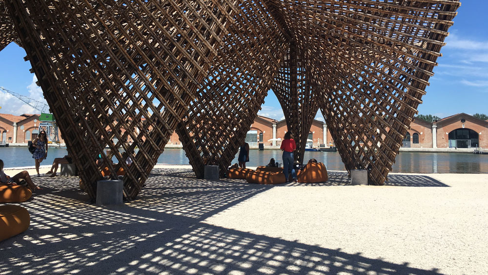
VTN Architects. Photograph: Veronica Simpson.
Venice, Italy
26 May – 25 November 2018
by VERONICA SIMPSON
With high hopes and the best of intentions, Shelley McNamara and Yvonne Farrell, the founding directors of Grafton Architects in Dublin, announced their theme as curators for this year’s Venice Architecture Biennale: freespace. In short, they wanted their 71 participating architecture studios and those working for the 63 national pavilions to interrogate the ways in which architecture can be more generous, more inclusive, more engaged with the city and the people around it; exploring how even private institutions can deploy their buildings to be more public-facing and interactive.
A manifesto accompanies this year’s iteration, rich in poetic language and aspirational rhetoric, such as: “Freespace describes a generosity of spirit and a sense of humanity at the core of architecture’s agenda, focusing on the quality of space itself.” Participating projects were asked to consider not just people, but nature – the best, most considerate use of our natural resources, from sunlight and moonlight to materials – as well as our engagement with the landscape itself. “The Earth as client” was a major consideration.
Against the backdrop of these heady challenges, have their participants delivered?
By luck, I started my investigations this year in the Arsenale’s Corderie - the vast disused rope factory along the northern edge of the city’s former naval quarter. It is here that variations on McNamara and Farrell’s chosen biennale theme are most vividly and lucidly expounded, thanks to the presence of almost exclusively invited participants – the 71 practices whose work and ethos the curators felt chimed most loudly with this year’s brief. There is, as one would hope, a fascinating mixture of famous names and new discoveries, and a multitude of exciting schemes to investigate. Every one is worthy of closer examination, although only a handful manage to combine exciting content with an exhibition design that communicates their worth effectively.
Indian practice Case Design brings the materials and the spirit of their new school campus for the Avasara Academy in Pune into the building. A fascinating example of accessible and resourceful design, the school is constructed on a concrete frame, but a simple porous lattice of bamboo along its exterior captures breezes and dilutes the heat of the sun. It involved a strong participatory approach, included sourcing ceramic floor tiles from the surrounding villages, each of which has a particular tone in its clay, so that all the pupils can recognise elements from their village as they walk around the buildings.
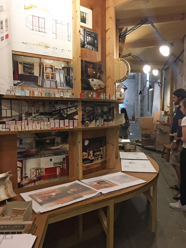
Flores & Prats. Photograph: Veronica Simpson.
Barcelona-based Ricardo Flores and Eva Prats, of Flores & Prats, had seemingly brought with them a section of a restored workers’ co-op from the Catalan capital – their stand looked from the hallway like a sculptural piece of public seating with a raised walkway, but revealed itself to be a physical echo of their new Sala Beckett theatre. A riotous, workshop-style presentation, rich in detail and character, with exuberant working models and films, revealed how the practice has re-used elements from the original, derelict structure, to create a new community space and theatre.
But it doesn’t take large structures or complex models to convey information well. Elemental, the practice run by the curator of the 2016 architecture biennale, the Pritzker Prize-winning Alejandro Aravena, articulated its chosen projects with great clarity and the minimum of fuss and cost, using chalk, string, handwritten notes on paper and small smartphone screens playing informative videos, against a simple grey wall.
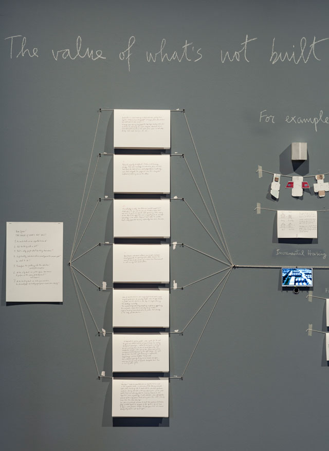
Elemental. The Value of What’s Not Built. Photograph courtesy: La Biennale di Venezia.
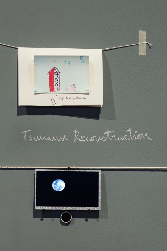
Elemental. The Value of What’s Not Built (detail). Photograph courtesy: La Biennale di Venezia.
Called The Value of What’s Not Built, one of the most innovative ideas was “half house”: given only half the funding they needed, by the Chilean government, to construct some workers’ houses, they built the basic framework for whole houses, then as much of the external envelopes as they could to provide shelter while allowing people to improvise the rest from scavenged materials.
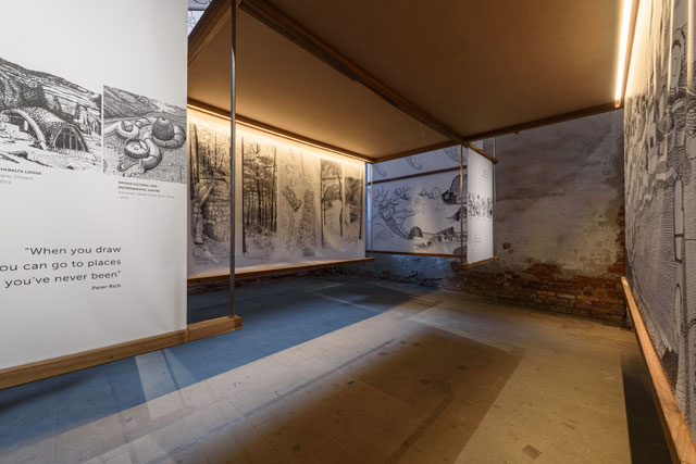
Peter Rich. Photograph courtesy: La Biennale di Venezia.
South African landscape architect Peter Rich has long worked with different indigenous peoples to help realise structures that express sensitivity to their specific aesthetics, cultures and materials. His projects were presented most simply and effectively with drawings in the form of hanging banners around a simple frame, which invited closer inspection.
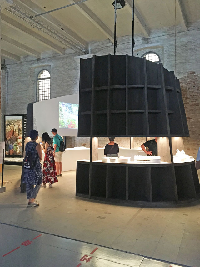
Weiss/Manfredi. Lines of Movement. Photograph: Veronica Simpson.
New York practice Weiss/Manfredi’s Lines of Movement was also an inviting enclosure: a curving horseshoe painted black on the outside, white inside, with small, white models of projects – both its and others it admires - with lines of greenery traced into their white contours, to describe the way movement and landscaping draw people through the site.
Canada-born, UK-based architect Alison Brooks came up with ReCasting, one of the most enjoyable sculptural but educational interrogations. She designed structures created from wood, which explore elements from her own housing projects: a vaulted threshold, a cloistered passage and a canted roofspace. Uplifting and intriguing, this presentation demonstrates how the simplest forms and materials can enhance everyday life.
There are global-status practices here that one feels could have tried harder: much as I admire Diller Scofidio + Renfro of New York, and agree that the educational building it shows here – the Roy and Diana Vagelos Education Center, part of Columbia University’s Medical Center - is extraordinary, I found the films of staged interactions, intended to show how different users occupy the building, a little cheesy. And I would question the relevance to this Freespace fiesta of an expensive, elitist institution that only staff and high fee-paying students can access.
I was also initially unimpressed by Rafael Moneo’s contribution: it appeared to be nothing more than a solid bench in front of a large graphic panel with a photo of his Murcia town hall on one side, a chunk of text on the other, and a plan on the floor. When you look closely at this plan, however, and the way it is shaded, it reveals all the freespace this building “activates” though its positioning and sightlines.
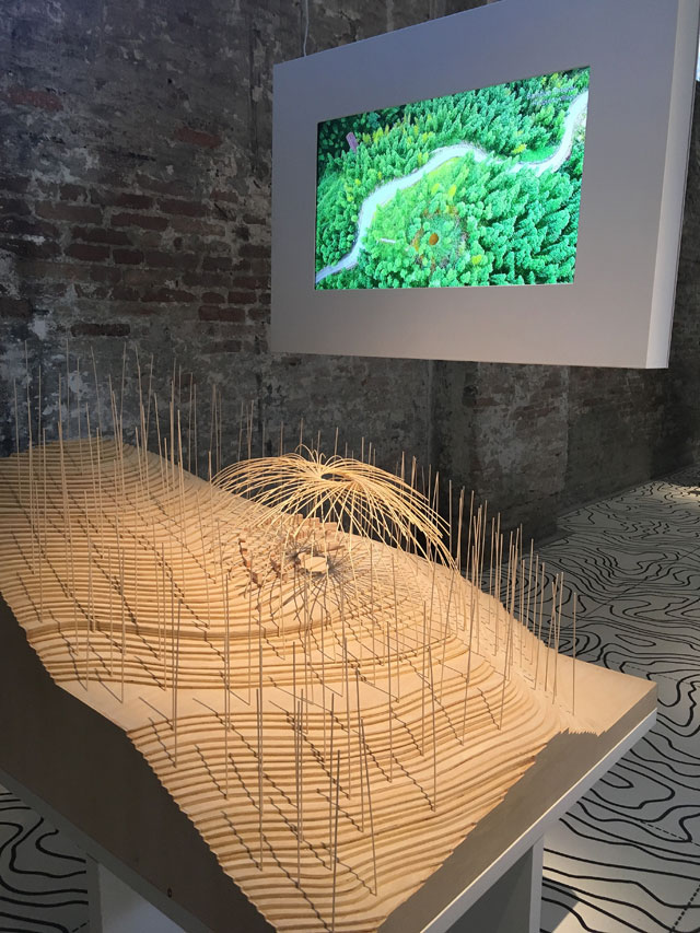
DnA. Photograph: Veronica Simpson.
One of the most engaging demonstrations in the show came from Chinese practice DnA – demonstrating, perhaps, what can be achieved when ambition and budgets are high. It placed large, wooden models at chest height – an optimal level and scale for understanding the project in its setting – and choreographed these models perfectly with educational films, to reveal how its buildings and landscaping are helping to enhance an appreciation of the Chinese countryside for the nation’s rapidly urbanising population. One was a hydraulic national park – civic infrastructure that has been turned into a place for leisure, exploration and science, with buildings for research and teaching. Another scheme showed an elegant, umbrella-like bamboo theatre, constructed in a village using materials and techniques that the villagers understand and have easy access to, so that they now have the tools to create such structures for themselves.
McNamara and Farrell took pains to ensure that the exhibition’s staging also reveals the beauty of the Corderie itself – a 317-metre-long brick shed that they stripped out, exposing all its elegant arched windows, so that it could truly be what Farrell has dubbed “a vessel of light”. And it is shown off to best advantage when there is a break between oversized, sculptural or text/image-filled display panels or densely clustered models. Álvaro Siza offers one inspiring moment of pause with a simple curving stone bench, placed in dialogue with a sculptural oblong that captures and casts intriguing shadows from the sun that streams through the window above; another curved screen opposite the seat provides privacy from the hall. Belgian architect Marie-José Van Hee creates another moment of pause with the simplest of displays: two large, beautifully printed book of words, photographs and drawings, placed either side of a freestanding lectern, offering us some beautifully curated visual meditations on space and place. The only other elements are a lamp to see by, two low benches nearby to sit on, and a couple of paintings placed near one of the Corderie’s elegant windows.
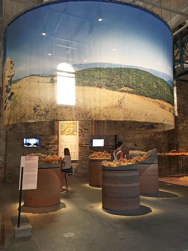
Gumuchdjian Architects. Tread Lightly. Photograph: Veronica Simpson.
Tread Lightly by Gumuchdjian Architects is what it calls “a linear festival along the Transcaucasian Trail”, an exciting re-envisioning of how architecture can help to activate nature as freespace, with a proposed 750km trail from the north to the South of Armenia (in the hope of generating sustainable tourism for isolated communities). The architects are catalysing support for this 10-year project by visualising a sequence of structures for shelter and respite – or bridges - that sit gently in the landscape. Exquisite, gem-like models perched in wire landscapes, the whole shrouded in an elegant printed voile.
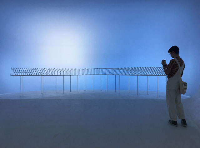
Dorte Mandrup. Conditions. Photograph: Veronica Simpson.
Like Tread Lightly, many projects focus on the rustic rather than the urban – or even landscapes at the outer extremes of weather and climate. For example, the Conditions exhibit by Danish architects Dorte Mandrup, about the Icefjord Centre, Ilulissat, Greenland, proposes an elevated, elongated social space for local inuit inhabitants and visitors. Set in the harshest environment on the west coast of Greenland, it combines extreme durability and robustness with enchanting lightness, as its model demonstrates.
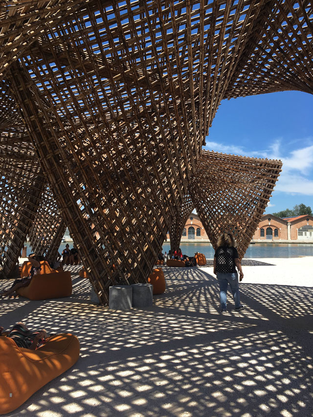
VTN Architects. Photograph: Veronica Simpson.
In contrast to this project’s icy stage setting, you emerge from the Corderie into the intense heat of a Venetian summer, but genuine respite is at hand, in the form of Vietnam’s VTN Architects’ elegant pavilion made of bamboo, a material that cropped up again in the Chinese pavilion, at the top of the site, co-located with the Italian. Both of these countries’ exhibitions meditated on various methods of reclaiming interest in, and engagement with, the countryside, although the Chinese effort seemed intent mainly on promoting its bamboo production industry.
That temptation for national pavilions to prioritise opportunities for commerce or self-aggrandisement, rather than follow the curators’ script, is a perennial problem with vast, globally important exhibitions like this, but was particularly evident in the Giardini. Here, for example, Canada focused on the, admittedly impressive, quality of its own pavilion’s refurbishment, while Russia trumpeted the achievements of its vast railway network.
Britain (a joint initiative between architects Caruso St John and artist Marcus Taylor) stepped well away from that hazard, to offer an empty pavilion with scaffolding around its walls, and a temporary roof terrace newly constructed on top, where free verbena tea is served at 4pm – most welcome on a sweltering July day. Grafton architects like to quote their curatorial predecessor, Aravena, in saying they want to “make as much nothing as possible” - and certainly the British contribution encapsulates that perfectly.
Germany went the other way and, for me, scores top points for content as well as concept. Curated by GRAFT and Marianne Birthler, Unbuilding Walls marks 28 years since the reunification of Germany (a year after fall of the Berlin wall), examining its own attempts, post re-unification, to heal the wounds of partition. That could come across as self-congratulatory, but somehow doesn’t, partly thanks to a gallery of video interviews with people from other parts of the world - Spain, Belfast, Israel, Cyprus and Mexico - about their experiences of borders. The presentation itself comprises a sequence of big black wall sections that part as you move through the space to reveal the content behind them. Projects showcased include the Iron Curtain Trail – a cycle trail from the Barents Sea on the Norwegian-Russian border to the shores of the Black Sea in Bulgaria – a journey of 10,000 km through 20 countries previously divided, 14 of which are now EU member states. There are also admissions of wounds that have not yet healed – villages along large stretches of the former wall that have remained empty since people were forcibly removed from them.
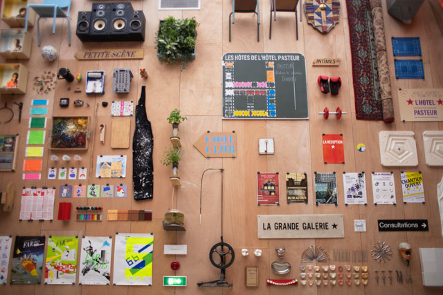
France. Photograph courtesy: La Biennale di Venezia.
France also rose to the challenge with an exhibition that centres around a hall with all the components for possible community centres pinned to its walls - from wheelbarrows to chandeliers, a truly eclectic pick and mix. Below these are genuine, community-led projects from the last 10 years revealed in plywood models along a plywood shelf.
Switzerland walked off with the Golden Lion this year, for its labyrinthine pavilion. Created by a group of young architects from Zurich’s groundbreaking ETH architecture course, it is called House Tour, and lures visitors down an Alice in Wonderland-esque “rabbit hole” to experience a sequence of seemingly bland rental home spaces that offer disconcerting switches of scale. The architects state that the intention of their house tour is to offer you “an exaggerated architectural sensibility through which you see the peculiarities of your own home from the perspective of an outsider”.
The central pavilion in the Giardini is something of a mixed bag. There must be huge difficulty for the curators in policing or anticipating what their contributors will ultimately provide, or how well it will communicate off the page. But Grafton took pains with this building, too, to strip out the sense of hierarchy that apparently dictates this building’s usage for the art biennale: usually the most “important” artists are placed at the centre, with the importance diminishing as one reaches the perimeter. They tried to make this space as inviting as possible, even exposing one of Carlo Scarpa’s early interventions in the building – a gorgeous window framed with two interlocking circles.
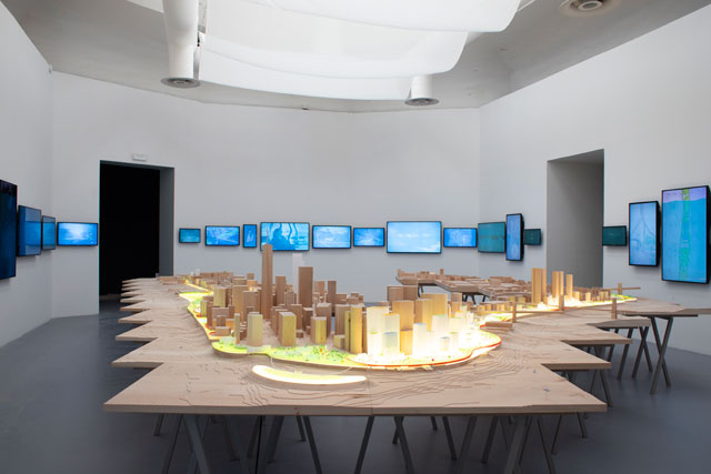
Bjarke Ingels Group. Photograph courtesy: La Biennale di Venezia.
One of the highlights is definitely Bjarke Ingels Group’s exposition of its floodwater resistance project proposed for New York, which evokes both the scale and the nuance of this project - placing a series of parks and mobile flood barriers around the edge of Manhattan – with an enormous model and multiple screens showing interviews with the community who will (let’s hope) be crucial in making this happen.
Close Encounters, an intriguing display curated by McNamara and Farrell, is also highly engaging: they invited other Irish practices they admire to respond to buildings that are acknowledged treasures. The corresponding sculptures are fascinating. On the mezzanine area beyond this, for those whose energy and commitment to engage with lots of text, plans or drawings is waning, there is a display of models of unbuilt projects from the Swiss architect Peter Zumthor.
Although this biennale has been deemed one of the most successful in expressing what is most fascinating – as well as problematic – about architecture as it is practised today, there are still perhaps too many exhibits that rely on two-dimensional material – the aforementioned texts, plans and drawings – to describe in detail what most non-architects will lack the patience to interrogate. Even to those who can read a plan, entering a room filled with plans and drawings is something of a turn-off (especially if it’s the 20th such room you have encountered in the day).
For which reason, it was a pleasure to come to the Vatican Pavilion – the Holy See’s first outing for the Architecture Biennale. Set in the gardens behind Palladio’s San Giorgio Maggiore church, just off the island of Giudecca, it features simple places of worship commissioned from nearly a dozen leading architects.
Francesco Magnani and Traudy Pelzel’s Asplund Pavilion, built by Alpi, was an exquisite alpine chapel, while Eduardo Souto de Moura’s structure comprising great monolithic blocks of stone feels more like a mausoleum.
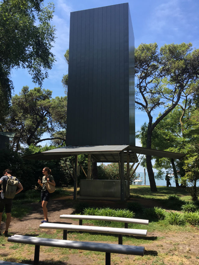
Sean Godsell. Exterior. Photograph: Veronica Simpson.
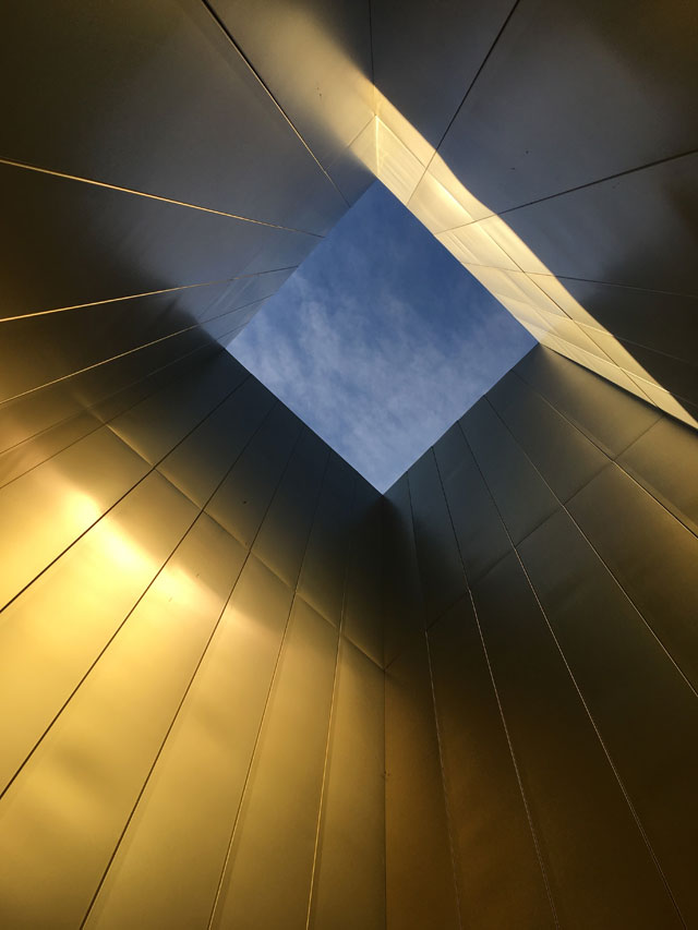
Sean Godsell. Tower interior. Photograph: Veronica Simpson.
Other highlights are: Sean Godsell’s articulated chapel structure (a simple metal tower, with skirts that lift to reveal an altar and the tower’s gold-lined interior), and Flores and Prats adobe-like friendly little open-air structure.
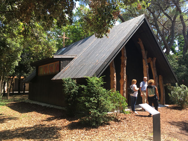
Teronobu Fujimori. Exterior. Photograph: Veronica Simpson.
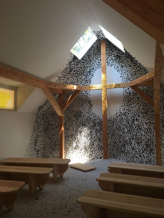
Teronobu Fujimori. Interior. Photograph: Veronica Simpson.
But Teronobu Fujimori’s simple wooden hut was most moving of all: It looked from the outside like a neat but basic mountain chalet, but inside, the placement of windows, the channelling of light and shade on to a central crossed wooden beam adorned with shaved gold elements and mysterious black ceramic pellets scattered around it, absolutely articulated the power of architecture at its best: the skilful combination of form, material and light to achieve mysterious, but – dare I say it, divine - results.