


Courtauld Gallery, London
17 September 2015 – 17 January 2016
by EMILY SPICER
Colour shifts; it is not stable or constant. Artists have known this for hundreds of years. Michelangelo knew it when he painted the Doni Tondo, Turner knew it when he painted his landscapes, and the impressionists put this knowledge to work with great effect. They all knew that placing a colour next to its complementary would heighten it. Put it next to black and it will look darker, put a white border around it and it will suddenly look lighter. Much of how we view colour happens not on the canvas or the page, but in our minds, which are hardwired to see the world in a particular way. In other words, our perception of colour is relative and, by knowing which colours to place where, an artist can soften edges, make the picture plane recede and even make an image appear to move.
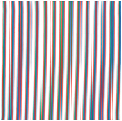
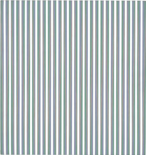
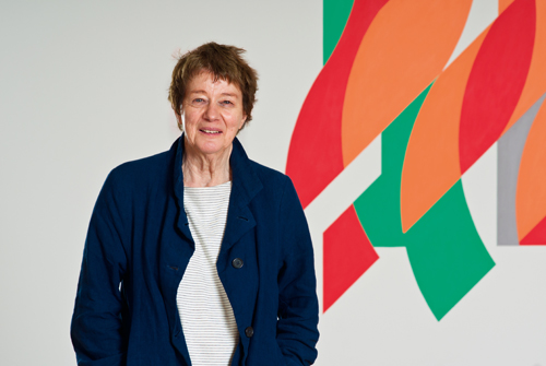
The mutability of colour and tone has been a cornerstone in the work of Bridget Riley (b1931) since she left art school in the late 50s. And, as Bridget Riley: Learning From Seurat demonstrates, this is all thanks to a single artist. Georges Seurat died aged 31, but in his short life started a movement that, although brief, would have a profound effect on modern painting. Chromo-luminarisme as Seurat called it, or pointillism, as we know it today, applied colour theory in a very methodical way – what he called “ma méthode”. Using dots of pure colour, the artist built an image by relying on the eye’s ability to mix, for example, red and blue to produce purple. He knew, too, that the juxtaposition of colours is key to how they are perceived.
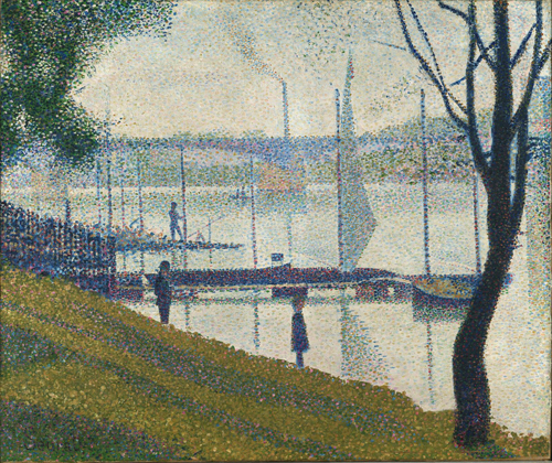
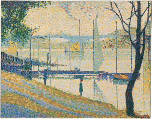
On leaving art school, Riley was at somewhat of a loss. She had had an academic training in drawing, but felt that she knew nothing about colour. Until, that is, she discovered Seurat, and in particular The Bridge at Courbevoie (1886-87). Copying this single painting provided Riley with “a true masterclass … the best tutorial I ever had”. Her version of The Bridge at Courbevoie still hangs in her studio, all these years later, which she says, “tells you all you need to know about my feelings for Georges Seurat”. Riley wants it made clear, however, that hers is not a faithful copy, rather more of a transcription, a way of getting a handle on Seurat’s method.
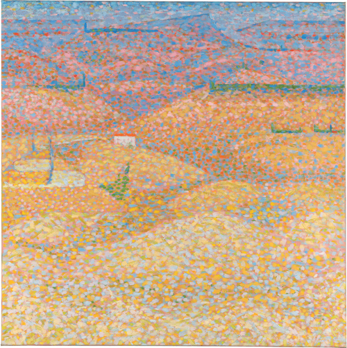
Curators Karen Serres and Barnaby Wright have respected Riley’s nervousness about displaying the two paintings side-by-side. In an attempt to stop visitors from drawing direct comparisons, a door separates the two versions. Another of Riley’s experiments with pointillism hangs on an opposite wall. Pink Landscape (1960), a painting inspired by the Italian countryside, is an experiment in pinks and blues. Riley is testing the relationships between the colours, a process that would become the one of the chief preoccupations in her striped canvases.
For anyone who knows Riley’s work, this initial foray into pointillism might come as a surprise. But Serres urges us to think of Riley’s stripes as elongated dots, like Seurat’s points of colour stretched across the surface of the canvas. In this way, Riley is taking the most fundamental principals of Seurat’s experiments with colour and distilling them, removing all figuration, while retaining the “conversations” between the colours.
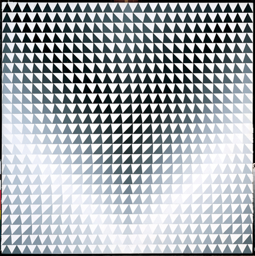
Tone, too plays a huge role in both Seurat’s and Riley’s work. Seurat doggedly pursued contrasts, outlining dark figures with light halos and picking out light figures with darker shadows. Riley, too, plays with tones and contrasts, but the result it very different. While Seurat’s paintings are rigid, with stiff doll-like figures and static landscapes, Riley’s geometric paintings are surprising fluid. Her stripes appear to ripple and undulate, to the point of disorientating the viewer, and shapes seem to stand proud of the canvas’s surface. Tremor (1962) is a perfect example of this. More so than Riley’s pointillist experiments with landscapes, Tremor produces the illusion of three-dimensional landscape. Mountain peaks rise up as though we are viewing them face on and from the air simultaneously. This is achieved with rows and rows of varied triangles, some with convex edges, others with concave edges, all coming together to give the illusion of shifting light and dark.
It is sometimes easy to forget that Riley’s works are paintings at all, but they are much more painterly than they first appear. Although she doesn’t execute the large canvases herself, she will spend a great deal of time experimenting and improvising the compositions, altering works that fall short of the desired result. The scale of Riley’s paintings is an important reason for this. The illusionary effect works best on large canvases viewed from a distance of several feet. The same, of course, can be said for Seurat’s works.
Seurat has remained a touchstone for Riley throughout her career. When confronted with a problem in her painting she returns to his work for answers. Would the art of Riley, as we know it, exist without Seurat? Serres thinks not. “She has said so herself. She was completely stuck when she left art school. She just couldn’t find her own voice. Seurat is where she learned about colour, and making marks on a canvas.” In highlighting the link between Seurat and Riley, this small exhibition (there are only seven works displayed in a single room) encourages us to look at both artists more carefully. If you are planning to visit the Courtauld Gallery, it is worthwhile spending some time with this display before walking the short distance to pay a visit to Seurat’s small oil sketches in the permanent collection, just a couple of rooms away.
Click on the pictures below to enlarge

Copyright © 1893–2026 Studio International Foundation.
The title Studio International is the property of the Studio International Foundation and, together with the content, are bound by copyright. All rights reserved.


-18-300.jpg)

 Concentric circles: Wojciech Fangor and Peter Sedgely
 The British Line: Group Show
![Moses Harris. The Natural System of Colours Wherein is displayed the regular and beautiful Order and Arrangement, Arising from the Three Premitives [sic], Red, Blue and Yellow, The manner in which each colour is formed, and its Composition, 1769/1776. Royal Academy of Arts, London.](/images/articles/m/making-colour-2014/smallpix/X8384-300.jpg) Making Colour
Making Colour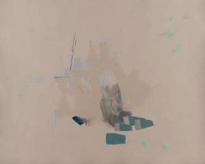 Project Space: Inverted House – Tina Gverović and Siniša Ilić
 David Whitaker Retrospective Part II: Waters of the Nile