


by Andrew Causey
Studio International – April 1972, Volume 182 Number 943
The intention here is to elucidate Rothko's achievement in terms of the paintings themselves. The danger of the literary approach to Rothko is not that it necessarily mistakes his intentions, but that it diverts attention from the primary expression of his intelligence, his paintings.
From 1950 all Rothko's painting, with the exception of the pictures connected with the Seagram mural commission of 1958, and the last so-called black and grey paintings of 1969—70, observes a similar format. A part of Rothko's purpose seems to have been to make his authorship immediately recognizable. Typically, rectangles of colour, more or less regular in shape, exist within areas of ground colour. Their sides generally extend fairly close to the edge of the canvas, leaving a margin of ground colour on either side. The height of the rectangles and their internal relationships vary considerably from painting to painting, but their symmetry is almost invariable. Rothko avoids the use of shapes that would surprise by their irregularity or unusual positioning, and does not draw attention to the edge of the canvas, as he would if he allowed any of the internal colour shapes to break their symmetry in a single place and spread to the edge of the picture. Rothko's minimal involvement with shape, and particularly his avoidance of any obliqueness in the placing of the shapes, means that his pictures relate very directly to the spectator. They answer back in the way Piero della Francesca's Baptism or Resurrection do, because of the frontality of the figure of Christ. That is not to say that in either artist's work immediate contact leads more quickly to fuller revelation. The creation of this kind of response is the artist's method of holding the spectator's attention, of drawing him into the picture and inviting him to consider it in detail.
Rothko is not, in general, involved with shape for its own sake, nor is he primarily concerned with line, nor at all with perspective. He does not want formal innovation in his pictures to be seen as something important in itself. Against this negative summary of characteristics can be put his positive concern with gradation of colour and tone, interest in texture and often brushwork, and in the formation of local variations of space. All these concerns relate to the detail of the pictures. Rothko himself described his purpose as ‘the simple expression of the complex thought’. Simplicity of expression is indeed evident in the layout of the paintings, but his complexity of thought has a counterpart in the complexity of detail in the pictures. The simple format, the self-enforced limitation in Rothko's pictorial language, is one of the main sources of his freedom. His basic form is severe, and as soon as one becomes familiar with his art, expected. It is an undistracting framework within which problems of light and colour are resolved.
The Hayward exhibition opened at the point (1948) when Rothko was still engaged in pulverizing recognizable objects. It was a weak starting point; the 1948 paintings are difficult to look at, indecisive and amorphous, and very much part of the conscious search for an alternative to semi-abstract Surrealism. It would have been wiser to have started earlier, or slightly later with the breakthrough to unequivocal abstraction. In the 1948 paintings Rothko experiments with many different colouristic and textural arrangements within each picture, thin paint against thick, luminous against dense, all with a very loose sense of how to use the boundaries of the canvas as a form of control. Rothko said of his paintings in 1947 that ‘they have no direct association with any particular visible experience, but in them one recognizes the principle and passion of organisms. One certainly does recognize this principle in them, and it is precisely the organisms’ independence of the artist's intelligence and will that mars their impact.
Recalling in these terms the magnificent No 20, 1950 (the earliest painting with a ‘typical’ format in the exhibition), one can see how Rothko resolved the threat of possible anarchy. It is still an organic painting, involving movement and development in detail, though a more controlled form than previously. There is also an authoritarian framework of rectangles against ground colour of the kind already described. The painting's dimension (116 x 102 inches, roughly twice the size of the earlier pictures) gives it a natural authority, as does its simplicity. The layout is easily understood, particularly the strongest colour, a band of crimson, divides the height of the canvas in the proportion of the golden section, and the basic colour design is straightforward: pink is introduced with increasing intensity into the blocks of white in the upper half of the picture as they descend towards the crimson, and below a rectangle of lime green rests on the overall yellow ground. Change of tone and colour, which in the earlier pictures had been sudden and unpredictable, here becomes gradual, so that emphasis is switched from novelty within the picture to continuity. The new control of gradation reduces a shout to a whisper, and when Rothko remarked that ‘silence is so accurate’, he pinpointed the new exactness that his painting acquired by the elimination of sudden contrasts and oppositions.
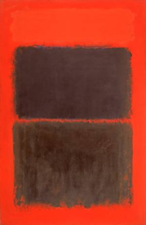
The colours of No 20, 1950 give it a steady, luminous quality. Not all the 1950s paintings in the Hayward had a comparably silent character. In White, Red on Yellow of 1958, another yellow-ground painting, Rothko chose a much harder and denser yellow, and arranged on it two blocks of colour, smaller than customary in proportion to the ground colour, and even more than usually symmetrical in their placing. The lower, red, block is uncharacteristically dense and flat, but the lack of activity within the colour is partly compensated for by the liberty with which the red brushmarks are allowed to spread over the yellow. By contrast, the higher, white, block is laid on very thinly over a brownish ground with brushmarks very much in evidence; but, unlike the red, the white is not allowed to spill over into the yellow. The painting is built out of contrasts, both of actual colour, and of the way the colours are handled.
In a sense this kind of treatment refers back to the sort of contrasts set up in the 1948 paintings, even if here they are carried out with much greater sureness. In the following ten years, to 1968, Rothko narrowed his field of activity, so that smaller nuances of colour and tone are loaded with greater meaning. Contrast is largely replaced as a principle by gradation.
A landmark in the change was the Seagram murals commission which Rothko received in 1958, and which occupied him till 1960. He rejected his traditional format for the murals, opening, as it were, the central rectangles so that either one or two separate areas of the ground colour appear in the centre of the painting. A significant effect of this development was, as Clement Greenberg pointed out, to increase greatly the effect of drawing within the picture. The murals seem closer to figuration than anything else Rothko made after the late 1940s, as if they contained images of doors, gates or thresholds of some kind. This may partly be because of the large amount of drawn edge, drawing being the basis of representational art in the western tradition. It may also be connected with the pattern of the colouring, the plum ground colour alternating across the picture with the orange-red of the ‘doors’. The effect is to make one read the surface of the picture as a sequence, instead of, as usually with Rothko, taking the whole picture in at once; this adduces a literary interpretation. Seen as gates or doors, the shapes favour the tragic, Orphic, explanation that Rothko's paintings in general are often given. One could imagine, in particular, that the fiery red of the gates signifies the artist's daring in passing through, and the mute light-absorbent plum colour was an equivalent for Hades. But though Rothko was fascinated by tragedy, there is no evidence that at this time his mind worked through the figurative images of ancient myth. At best one can be reasonably certain that, in reading the pictures figuratively, one id identifying correctly their implications, even if in doing so one is reverting to the use of images after the artist had commanded them to be pulverized. The issue is not entirely confined to the Seagram murals because, though Rothko stopped using their format, he continued with their colours.
The importance of red for Rothko in the 1960s may have been connected with its flexibility, its ability to appear thrusting and fiery or sombre and melancholy. This contrast is felt in the Seagram murals, and though sombre colouring tends to dominate in the later paintings, one picture at the Hayward, Reds and Violet over Red of 1959, was almost entirely warm and expansive in character. Reds played a major role in all but one of the paintings in the Hayward between 1959 and 1968. To judge by the exhibition, his late paintings were much less varied in their colouring, and, in particular, the yellows which were common in the 1950s disappeared. Rothko liked to deny that he was a colourist, and the significance of the later pictures may be as much in the closeness of their colours and tones as in what the colours actually were. It is attractive, and perhaps partly true, to think of the earlier light-exuding pictures like No. 20, 1950 as optimistic, and the dark 1960s paintings as pessimistic, but the problem is certainly more complicated, as a dark red can be just as stimulating as a luminous yellow.
In Black on Deep Purple of 1964 an impenetrable black central section is surrounded by a dark purple ground area of thin paint textured surface. Differences of colour are minimal and yet quite unmistakable. In narrowing his field of activity so much Rothko rejects the blunt contrasts of pictures like the 1958 White, Red on Yellow which must have seemed to him by the 1960s to be too direct, noisy and approximate, compared with the accuracy of the later paintings. His silence is a kind of stealth by which he takes and holds one's attention with a minimum of gesture, and carries one gently into the excitement of his darkness. The authority of the format combined with the soft spread of colour across the surface calls us to participate in the steady process of his activity. The restricted colour does not prejudice the sense of change and development that existed in the earlier paintings, but it does resolve that struggle of opposites that existed in the pictures based on obvious contrasts. De Chirico, whom Rothko admired, was excited by the process of darkening, and described it figuratively in terms of dusk and lengthening shadows. Like Rothko, he felt that a kind of silence was the prerequisite of creativity. With neither painter does one feel that the process of darkening is so much something final as part of a cycle of continuous change.
In his final black and grey paintings Rothko significantly altered his format. The canvases are divided horizontally close to, or rather above, the centre, to form two negatively coloured blocks, dark brown or black above and grey or buff below. The edges of the canvas are primed white and taped during painting to make narrow hard-edged white frames round the finished picture. This distinctive treatment of the edge gives the pictures a new rigidity and fixedness. For the first time since 1950 the edge is more than something that is inevitably there; its hard immutable whiteness defines positively the internal area of activity. The division of each canvas into two reduces the field of interaction between the two areas to the single horizontal line. Implicit in Rothko's idea that his paintings possess ‘the principle and passion of organisms’ is the continuity of movement and development across the surface of the picture. In the last pictures the potential areas for this activity are vastly reduced. It is not only the reduction of colour edges where the exchanges between colours make these movements most potent; now the colour itself is negative, and the blacks and greys contain little detailed variation. Also, the placing of a single dark area over a single lighter one introduces a duality into the painting, an opposition that seems insoluble because activity within the picture is so limited. In a sense the principle of contrast, which Rothko had eliminated in the 1960s, is reintroduced. But it is not the active, positive contrast of colour and colour usage in White, Red on Yellow of 1958. Because of the internal division of the last paintings into two, it is both negative and implacable. The darkness of Rothko's pictures in the 1960s up to 1968 is exciting and expectant of further development. But it leads in the final paintings only to an equilibrium that is cold and despairing.

Copyright © 1893–2026 Studio International Foundation.
The title Studio International is the property of the Studio International Foundation and, together with the content, are bound by copyright. All rights reserved.

-300.jpg)
-18-300.jpg)
-Tate-(Larina-Fernandes)-(12-1000)-300.jpg)
-300.jpg)
 Rothko in Britain
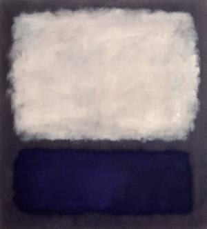 Mark Rothko: The Retrospective
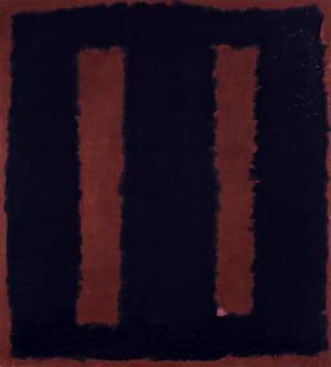 Mark Rothko: the 'end of philosophy, the beginning of art'