


Studio International, December 1965, No. 872
Q: What do you feel about the idea of a single image in sculpture, for example, as in Giacometti? The single image approach (very central to many American painters for example, Rothko, Newman, Stella, Noland, Reinhart, Albers, Gottlieb to name a few) seems very foreign to all of the Whitechapel group of sculptors-is there any real reason for this?
KING: I am not interested in working in series because to me a series implies a directed effort in only one direction, with the result that one's work is bound to reach a point of greater achievement at some time-this point I want to achieve as soon as possible.
When I see the way ahead I have already been there. To work on variations would seem like a betrayal of the original. Most of the time I am in a state of utter confusion as to what I want to do next, in spite of the fact that the same aesthetic concerns will be there, reviewed and redefined all the time, or recreated into new relationships. Many one image artists (according to your definition) have reduced the formal inventive process deliberately holding certain values above all else. In the post-abstract expressionists, colour becomes the direct spokesman for feeling. Decisions about shape are presuggested by given limits and the method of working. Those pop artists are most admired who recreate the urban imagery without change, the meaning of the art lies in the act of transposing.
Qualitative thinking
The terms of thinking I use in my work are never terribly defined. Feeling, colour, surface, space, volume, contour, are terms I tend to use but their boundaries remain blurred and their values are relative.
I like to think of them in qualitative terms. At the back of my mind the idea that these terms are only adopted for convenience never leaves me, this allows me greater freedom of movement in dealing with them.
If making art is involved with making decisions about shapes and interpreting relationships of these decisions, then to my mind they must open out in the end into a meaningful order.
Thoughts about meaning of shape and colour, in the most general sense, thoughts about formal relationships, etc., are ideas that form the basis of one's aesthetic attitude, but which cannot help being expressed in the manufactured object in particular terms. They reflect only indirectly the general concepts through 'particularness' (Mondrian was very conscious of the problem). Perhaps the very nature of being means 'particularness.' Similarly (for me) the general characteristics that apply to .imagery, the relations between form and emotions, must in the object find a particular expression. So one moves from the general to the particular and back to the general, in both form and content.
Elements of the particular
The preconceived idea for a work of mine already contains elements of the particular, so the process of actualizing is straightforward, decisions about proportion and position that occur during the making are secondary. I don't have to be involved at a fundamental level with deciding whether something should be half an inch more this way or that way. Sometimes however the idea may undergo a change in the making but it generally turns out to be a considerable one, changing the meaning of the sculpture.
Q: Are you concerned with material as a thing in itself? What influence has material on your shapes?
KING: I would say matter rather than material. By that I mean I am much more concerned with the general properties of materials than with individual differences. I tend to impose the properties of materials on my shape, changing them at will, rather than uncovering them in their particular form. In the same sculpture the materials will change from having the appearance of fluid softness to brittleness, sometimes owing to the fact that the shape imposes character on the material, sometimes conversely a formal problem may be inspired by some physical property of a material, for instance, when a crinkly thin form has been inspired by the properties of materials like paper, but would in the end be made in a rigid material like resin. Other instances would be in splitting, unfolding, etc.
The limits of matter
I do not wish to draw benefit from the heroic struggle of man versus material (even though it is a bloody battle) in which sculpture has so long been trapped. Hence the freedom of approach to materials, but I do want to be aware of the limits that matter is imposing on me. To use a collage technique or even weld an impossible joint would seem like cheating.
Much of the power of Brancusi comes from the simple constructional principles he uses, objects lying on top of each other in a believable balance. The struggle of matter towards expansion, movement and change is set against an awareness of the static controlling forces of inert matter. Hence the often recurring use of the cone as a very large, very much earth-bound shape that will provide maximum challenge in an effort towards expansion.
Q: Your pieces are basically symmetrical, but there seem to be deliberate discrepancies which appear to be carefully balanced. In other words, you seem to be concerned with balance. Is this so, and why?
KING: I use symmetry because I do not hold particular value in asymmetry, like some artists have held. To adopt symmetry seems a natural part of the effort to arrive at the most direct expression of an idea. It is after all one of the simplest forms of order. I do not try to achieve a direct and ordered structure I value order, but to me order leads to structure and structure to character or expression (a need for expression is a first cause and not reason why I am an artist).
The conflicting forces in a work are created by a multitude of factors. To name one, the effort of the parts to retain their autonomy creates a balancing problem made all the more difficult because sculpture with a main front has optical forces operating as in painting. The same movement to the right or left will have different forces, all resulting in the discrepancies you mention. There is then a balancing problem of controlling local forces and interpreting them. Also an effort to assist these conflicting forces in order that the balance in the end will be al) the more evident.
Surface not texture
Q: Although there are many examples, take Giacometti as one extreme of the range and Brancusi as the other. Both have an extraordinary concern for surface. What is your concern in this direction?
KING: I would say surface as the outside of volume and not texture. Shape thought of in terms of volume and surface covers more ground and is more flexible than let us say thinking of it in terms of matter, quantity and quality, producing mass and volume.
In the first proposition surface becomes an aspect of volume or the outside of volume and takes on an identity of its own, outside the quality of volume, working with or against it, making a thin volume seem heavy or a large volume seem light.
I make my surface smooth because smoothness seems to express much better the variable quality of surface, texture would get in the way, being loaded with information about the history of the material and revealing all sorts of facts about how long it took to make the work, with what tool, etc.
Qualities of surfaces react with qualities of volume, outline, weight, space and especially colour (colour that is put onto shape as opposed to natural colour often has the appearance of a skin, this effect is particularly pronounced on textured surfaces, the smoother the surface the greater the integration between colour as skin and surface. (I shall expand on this more fully in another question on colour.)
The permanency of work
Q: Are you concerned with the permanency of your work? If so, to what extent? What makes you feel different from Caro, for example (who seems unconcerned with the permanence of his paint and colour) and why?
KING: This is a question of time and money. If I could have my work cast in a light stainless steel or aluminium I would do it and paint it afterwards. If I worried too much about permanency, I would take even longer than I do over each piece. I do my best in the present circumstances. An outdoor static life would preserve my sculptures indefinitely.
Q: Do you make editions of sculpture? If not, why not?
KING: I sometimes make editions up to a maximum of three depending on the ease of reproduction of the pieces. This is largely a matter of time. A large complex work would demand a lot of my time to be reproduced, even if I give the work to be done by someone else, and I would rather get on with new work.
Q: What process did you use in your latest pieces?
KING: In my last piece I have used polystyrene. A very light expanded foam plastic, that can be carved like butter and covered with a hard layer of resin and fibreglass after shaping. I also used wood then coloured the lot. The time before that I cast sheets of fibreglass and resin on the ground, on top of linoleum and then when they were not quite set (after gelling) I shaped them around particular forms and let them go hard. This method has its limitations, however, and could only work with very simple or large curves. Before that I made a shape in plaster, covered it in resin and fibreglass, smoothed the surfaces and broke the inside plaster.
Various influences
Q: Do you think many of the images used by you and your Whitechapel colleagues, in part or in whole, have been influenced, in one manner or another, by packaging, industrial or advertising design?
KING: Not consciously. I get as much of a kick going to Kew Gardens as I do going to London Airport. I am in sympathy with the new shapes of our urban environment and therefore must integrate them into my work somehow. (But then a visit to the National Gallery is even better for me.)
Use of colour
Q: What is your approach to the colour of your sculpture? (There are obviously two aspects (1) Your technical approach to colour, for example, do you paint on top of the finished work, bond it into the resin, do both, etc. (2) What is your philosophical approach to colour, for example in what way do you think colour extends the meaning of your work or do you use it purely decoratively? Or to deny form, or render it unstable, or ambiguous? If so, in what manner? Do you have difficulties in using certain colours within your material, why and so on?)
KING: I always paint on top of the finished work. The reason for this is that it is a much more flexible method of arriving at the right colour (I may change a colour 10 times or more in a single work). The range is wider and the colours are brighter. But the disadvantages are that the paint surface is vulnerable, and the paint can look like a skin rather than an integrated surface.
Sculptors in the past were little interested in using colour as they tended to emphasize the quality of the material. Surface texture portrayed the character of the material and the working tools of the artist rather like brushmark in a painting. To paint on top seemed to be giving a concealing skin to all this.
Removing texture and history
The answer to using colour for me, then, was to remove surface texture, work within a more neutral and smoother surface. Working in materials that had no history and were intractable like plastics helped. There was no temptation getting in the way. Smoother surfaces tend to fuse the colour into them rather than the colour staying on as skin. What interest existed in textural terms has been reinterpreted in only colour and space. For instance the mark of the hand giving an account of the artist's struggle with the matter, becomes a concern for shape evolving out of the working limits. Gravity, the ground, one's own physical make-up, such as one's reach, eyelevel, etc., are used as gauges. Unconscious decisions about size, distance from the ground and many others are related to physical and felt experiences. These decisions are still really about matter within the physical world of man. Colour and shape instead of material quality take over the task of deciding what weight a part may have. Colour then comes in to extend this dialogue not to reduce it. Its shininess or mattness will have different meaning according to different shapes. Colour sometimes can even stand for shape. Sometimes it may only emphasize or reduce it. It can give a volume greater or lesser mass, clarify shapes or confuse them. Colour comes in towards the end of making a work, but I feel it is subconsciously carried in one's mind throughout the working process, as stored up experience, and is a definite affecting force-(rather like it seems possible to model in clay and yet be aware of the looks of the work in bronze, and make decisions accordingly).
Colour also plays an important role in extending the symbolic meaning of the shapes and clarifying imagery. I find mauves difficult because they fade, and I have found difficulty in getting a matt paint that will not shine on rubbing.
Formalizing the idea
Q: Do you deliberately seek some kind of geobiomorphic form or imagery, some kind of a segmental view of nature or perhaps something similar. If so, what kind and why?
KING: I would say formal themes run through my mind for long periods at a time. In their general characteristics they relate to formal problems, but in the working out of an individual piece, associations to natural forms, phenomenal events or contemporary imagery do crop up, they remain of secondary importance and their main value lies in the fact that they help to formalize an idea which seems to exist in the mind mostly in term of feeling and shapes based around a formal event For instance, when I made Genghis Khan I did not think of mountains and clouds, but the idea was based around a bursting event using flowing forms, bounded in by side walls and the ground.
Associations tend to be more about general human symbolic gestures or phenomenal events than about particular objects. As far as a segmental view of nature is concerned. The fact that the total unity is so evident in my work would perhaps make the parts seem like segments of the whole. I am concerned however with giving the parts an individual character. The changes and variations of these parts are made through simple directions like distance from ground, or away from the centre, or directions to the right or the left from a frontal position, positions of parts in the zones of verticality, horizontality or obliqueness. A parallel in nature would be the refraction of an object between air and water. Shape changes as a new zone is entered.
Q: Some writers have connected your work with surrealism. (There are obviously many different aspects: a lot depends on what they mean by surrealism). Do you have any particular view? If so, what?
KING: I would say that one could count on the fingers of one hand the artists of the 20th century that could be said not to have some sort of connection with surrealism, in its broadest sense. I don't think I am amongst those few.
The known size of objects
Q: What does scale mean to you? Do you deliberately distort the size of familiar forms? Is the size of your image critical in anyway? How do you know?
KING: Associations with objects of known size from the outside world helps. For example the rope at the top of Tra-la-la and my own physical size is the standard gauge adopted and I may move up or down from these according to the pull of associations. But it is not just a matter of eye level. My own skin area or shape complexity, or volume, will also be a guide to determine size. Proportions may be gauged this way too. It is a matter of accommodating all these factors together.
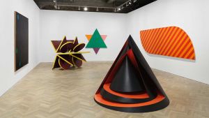
Q: Why the preoccupation with a cone shape?
KING: First of all I started making elements stand up by their mutual pressure at the top, thus forming a triangle. This seemed a way of getting out of the standing piling up idea, without losing anything. In an attempt to make mass less a question of weight in the material, I started using the split cone, and the elements became sheets in the shape of semi-cones. More recently I have come to use the cone more because it is such an extremely stable shape, that has maximum mass for its volume and can allow maximum manoeuvrability in an effort to make mass controllable in terms of shape, volume, surface, colour, contour, space.
Ways and means
Q: You seem to be uninterested in using engineering processes in your work. True?
KING: Yes.
Q: If you had unlimited money would your working processes change much? Are you impeded at all by not having the ideal amount of money to work with? How do you think money affects a sculptor's work? (For example, could you do a lot more work not from the point of view of producing more objects for sale, but of realizing your ideas with greater intensity, getting further along and deeper.)
KING: No-money would mean more time to work. Possibly casting work in harder materials but I would still work in polyester resin as I find it a very flexible medium.
An absence of myth
Q: There appears to be rather vague mythological overtones to your work. True? Why, and what is your attitude towards the whole question of mythology?
KING: None.
Q: Comment: The majority of your images appear to be basically frontal (at least, in comparison to Caro). Have you anything specific to say about this, for example, the question of emblemism, etc.
KING: I do not want my sculpture to have a main viewing point or front, but to be a front. Because once a sculpture is given a front or main viewing point, there is a danger that the rest may become a matter of design and elaboration only. Where sides and back follow cleverly the general impetus given by the front.
I want to avoid having to make my secondary decisions other than the initial ones that contain the meaning of the sculpture. These initial and fundamental decisions however take place in three dimensional pace. Frontal sculpture perhaps, but not flat sculpture. Two dimensional elements exist but they play against three dimensional ones and articulate the objects according to its needs. Outside contour can work with or against inside shape, making it more or less tangible. The use of simple horizontal vertical co-ordinates, tend to make points along the sculpture more measurable to the viewer. The manner in which the sculpture occupies the ground may be manifestly clear also. The ground contour will be regular or perhaps areas of common ground to the viewer may be visible inside the sculpture. But these tangible factors may disappear or be reduced in relation to other factors. For instance, the all round contour of Genghis Khan has more formal entity than the ground contour and it also echoes it and dominates it, thereby helping to make the sculpture float off the ground.

Copyright © 1893–2026 Studio International Foundation.
The title Studio International is the property of the Studio International Foundation and, together with the content, are bound by copyright. All rights reserved.

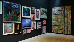
 Moon/King: The Work and Friendship of Phillip King and Jeremy Moon – 1956 to 1973
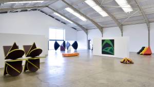 Sam Cornish: ‘We started with this idea that all works would have to contain repetition, sequence and symmetry’