


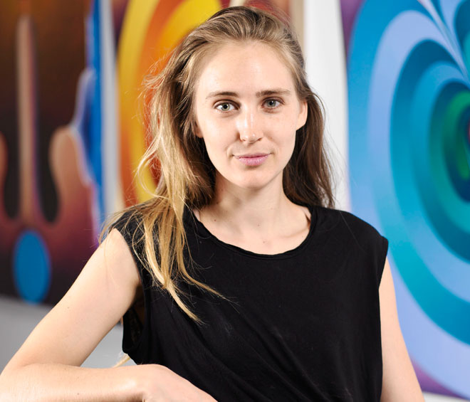
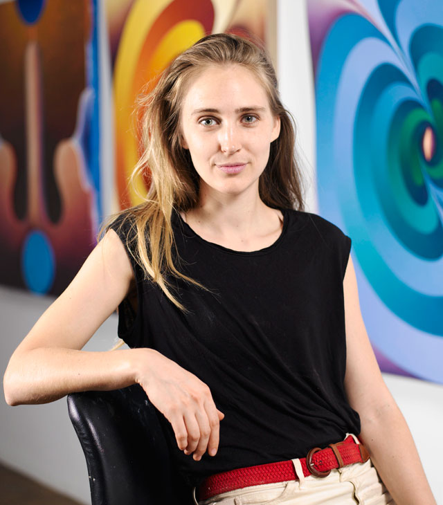
Loie Hollowell. Courtesy Pace Gallery.
by EMILY SPICER
Loie Hollowell (b1983), based in Queens, New York, is one of those rare artists who has emerged on the art scene fully formed and confident of her purpose. Her canvases are bright, unapologetic celebrations of colour and form, bursting with thinly veiled references to sex. And there is something uncanny about her images. Buttocks resemble planets, glowing orifices look like portals to other worlds, and penises like futuristic monoliths as imagined by a 1960’s sci-fi writer. There’s also a touch of Salvador Dali, a hint of Georgia O’Keeffe and more than a nod to the colour theorists of the 20th century hiding in her works. But Hollowell’s approach is consistent, self-assured, and, when viewed in person, rather dazzling, if a little unsettling at times (to me, those drooping “ball sacks” look like melting flesh.)
Hollowell is a playful artist who likes her work to confound expectations. When viewed on a computer screen, for example, there is no way of telling what protrudes from the painting’s surface and what recedes into it, as her precisely modelled forms, cut from foam and attached to the canvas, are disguised, shaded to look one way, when they are, in fact, the opposite. She uses textures, too, stippling the paint with a sponge, or blending tones with little, hair-like strokes, with an expert eye towards how light can play on varied surfaces.

Loie Hollowell. A Gentle Meeting of Tips, 2018.
Oil paint, acrylic medium, sawdust, and high-density foam on linen mounted on panel, 121.9 × 91.4 × 8.9 cm. © Loie Hollowell, Courtesy Pace Gallery.
It is refreshing to talk to Hollowell. She is relaxed and unabashed and we launch right into a conversation about genitals as casually as though we are discussing the weather. In her art, the male and female are sometimes confused and no one gender comes out on top. Perhaps this is a sign of the times. By using an abstract language in her painting, she frees the image from that art historical hot potato, the gaze. Hollowell’s paintings really do seem to be from another time, a future where sex is entirely disembodied from gender politics.
Emily Spicer: Your work is very much based in female experience, but your most recent paintings feature quite a lot of penises.
Loie Hollowell: Yeah, there are a lot of penises. It comes from me, so it’s a very hetero-normative take on sex. It is based on my husband and myself. Halfway through making this show, I found out that I’m expecting a boy, so I was thinking even more about penises. And there’s a very clear insemination painting, a ball-sack painting, and then a lot of the female mandorlas, the glowing yellow/orange almond shape. I was working on those ideas before I found out that I was pregnant. We were just trying, so I was thinking about my vagina more and the mandorla shape dominated my painting. The penis and the balls came later.
ES: This show is less abstract than a lot of your past work. It’s much more obvious that you are representing genitalia.
LH: A lot of them are much less abstract. For example, there’s the painting of the lemon and lime shapes with flesh-coloured belly buttons and vaginas [Something Acidic, 2018]. That’s an image I worked with at least two years ago, but then the bellies weren’t so pregnant. With Dead End (2018), I basically just turned the pendulums into sperm to make them more referential.

Loie Hollowell. Something Acidic, 2018. Oil paint, acrylic medium, sawdust and high-density foam on linen mounted on panel, 121.9 × 91.4 × 8.9 cm. © Loie Hollowell, Courtesy Pace Gallery.
ES: You’ve made several pendulum paintings. What did they signify before you changed the pendulums into sperm?
LH: With the pendulums, I wanted to create movement that described time and I wanted to create more of a play with colour. The title of the exhibition, Dominant/Recessive, refers to human genes, but this show is also about dominant and recessive colour, so there are a lot of complementaries pushing against each other. And I don’t know if it worked out, but, theoretically, the red and the blue of Dead End are on the same tonal spectrum, so in theory, those two tones would be flat in a black and white image. They would register as the same grey, but you would need an analogue camera to show that.
ES: How much is colour theory a part of your work?
LH: Colour and light are always the driving factors in my work and my body is the conceptual length that brings the viewer in and keeps me engaged. I could make this painting over and over again just playing with colour relationships. But I think I would get bored eventually, and probably the viewer would get bored, too.
I also use a set of symbolic languages, like the ogee and the mandorla. The ogee is a gothic architectural form that sits above the arch of a door. I don’t know what function it has beyond decoration because it isn’t structurally significant, but it’s a visual thing. It just becomes a more elaborate form of an arch, and to me it looks like a breast.

Loie Hollowell. Dead End, 2018.
Oil paint, acrylic medium, sawdust and high-density foam on linen mounted on panel, 121.9 × 91.4 × 8.3 cm. © Loie Hollowell, Courtesy Pace Gallery.
ES: And the mandorla, the almond shape that you use, tell me more about its significance.
LH: In contemporary critical thinking, it becomes really sexual, but it originates from vesica piscis, from two circles overlapping, the crossing of heaven and earth. The centre becomes the intermediary point.
ES: Like a Venn diagram.
LH: Yes, like a Venn diagram. So there’s the centre of the Venn diagram, which forms the mandorla shape, with Jesus or Mary sitting in the middle.
ES: The mediators between the heavenly and earthly realms.
LH: Yes, the human intermediaries. I liked that shape and in a lot of old cathedrals it looks like Mary is sitting inside a vagina. In my head, it just became this flaming vagina because it’s always bright, she’s always surrounded by light and sometimes it even goes from a red to a yellow. You often see it in Spanish cathedrals, where Mary is more of a central focus.

Loie Hollowell. Low Hanging Fruit, 2018.
Oil paint, acrylic medium, sawdust, and high-density foam on linen mounted on panel,
121.9 × 91.4 × 7.6 cm. © Loie Hollowell, Courtesy Pace Gallery.
ES: Your work has been described as spiritual. How much of what you do is embedded in a spiritual understanding of the body?
LH: I’m not a spiritual person. It’s about trying to find a formal language that comes from my experience. There could be some spiritual understanding coming to me from my undergrad gothic art history class, which I just forgot about. It wasn’t a conscious decision to pick the mandorla as my vagina shape. But everyone wants to talk about the spiritual. It’s such a hip thing right now.
ES: My thinking leans the other way, towards science and the corporeal.
LH: Me, too. It’s also hard to talk about form right now. I come out of the tradition of American abstract expressionism, minimalism and colour theory. And there’s the school that comes out of Josef Albers when he came to the States. I think that’s the conversation I’m coming from, and for me that’s a very corporeal conversation, a more phenomenological experience. For example, how did Rothko deal with colour on a bodily, physical level?
ES: Do you think your work will develop more towards realism?
LH: I don’t think so. I think it’s always going to be hinted at in little parts. When I get cartoony or super literal or direct, the next painting always becomes much more formal, much more minimal. I like talking about the comedy of sex, the comedy of the body, the fragility of the body, but, for me, the phenomenological experience of looking at the painting in the presence of the work is paramount, because that’s my experience in the studio. There’s something about creating a very minimal, super-structured image that [makes it] more powerful when you see it in person.

Loie Hollowell: Dominant/Recessive, installation view. Courtesy Pace Gallery.
ES: Why add a three-dimensional element to your work? Why not just use a flat surface?
LH: I’ve always had little vaginas in my paintings as space fillers and I wanted those little areas to be raised. I just thought it would be funny. And because the illusionary rendering on top of the modelled, sculptural element became so eye-distorting, so trippy, I started employing it more and more and then started to build up the mandorlas, too.
ES: On a reproduction, it’s very hard to tell the difference between the flat and three-dimensional areas of your paintings.
LH: That’s good! That’s where I want the confusion to rest. I was trying to do that very clearly with this group of paintings. Thinking again about the dominant and recessive, I am trying to play with the physical dominant and recessive-ness within the structure of the canvas.

Loie Hollowell. Dominant/Recessive, 2018.
Oil paint, acrylic medium, sawdust and high-density foam on linen mounted on panel,
121.9 × 91.4 × 8.9 cm © Loie Hollowell, Courtesy Pace Gallery.
ES: It seems that one of your main aims is to complicate the surface of the canvas, to complicate what’s going on in the eye. Do your formal concerns relate to the subject matter at all, or are they entirely separate?
LH: Paintings like Dominant/Recessive (2018) and Double Hemisphere (2018) quite simply represent my butt on a kind of shelf. It’s my butt on the edge of the bed in preparation, like a sexual preparation. But abstracting that becomes important so quickly because I do not want it to be my butt resting on the bed. I can paint that! I can do that! You can just find porn and see that instantly, so abstraction is where the fun really is, creating the formal language of the push and pull.
ES: Are optical illusions and the abstraction of the sexual a kind of game you play with the viewer?
LH: Yeah. I think when you look at anyone like Albers or Bridget Riley, you can see they’re having fun. It seems so planned and controlled, but there’s such a sense of giving with optical and colour theory painting. And it’s not time sensitive. The optics of the eye is consistent throughout time, so I think there’s something so generous in playing with that. Let them talk about sex and femininity, but hopefully the play of dimensionality and dominant and recessive space is something I can give to the future. It’s not just right now. It can exist as a universal language.
ES: But sexual imagery will always be understood, too. A penis will always look like a penis; a vagina will always look like a vagina.
LH: But maybe we won’t be into any kind of sex in the future and no one will want to see phallic forms. I don’t know! As a heterosexual white lady, I am interested in creating a conversation that is not so specific to myself. I want to create some kind of conversation that can be had by anyone, a conversation that is not genderless, but gender fluid. Do you read Ursula K Le Guin? She died recently, but is one of the most famous American sci-fi writers and she wrote this really great book about a planet of people who are gender fluid. Depending on who they meet, they physically change to the male or the female. Their traits, relative to yours, dictate who’s going to be the sperm-giver and who’s going to be the taker. And then someone comes in from another planet and analyses it and disrupts it a little bit. And she was dealing with that idea in the early 1960s as a female sci-fi writer among all male sci-fi writers.
ES: Your work does strike me as being a little bit on the sci-fi side of things.
LH: Yeah, for sure.
ES: It reminds me of 50s film posters for something like Forbidden Planet.
LH: Definitely and I love the Ursula K Le Guin covers! And there’s a poster element because of the solid colours and the geometric spaces and the clean edges. With the earlier stuff, I was looking a lot at art deco and the way it uses symmetry and central light sources. And the colours are much more gold and bronze. But as the work progressed, I brought in stronger colours and jumped from the 1920s to the 70s. And once you bring in a fuchsia and lime green you go to the 80s and the 90s when Golden Acrylics was developing acid colours. Pigments are just getting better and better and more complex.
• Dominant/Recessive is on at Pace Gallery, London, until 20 September 2018.
Click on the pictures below to enlarge

Copyright © 1893–2026 Studio International Foundation.
The title Studio International is the property of the Studio International Foundation and, together with the content, are bound by copyright. All rights reserved.


-18-300.jpg)
 Mark Rothko 1968: Clearing Away
 Peter Freeth: 40 Years of Aquatints
 Black art matters: what not to miss in Miami
 Leo Villarreal – interview: ‘It was interesting to connect to the universal power of light. As humans we really respond to these things’
 Brent Wadden: ‘I love a good happy accident. The mistakes end up being integral to each piece’