




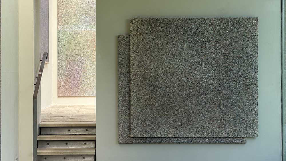
Ian Stephenson, Eclipse, 1966-67. Oil on canvas, 167.7 x 182.9 cm (66 x 72 in).
New Art Centre, Roche Court, Salisbury
20 June – 13 September 2026
by BETH WILLIAMSON
Visiting exhibitions in the New Art Centre at Roche Court is always a pleasure. With this oasis of calm in the middle of the Wiltshire countryside, Madeleine Bessborough has created something very special. The New Art Centre was founded by Bessborough in London in 1958 to provide a space for young artists to exhibit and sell work. In 1994, it relocated from its Sloane Street premises to Roche Court a 19th-century house in the Wiltshire countryside that became the New Art Centre, Roche Court Sculpture Park.
The latest exhibition Ian Stephenson: Planes of Heaven is special for several reasons. Stephenson (1934-2000) had his first solo exhibition at the New Art Centre in London in 1962. It is remarkable that the relationship between gallerist and artist, and later his estate, has sustained for more than six decades. The exhibition itself is unique for the scale of paintings it is showing, focusing on large works from the late 60s and early 70s. Truly monumental, it is exceptional to be able to view such works in a space that feels somewhere between inside and outside, embedded in the landscape and the world, making us even more curious about our place in the universe. This is Bessborough’s last exhibition as director after a long and illustrious career championing the arts, although I suspect she will still have a hand in what comes next.
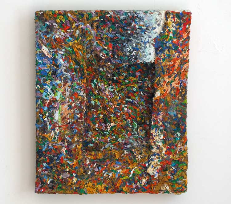
Ian Stephenson, Burlap, 1958. Oil on canvas, 30.5 x 26.7 cm (12 x 10 ½ in).
The exhibition title is taken from John Martin’s The Plains of Heaven (1851-53), which Stephenson recalled seeing in print form in his childhood, something I will return to. Stephenson’s paintings are shown across multiple gallery spaces. In the Gallery and adjoining Orangery, are nine enormous works, some almost 4 metres long. Elsewhere multiple smaller works function on a more domestic scale. In these smaller works, such as Dipper Palette (1959) or Burlap (1958), it is more explicit that what he was concerned with was making paintings about the condition of painting itself.
It is Stephenson’s technique that is so perplexing, not in and of itself, but for the mesmerising works it creates. One reference point may be Martin’s The Plains of Heaven. Its significance is in its effect on the viewer – shallow and never ending as you approach it, yet a vast eddying distancing effect, two sensations that together destabilise you, confounding your understanding of what it is you are looking at and how you relate to it. It is more significant, perhaps, to mention Stephenson’s art school training at King’s College, Newcastle, then part of Durham University, now Newcastle University. It was here that he experienced a radical new form of artistic training known as Basic Design. Under the tutelage of Richard Hamilton and Victor Pasmore, students learned through exercises in line, colour, form and space, with a balance between free exercise and more systematic approaches. Gaining a BA in fine art in 1956, Stephenson was appointed as a tutorial student then studio demonstrator on the course from 1956 to 1958. He then spent a few years travelling and teaching part-time. In 1966, Stephenson’s work was selected by Michelangelo Antonioni to be included in his film Blow-Up. This exhibition includes a four-part painted screen by Stephenson (made in 1960) that appeared in the film. In 1966, he was appointed director of foundation studies at Newcastle, where he stayed until 1970, when he moved to teach painting at Chelsea School of Art until 1989. In the midst of all of this, he maintained a rigorous painting practice.
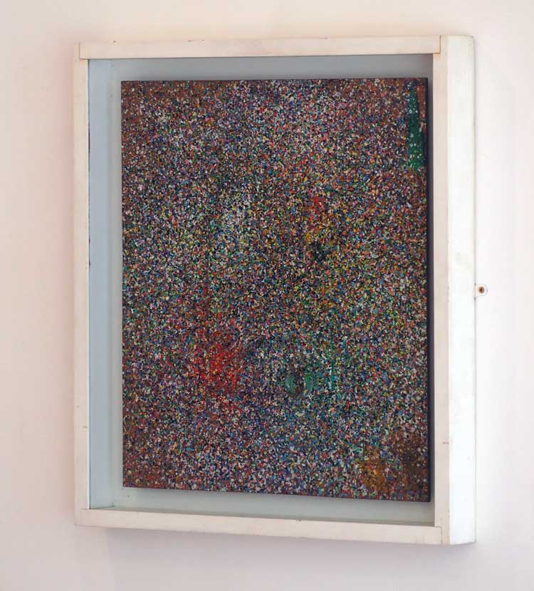
Ian Stephenson, Dipper Palette, 1959. Oil on wood and palette, 49.7 x 44.6 cm (19 ⅝ x 17 ½ in).
Stephenson’s systematic approach to painting was not about visually determining where the paint should go on the canvas. Rather, his process involved preselecting colours and walking around the canvas placed flat on the floor, or on blocks, flinging paint in the air at pre-determined points to see what might emerge on the canvas below. These gestures created a shower of painted dots on the canvas of differing sizes and overlapping to differing degrees. He would continue in this mode, until the dots built up to a point that pleased him, where a balance was achieved. For Stephenson, this was not only a palimpsest of paint within the space of the canvas, but an accretion of time too. It is somewhat surprising that, despite the key role of chance in his process, a degree of harmony was always reached. The other surprise is that, while such a systematic approach might be considered clinical, the paintings that emerged were anything but. Indeed, there is a degree of romanticism in works that draw the viewer closer and then push them away, creating a meditative space. In this respect, we might reference Stephenson’s admiration for Pasmore and other painters of the Thames such as James McNeill Whistler and JMW Turner. Stephenson’s Thames (1972) is a huge undulating landscape of sorts. There is a sense of movement that sometimes operates in a push-pull dynamic and at others seems to ripple like waves across the surface, a slow and understated version of op art perhaps, but not quite. While we might think of American abstract art of the period, Stephenson was quite clear in 1974 when he said: “I am an English painter and do not want to be anything else. I love the tradition of an Albion art and really my paintings have more to do with Constable’s snow than [Mark] Tobey’s white writing.” There is no room for doubt here.
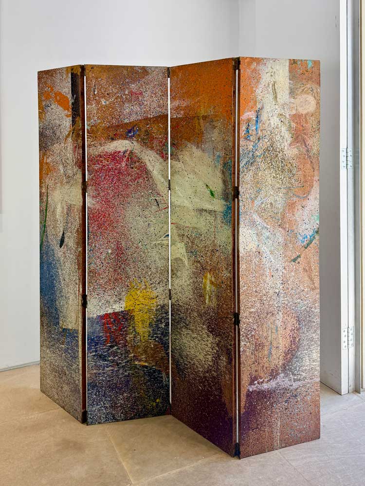
Ian Stephenson. Screen (featured in Antonioni's film Blowup in 1966), 1960. Oil on board, 165.1 x 152.4 cm (65 x 60 in).
Stephenson’s “explorations”, as he occasionally called his works, were not experiments, but experiences, not only visual but mindful or meditative in nature. The endless iteration of dots within dots draws us closer and closer while the vastness of the canvases throws us out into the universe once again. As the art historian Chris Stephens described it in his opening remarks to the exhibition: “The extraordinary thing about these paintings is that fundamental tension between something solid and something ephemeral. This is not just about nature and light, there is something much deeper.” It is the tension in these paintings that makes them work so beautifully. Their enduring interest is in how something created by a combination of chance and systematic process can convey such wholeness, such harmony, such wonder.
Click on the pictures below to enlarge

Copyright © 1893–2026 Studio International Foundation.
The title Studio International is the property of the Studio International Foundation and, together with the content, are bound by copyright. All rights reserved.
 |
 |
 |
|---|
-1000-300.jpg)
 Nika Neelova – interview: ‘Everything in the world around us is constantly undoing and you can just grasp a moment of it’
 Nicholas Pope: ‘We artists can speak and everyone can understand in their own way what we’re speaking about’
 Jacqueline Poncelet – interview: ‘Uncertainty is all right; it gives us an opportunity to look again and think again’