




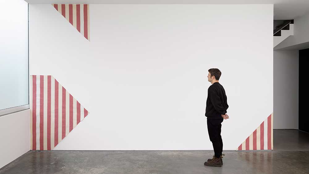
Daniel Buren: Pages in situ, installation view, Lisson, London, 11 June – 5 September 2026 © Daniel Buren, Courtesy Lisson.
Lisson Gallery, London
11 June – 5 September 2026
by TOM DENMAN
How do you curate an exhibition surveying the significance of the French conceptual artist Daniel Buren’s output down the decades? It would seem an almost impossible task. His work depends on the time and place of its installation, his best pieces were made for places outside the gallery or museum, and the fundamental motif of all his work hasn’t changed in 60 years. The mundane minimality of the 8.7cm (3.4in) stripes Buren (b1938, Paris) has been inserting into various architectural spaces since 1965 acts as a “visual tool” – as he puts it – to get us to stop and think about the world around us (without telling us what to think), with the potential to subvert the ideological givenness of appearances. The works have always been, therefore, in situ, made for the space they (often temporarily) inhabit. Hence his massive takeover of the Pompidou Centre in 2002 – which for most artists receiving such an honour at the age of 64 would have been a retrospective – constituted a “new” artwork in itself. The weird and wonderful, stripy labyrinth deflected attention not only to the museum’s postmodernist architecture but also, as Rosalind Krauss observed in her review in Artforum, to the works it housed.
Buren, therefore, in many ways resists the museumification that would decommission his work’s site-specificity and public role, and the consumerist exchange dependent on an artwork’s easy mobility, in order to stick as truly as possible to an ethos of egalitarianism. His Diamonds and Circles, installed at London’s Tottenham Court Road station in 2016, is unavoidably tangled up with the power dynamics of public infrastructure. Yet, while its stripes and primary colours are suggestive of the tube map, it distils its aesthetic qualities without mapping us, thus stimulating a subjective response. A healthy share of its fluid, contingent meaning is in the hands of passersby. At a time when didacticism governs so much political art, Buren’s democratic, open-ended approach is refreshing.
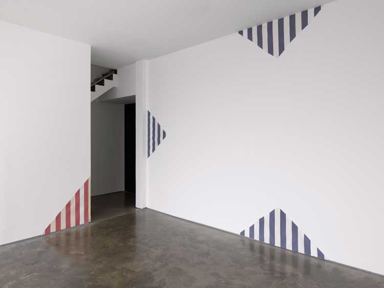
Daniel Buren, One Piece in Three Parts, 1968-1976. Painting on linen cloth, 183 x 142 cm (before cutting), 72 x 55 7/8 in (before cutting) . © Daniel Buren, Courtesy Lisson.
London-based graphic designer Fraser Muggeridge has collected more than 100 bibliographic items featuring Buren’s 8.7cm stripes, either as plain-coloured columns on a white background or somehow set into the templating (most often with the measurement recurring in the width of the text block). These books, magazines, pamphlets and invitations, with the stripe facing us, are displayed on an uninterrupted line of two-tier bookcases on the first floor of Lisson Gallery’s historic west London site. The show also includes Buren’s seven-volume artist book Passage (1972) stacked on a plinth, a couple of striped paintings (one red and white, exploded in three parts at the edges of one wall, the other yellow and white, intact), and three posters. And because each stripe measures 8.7cm in width, they could be regarded as “original” Burens, as opposed to representations of them. And because Muggeridge’s collection spans 1968 to the present, and because all the works are, arguably, in situ – by remaining in their publications – this archival presentation is about as close to a Buren retrospective as you can get, raising nuanced questions about art’s relation to time and space.
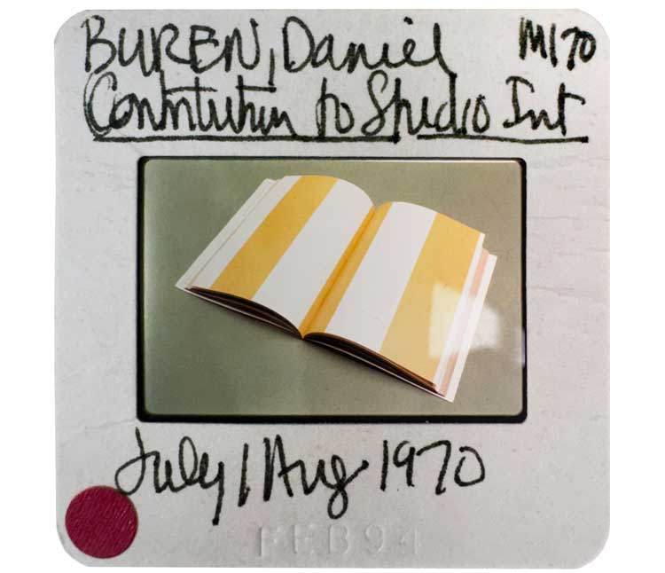
Daniel Buren, Contribution to Studio International, Jul/Aug 1970. © Daniel Buren, Courtesy Lisson.
Muggeridge has wisely omitted a printed bibliography to accompany the shelves – apart from a video of hands turning the pages of each item, with intertitles indicating the type of publication, title and date, less a finding aid than a captivating walkthrough of that which we cannot touch. In tune with the show’s palimpsestic feel, one of the earliest open spreads, featuring only yellow and white stripes, is a copy of Studio International from July/August 1970, the unlabelled eight-page intervention referring only to itself and its placement in the volume. The emphasis of Muggeridge’s shelf display, however, is not the stripe’s immediate context of where and how it appears as much as a timeline of changing qualities of paper, print, font and templating – and thus, to the informed eye, of graphic design – as well as the foxing, nicks and lignin degradation that come with age.
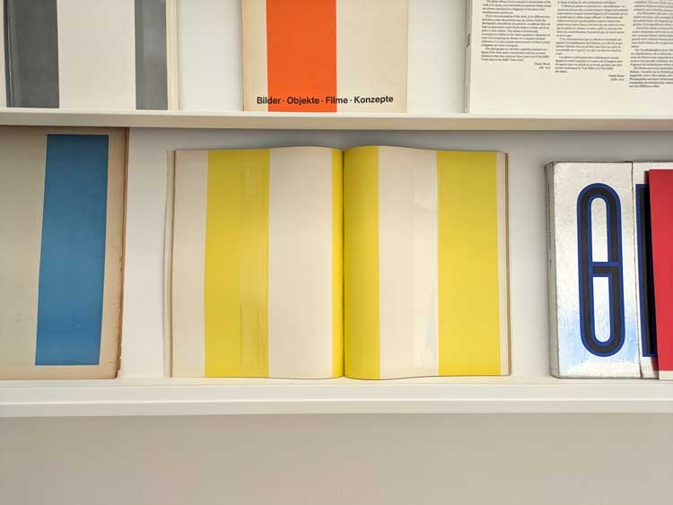
Daniel Buren, Studio International, July/August 1970. Installation view, Lisson, London, 2026. Photo: Tom Denman.
To generalise the trajectory: we see the buff, rough, pulpy paper of the 60s and 70s contrasting with the gloss that follows, which in turn gives way to muted, “accessible” tastefulness, the typefaces gradually shifting from august to playful to unintimidating – the breezy, soft-edged sans serif of Muggeridge’s flyer for Buren’s Art on the Underground intervention in 2016 being an example of the latter. A cover of Beaux Arts magazine features a robotic font that is unmistakably from the early noughties (the issue celebrates his 2002 Pompidou show), and features a black-and-white photograph of the artist with a white 8.7cm stripe obscuring part of his face – cleverly insinuating the monad’s paradoxical status as the artist’s signature and the sign of his anonymity. Hence this show feels almost as much a Muggeridge show, or a Lisson show, as it is a Buren one.
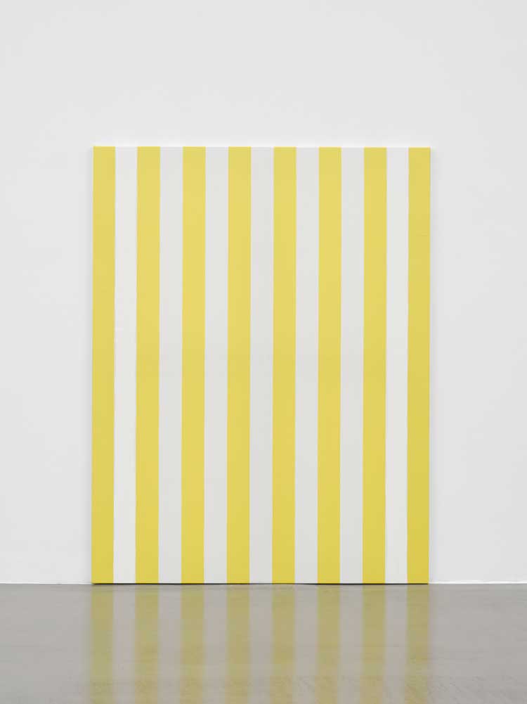
Daniel Buren, Peinture acrylique sur tissu rayé blanc et jaune d'or, 1989. Acrylic paint on yellow and white striped cotton canvas, 170.2 x 131.4 x 2 cm (67 x 51 3/4 x 0 3/4 in). © Daniel Buren, Courtesy Lisson.
The effect is to emphasise Buren’s relationship to time – and how this, in turn, relates to space. We might feel, for instance, Buren’s importance in the history of Lisson Gallery, which staged its first solo show of his work in 1976. And yet, because his work changes primarily because its context does (Buren had three shows at Lisson before Tony Fretton’s current building opened in 1991), and because the works will soon be moved from this context (notwithstanding the dispersion of other copies), the spatiotemporal relation posed by Muggeridge’s placement is unstable and open-ended. This is theorised in a red-striped, folded poster, ephemera included in the catalogue for the Guggenheim International Exhibition of 1971. Along the bottom of one fold is written: “Detail in Actual Size of a Work Executed in 1970”. Along the other: “Detail in Actual Size of a Work Executed in 1971”. Time changes, the work does not, its constancy highlighting that which changes around it and the artist’s fraught relationship with editorial and curatorial time.
Buren describes his stripe as a “visual tool”, given its subordination to the world around it. In this show, another image comes to mind: the vertical slice through time’s layers, or the Earth’s strata. It is apposite that Lisson included a dark fuchsia Buren stripe – fractured somewhat, like the comparably ruddy painting on the opposite wall – on the cover of the 2017 volume released in celebration of the gallery’s 50th anniversary, as if the constancy of the stripe were somehow accentuating the fluctuations of Lisson’s path, itself responding to broader historical changes. Often, as in the title of this show, his works are pronounced as in situ, but they are just as importantly, as Jean-François Lyotard emphasised, tempore suo, of their own specific moment, allowing them to act as a benchmark against which time’s passing is measured.
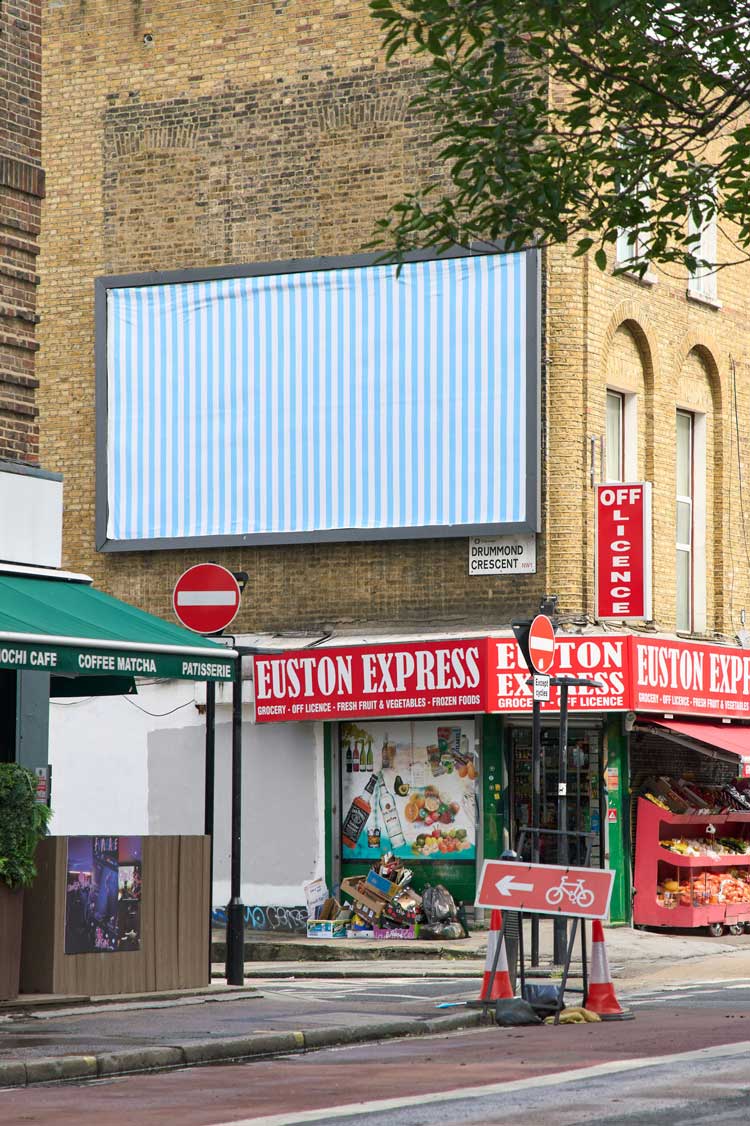
Daniel Buren, A Work in Situ, 2026. Billboard, 20 x 10 ft, Eversholt Street, London. Image courtesy Lisson, London.
Further demonstrating how Buren explodes the retrospective – a curatorial paradigm that seeks to crystallise an artist in time – is an invitation to see “A WORK IN SITU BY DANIEL BUREN” comprising a billboard pasted with a sheet of blue and white stripes, temporarily installed at 70 Eversholt Street, near Euston station. The text block measuring 8.7cm in height (presented vertically, as a Buren stripe) was designed by Muggeridge in imitation of an almost-identical invitation, earlier in the sequence, to see a similarly modified, purple-striped billboard at 59 Shaftsbury Avenue, visible for a week in February 1972. Muggeridge can only replicate the invitation’s design, but not the time and place of the billboard. Times have changed, as has London’s cultural and economic landscape. And so, now, the work has moved, changed colour even. It is, in fact, an entirely “new” work.
Click on the pictures below to enlarge

Copyright © 1893–2026 Studio International Foundation.
The title Studio International is the property of the Studio International Foundation and, together with the content, are bound by copyright. All rights reserved.
 |
 |
 |
|---|


-1000-300.jpg)


 Line
Line The boys the girls and the political
 Sergio Camargo: Mármore
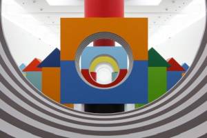 Daniel Buren: Comme Un Jeu d’Enfant / Like Child’s Play, Work In Situ
 Where Were You?