Yorkshire Sculpture Park, Wakefield
12 March 2022 – 8 January 2023
by DAVID TRIGG
The iconic Love motif that Robert Indiana (1928-2018) created in 1964 remains embedded in the public consciousness. Inextricably associated with the hippy counter-culture of the era, the four-letter design with its oblique “O” became so popular – reproduced on posters, T-shirts, mugs and stamps, mostly without his permission – that it overshadowed virtually everything else the American artist produced. Beginning as a Christmas card and later a line of paintings and sculptures, the image carries a multiplicity of religious, political, erotic and personal connotations that run far deeper than the upbeat spirit it is usually assumed to convey. Its ubiquity has tended to obscure the complexities of Indiana’s art, becoming a factor in his critical neglect. Redressing the balance, this exhibition at Yorkshire Sculpture Park (YSP) provides a rare opportunity to discover the scope of a practice centred on explorations of American identity, personal histories and political issues.
[image1]
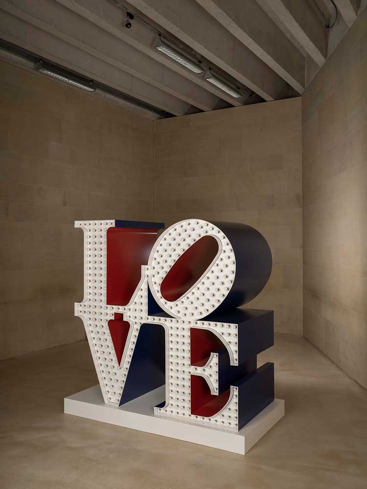
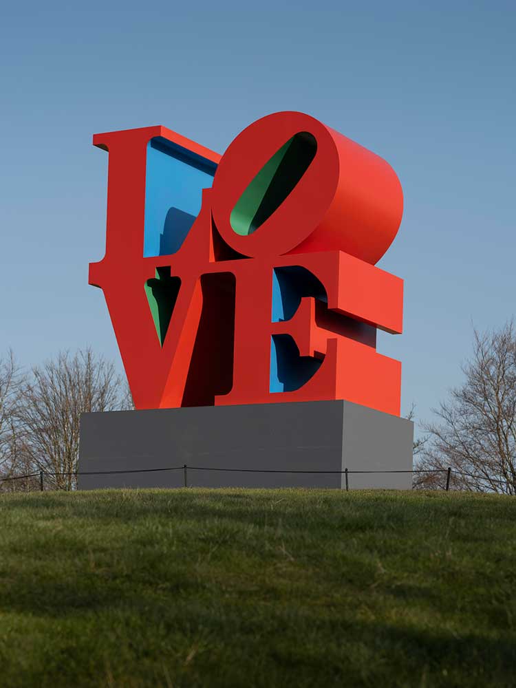
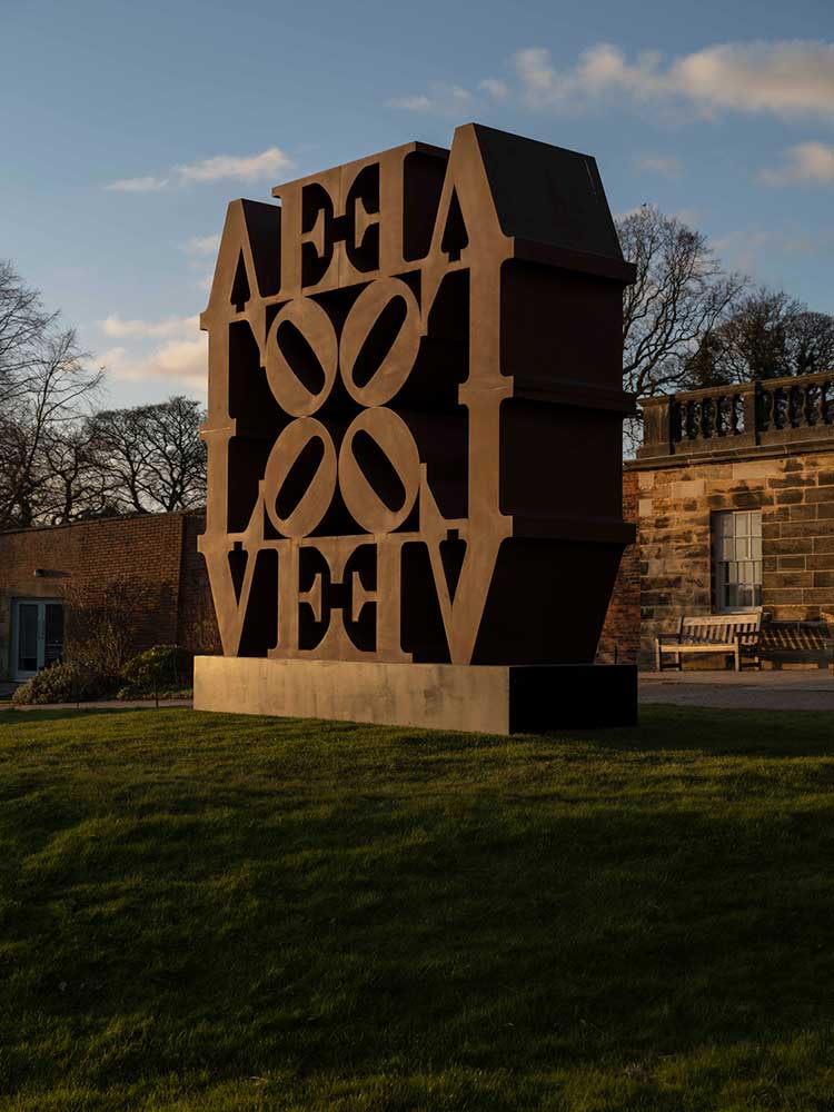
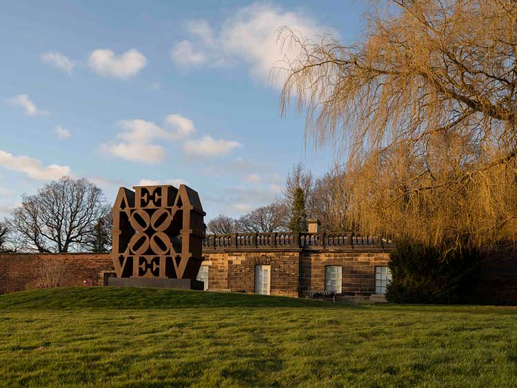
Greeting visitors to YSP are the familiar letterforms of Love (Red Blue Green) (1966-98), situated outside on the grass. Indiana once commented that its square format was simply “the most dynamic way to use four letters”, yet the slanted “O” works to destabilise the arrangement, hinting at the precariousness and mutability of love. Its colour scheme relates to the prominent red and green logo of his father’s employer, the Phillips Petroleum Company, the signage of which he remembers seeing against the blue sky of Indiana – his home state, after which he named himself in 1958.
[image6]
Other iterations and variations of the sculpture are scattered across YSP’s grounds; in Imperial Love (1966-2006) it is doubled and mirrored, while in Love Wall (1966-2006) it is quadrupled and inverted. Inside the galleries, a huge Corten steel version seems decidedly dull in comparison to the illuminated fairground stylings of The Electric Love (1966-2000), which flashes and pulsates at the exhibition’s entrance. Love’s personal context was Indiana’s relationship with the painter Ellsworth Kelly, whose geometric abstraction informed his pop-inflected work. But, as this exhibition demonstrates so adeptly, hard-edged formalism was merely one of a myriad of influences.
[image11]
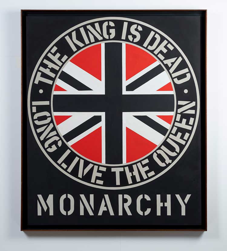
The interaction between Love’s letters fascinated Indiana, who, after attending the Art Institute of Chicago and Skowhegan School of Sculpture and Painting in Maine, studied typography at the University of Edinburgh in 1953. This trip, made possible by the GI Bill (created to provide benefits to second world war veterans), explains the graphic, hard-edged painting Monarchy (1969), in which the bold stencilled words “The King is dead, long live the Queen” encircle a red, white and black union jack.
[image9]
Referencing the Queen’s coronation of 1953, its sombre palette also commemorates the death of her father, King George VI. Revisiting the theme nearly 30 years later, and coinciding with the wedding of Prince Charles and Diana, is the assemblage Monarchy (1981), which comprises two vertical wooden beams adorned to represent a king and queen. Such royalist sentiment is surprising amid an oeuvre saturated with Americana, though it serves to highlight the breadth of the artist’s concerns.
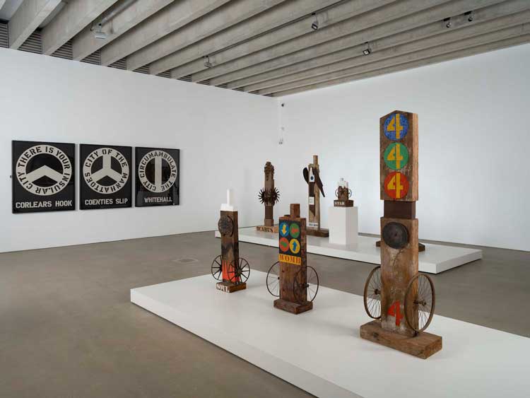
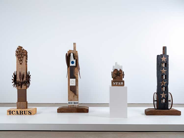
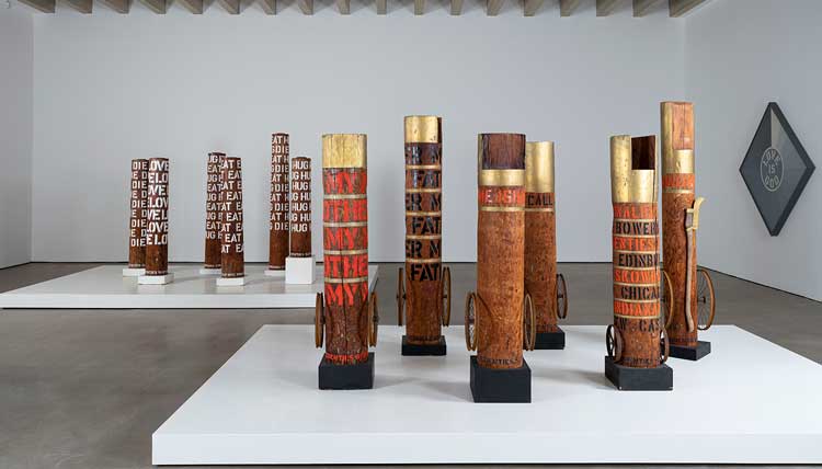
Indiana started making assemblages in Coenties Slip, the Manhattan street and artists’ enclave where he lived from 1956. His earliest constructions, made with large wooden beams and other salvaged materials from demolished industrial buildings, were dubbed “herms”, after the Ancient Greek waymarks that took the form of carved busts atop stone pillars. Built from scrap wood, metal wheels, agricultural tools and other found objects, these totem-like sculptures are filled with cryptic autobiographical detail.
[image14]
Many herms are painted with stencilled words, numbers, stars and symbols, mimicking the visual language of advertising posters and street signs. One is dedicated to Marsden Hartley, an artist who, like Indiana, did not overtly reference his sexuality in his work, but instead included subtle clues. Cast in bronze, the towering KvF (1991) is painted with designs lifted from Hartley’s Portrait of a German Officer (1914), which alludes to his relationship with Karl von Freyburg who was killed in the first world war.
[image4]
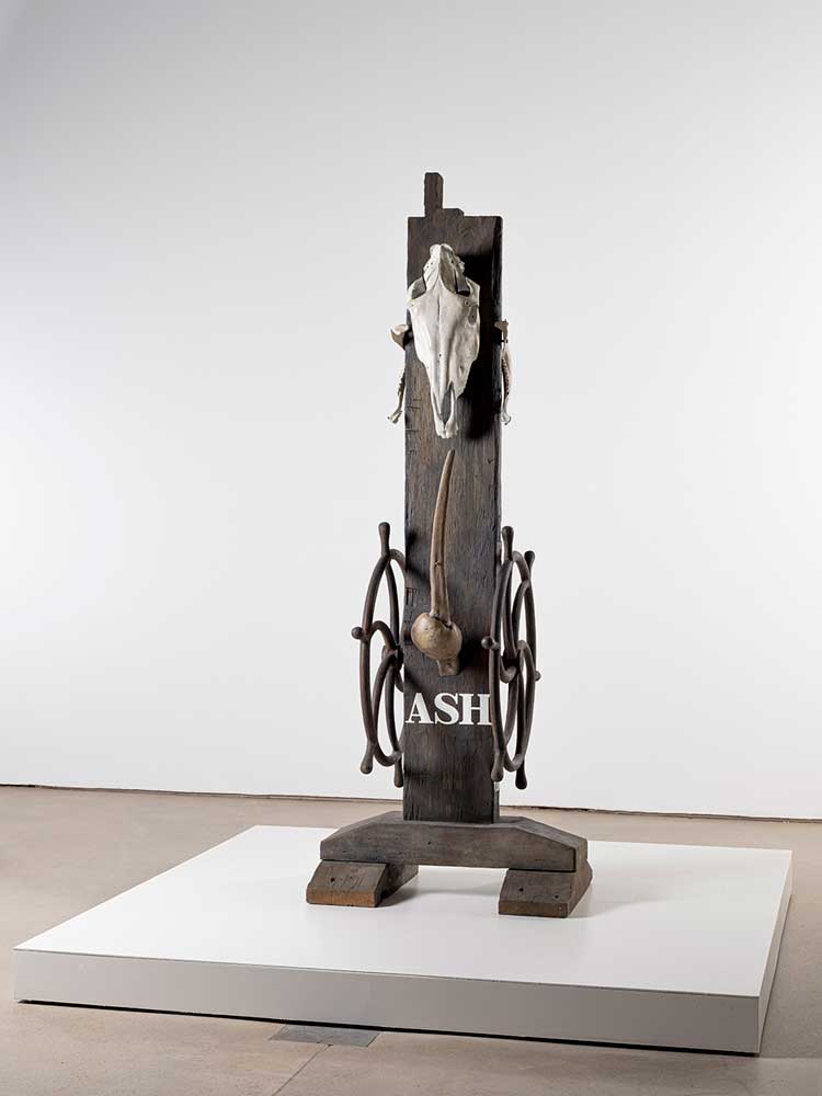
Another poignant herm is Ash (1985), a sombre bronze that Indiana made at height of the Aids crisis. A horse’s skull hanging atop the phallic sculpture speaks of mortality, evoking the sense of horror and loss as the epidemic swept the nation. Yet the piece is not without hope; painted on the reverse is the Biblical quotation “death where is thy sting”, a text originally written to encourage Christian believers with the assurance that, for those who trust in Christ, death is but a doorway to eternal life.
References to religious faith can be detected throughout Indiana’s work. Love, for instance, has its roots in the text painting Love is God (1964), the titular phrase of which reverses the biblical declaration “God is love” that Indiana remembered seeing in the austere Christian Science churches he attended while growing up. It was in those settings, too, that the circle, a symbol of life everlasting that appears throughout his work, was impressed on him.
[image8]
Indiana’s misgivings about his birth country are encapsulated in the painting Apogee (1970), made after a tumultuous decade that saw America fighting a war in Vietnam, race riots, police violence and a string of assassinations of politicians and civil rights leaders. Bearing the ironic words “USA fun” set in an arrangement of colours evoking a sunset, the blunt image is striking in its simplicity, yet lacks the formal elegance of Love, resembling instead a bumper sticker or road sign.
Nearby, in the screenprint Black and White Love (1971), Indiana repurposes his most famous motif as a tribute to Martin Luther King Jr, while his response to racism and atrocities committed during the civil rights era is seen in Mississippi (1971), a print based on a 1965 painting from his Confederacy series (1965-66), in which schematic outlines of southern pro-slavery confederate states are juxtaposed with constellations of stars and the cutting statement: “Just as in the anatomy of man, every nation must have its hind part.”
[image3]
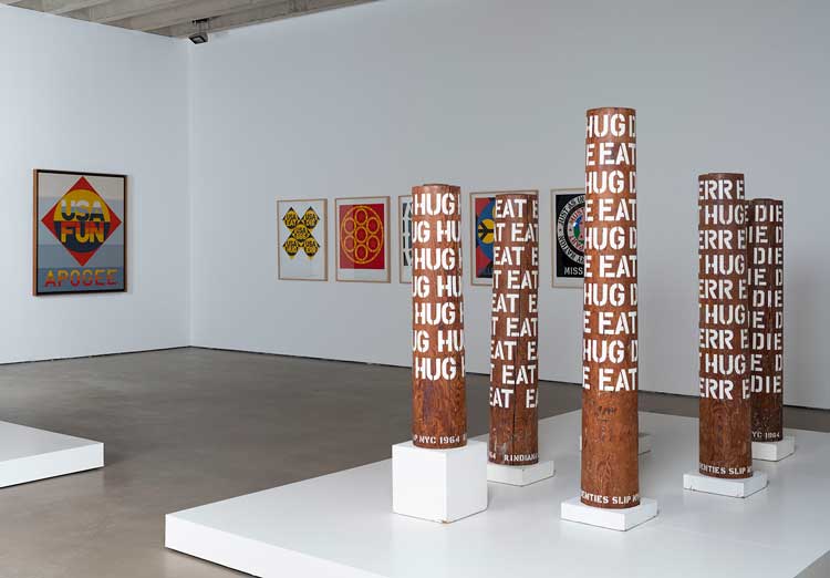
Antipathy towards the American Dream was a perennial source of inspiration for Indiana, who addresses the concept head on in pieces such as The Electric American Dream (2007-2018), a sequence of enormous illuminated words – eat, die, hug, err – that flash like brash advertising signage. With a characteristically economical use of language, this seemingly simple work encapsulates so much: “eat” as a comment on America’s rampant materialism (as well as being his mother’s last word); “hug” as a questioning of love and relationships; “die” a reference to all kinds of loss and grief, and “err” as an ironic poke at American exceptionalism that also speaks to the human propensity for moral failure, or sin, as articulated by Christian theology.
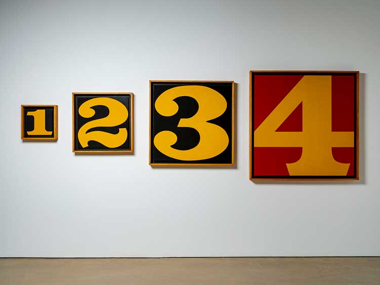
These simple yet loaded words, which Indiana began using in the mid-60s, are a remarkable distillation of his far-reaching concerns. In 1964, he stencilled them in bright white lettering around the perimeter of wooden columns cut from the masts of old sailing ships. Typically elegant and restrained, they, like so many of the works in this compelling survey, suggest a culture increasingly adrift.
,-1998-2006.jpg)
,-1980.jpg)

,-1980-2001.jpg)