
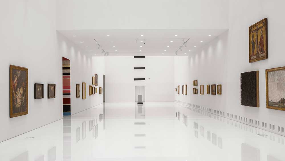
Royal Museum of Fine Arts Antwerp (KMSKA). Light gallery. Photo: © Karin Borghouts.
by VERONICA SIMPSON
Halfway through my interview with the Rotterdam-based architect Dikkie Scipio, director of KAAN Architecten, about the practice’s transformation of the Royal Museum of Fine Art (KMSKA) in Antwerp, she says an intriguing thing: “The staircase always was the proof of excellence in architecture.”
Well, if that is the case, this 1890 building, which already had a hugely impressive staircase in the De Keyserzaal space off the main entrance, its ceiling and walls adorned with lavish mosaics and gilding, now has three more. Are they all excellent? They certainly have their qualities.
But before we talk about staircases, let’s discuss the remarkable thing that KAAN Architecten has done here. It has taken a loved and historic but decaying and quasi-redundant building and transformed it into a space not just for the spectacular collection it has housed over the last 140 years – seven centuries of the finest European art, with a natural emphasis on Flemish masters – but has added 40% more exhibition space by inserting a gleaming box of galleries into its core. From the outside, this makes the €100m project almost invisible.
KarinBorghouts-(2).jpg "Royal Museum of Fine Arts Antwerp (KMSKA). Photo: © Karin Borghouts.")
Royal Museum of Fine Arts Antwerp (KMSKA). Photo: © Karin Borghouts.
However, to those who knew the museum before the renovations, the transformations around the building are significant. Obviously, the exterior of this temple to art – as its original architects, Jean Jacques Winders and Frans van Dijk, conceived it – has had its fair share of restoration, far more than just the obvious lick of new paint. But the soft landscaping that surrounds it also marks a major shift, creating a genuine public space, a sculpture garden, now adorned with many of the treasures that formerly sat inside the museum, or languished in its multiple storage depots. This is good news for the surrounding neighbourhood which, when the museum was completed in 1890, didn’t exist, as the museum was constructed on newly developed land, outside the area where the ancient city walls had once stood. Now, it sits in the emerging neighbourhood of Het Zuid, surrounded by some fine, older apartment buildings, several new blocks and a growing number of small private galleries and cafes. The ample benches, playgrounds and walkways that have been installed around the restored KMSKA – the balding grassy areas bearing witness to 11 years of building and excavation work - will ensure that it becomes a much more vibrant public park.
. The new galleries slot into the original building. Image © KAAN Architecten.")
Royal Museum of Fine Arts Antwerp (KMSKA). The new galleries slot into the original building. Image © KAAN Architecten.
Sinking the new galleries at the centre of the building – where there was formerly courtyard – is a move of genius and also humility. As stated above, from the outside, you wouldn’t know that a new, climate-controlled, state-of-the-art suite of galleries existed within. That kind of humility doesn’t come along often when architects are given the opportunity to design a landmark cultural building.
KarinBorghouts-(4).jpg "Royal Museum of Fine Arts Antwerp (KMSKA). Colour-themed gallery interior. Photo: © Karin Borghouts.")
Royal Museum of Fine Arts Antwerp (KMSKA). Colour-themed gallery interior. Photo: © Karin Borghouts.
There is nothing humble about the interior extension though. The galleries are gleaming, shiny and modern. Their shimmering white epoxy-resin floors (reminiscent of an expensive spa or a Chanel boutique) do a brilliant job of capturing and reflecting the daylight that beams down from the triangular, sculptural light wells suspended high above the floors. This stark contrast between the old galleries –lovingly restored, right down to the Pompeiian red and olive green period wall colours - and new helps to reinforce the curatorial narrative that splits old masters (anything pre-1880 is housed in the original galleries) from modern masters.

Heaven-themed room, old and new, including altarpiece and Panamarenko sculpture. Photo: Veronica Simpson.
Astonishingly, Scipio says the original 2003 competition, which KAAN won, was open to all possibilities – even demolition of the original. “There was no brief,” she says. “And that was the special thing. Nowadays (every competition) is so precise. Architects can then only design the form of that existing vision. But that’s not very inspiring. The good artist or architect will have a vision for what isn’t there yet. Here, in this museum, they said: ‘We have this horrible building, it doesn’t work any more, it’s leaking, and we also have to extend because we don’t have enough surface.’ And we started with that.”
The practice began by looking at the original plans for the museum and found that the design was good: it was all the additions over the years that were spoiling it. The original architects had designed it with large lightwells and windows, allowing several galleries and all circulation space to benefit from natural light, with frequent views on to the world outside. The architects had also wanted there to be pleasure in movement around the building. Scipio says: “They designed it as a walk in the park with a lot of connections with the urban light, very well in balance. But this walk was totally cluttered. So, we decluttered it to bring back the original quality of the building. It was already an excellent design, so it made sense to bring it back.”

Top floor gallery showing dramatic triangular lightwells. Photo: Veronica Simpson.
Bringing light into the new galleries, given that they are sunk into the original’s core, presented more of a challenge. Hence the dramatic rooflights that hover over this space, visible even from the first floor, through apertures that punch directly through to the top floors, where the proximity of this dynamic ceiling exerts a strong sculptural presence. Scipio makes light of the complexity of this intervention. She says: “In some ways, it’s simple. We created a northern light cupola and inserted a new cupola but composed of triangles so the northern light bounces into it and diffuses. That’s basically it.”
By inserting all new galleries in the centre of the 1890 building, the original, horizontal circulation routes are retained, though vertical circulation through these new galleries is where that aforementioned opportunity for “excellence” in staircases comes in - most notably in a newly nicknamed “stairway to heaven”, which slices through one side of the new block and continues, almost uninterrupted, for what feels like four storeys, but is actually only three. With a vertical grid of lights posted alongside the gleaming white stair treads, directing your gaze up to those triangular rooflights, it’s a compelling experience. I tell Scipio, it’s like a James Turrell light piece. “That’s the best compliment you can give,” she says.

Stairway to Heaven staircase in the new galleries. Photo: © Karin Borghouts.
This staircase is just one part of the vertical journey. After taking that staircase to the top floor and moving clockwise through the modern masters galleries, a different, darker staircase brings you back down into the old masters. This one is a far simpler, more intimate affair, with walls painted a deep, midnight blue and warm wooden handrails and treads. It feels appropriate for this interior journey, taking you back to the more introspective, devotional art of the middle ages.
The buildings – old and new – sit alongside each other, if not naturally, at least amicably. The stark shift in atmosphere and palette – a “demateralisation of the old galleries” is what Scipio was after – is as intriguing as the curatorial approach to the work on their walls. This has received a clever, but possibly controversial reinvention, where old mixes with new along specific themes. The modern galleries – apart from the James Ensor gallery on the first floor – are themed: light, form and colour. The 1880 dividing line arose because the museum has such a strong collection of these Ensor paintings, with Ensor representing the transitional artist of that time. As Adriaan Gonnissen, the museum’s curator of modern art, explains: “We say the work of the old masters was about myths and moralising and Bible stories, while modern masters painted ordinary people, landscapes and the life around them.” The commissioning process was different, coming largely through state and church, or those seeking to display wealth and influence. “After 1880,” he says, “artists said a painting is a surface on which we can create worlds. They were painting because they wanted to paint, creating work to be exhibited in galleries, not churches, and not because they were pleasing their rich patrons.”
We start the modern era in the Ensor gallery, its entrance highly visible below and between the two sweeping staircases in the De Keyserzaal. Moving through that hall, we come to the first modern masters gallery, looking at how artists explore light. It is an eclectic collection, topically as well as chronologically, which includes Jacob Jordaens’ The Adoration of the Shepherds (1616/17) as well as René Magritte’s The Sixteenth of September (1956) – a painting almost entirely in shades of midnight blue, apart from a crescent moon perched in the top branches of a singular tree. There is even a dramatic, striped intervention (with a side corridor to itself) by Boy & Erik Stappaerts, which seems to be far more about colour than light. But in the new KMSKA, these definitions, much like the periods and themes, are fluid.
Karin-Borghouts-(2).jpg "Boy & Erik Stappaerts. Photo: © Karin Borghouts.")
Boy & Erik Stappaerts. Photo: © Karin Borghouts.
From here, you ascend to the top floor via the “stairway to heaven” (lifts are, of course, available), to land in a gallery dedicated to form. But it is mostly two dimensional (sculpture sits on its own level, in the middle of the building), though highlights include a sculpture called Capote (or The Hooded Coat) (1922) from Oscar Jespers, one of my favourite discoveries among many intriguing Belgian artists. There are some obvious “form”-inspired choices, such as Lucio Fontana, Hans Hartung, and an unusually curved painting by Ben Nicholson, Still Life, (Carved Oval, 1950).

One of Rik Wouters' sculptures in the top floor gallery. Photo: Veronica Simpson.
There is a pleasing abundance of less familiar (to me) Belgian talent, including Gustave de Smet and Constant Permeke, and a corner dedicated to the more familiar Rik Wouters, with his extrovert paintings and sculptures. This leads you around to the colour-themed gallery. That is a surprise again: one expects an eye-popping feast of bold hues or experiments, but here are some of the most subtle-hued paintings in the post-1880s collection. Yes, there is a vibrant two-tone painting by Amédée Cortier (Green/Black 1970) and a glorious stained-glass work, Pietà (1528-30), by the Belgian artist Jean Chastellain, but much of the work seems to celebrate the absence of colour, such as the overcast winter’s day rendered by Jean Brusselmans in Snowy Landscape (1938), or the sickly yellow light and bruised sky of a deep Belgian winter, captured in Valerius De Saedeleer’s Snow in Flanders (1928). If anything, it is the mastery of the subtle range of colours captured in northern European landscapes that this selection celebrates – and on that front, of course, there’s a bustling scene from Pieter Bruegel the Elder, The Census at Bethlehem (1566). There are almost as many old masters as modern here – including the glowing, rose-hued painting of Madonna (1470-1500) by Dieric Bouts. One of my absolute favourites is a surprise Fra Angelico, Saint Romuald Refuses Emperor Otto III Admission to the Church (1435). It is presented in an unlikely trio with Still Life (1917) by Marthe Donas, one of the few female artists present in the collection, and a large Jozef Peeters work. Positioning of the works is designed to trigger conversations, says Gonnissen. In the modern galleries, by and large, it works well.
.jpg "Unusual trio of two 20th-century paintings and one Fra Angelico (bottom right). Photo: Veronica Simpson.")
Unusual trio of two 20th-century paintings and one Fra Angelico (bottom right). Photo: Veronica Simpson.
This pick-and-mix approach to period becomes more problematic when applied to the old masters within the restored galleries. The rationale for continuing this approach with the older works, we are told, is to break down the barriers that the young or new art lover might have to the dominance of religious figures and narratives, given that most Europeans under 40 have been raised in largely secular societies. So, the biblical stories and figures have little resonance. I am not sure that the way in which the themes have been grouped and then articulated does the work justice. In one gallery, the theme of power is explored with just a few marble busts of important 17th-century figures, and then a Jean-Michel Basquiat (Kings of Egypt II, 1982).

Jean-Michel Basquiat, Kings of Egypt II, 1982. Installation view. Photo: Veronica Simpson.
The idea of heavens might be rather redundant for the faith-free, but the room dedicated to that topic enriches the idea with some angelic choral music in the background, a glorious altarpiece – or parts of it – by Hans Memling. And then – for a touch of modernity - Antwerp’s own Panamarenko’s strange angelic mechanical being, Chisto 1 (1976).
-and-Rubens-left.jpg "Suffering-themed room with Bill Viola")
Suffering-themed room with Bill Viola's Man of Sorrows (2001) (right) and The Holy Trinity (1620) attributed to the atelier of Peter Paul Rubens. Photo: Veronica Simpson.
A room on suffering, thanks to the chosen artworks, pushes the atmosphere towards the grotesque, not least with the pairing of Bill Viola’s slow-motion video of an anguished face, Man of Sorrows (2001), next to the pale and sickly figure of the newly dead Christ, overlooked by a tormented God and a dove representing the Holy Spirit, in The Holy Trinity (1620) attributed to the atelier of Peter Paul Rubens. We also have in here one of 10 interventions by the contemporary Belgian artist Christophe Coppens, who takes elements from specific works in the room and then blows them up into figures or forms that are often silly or playful but sometimes bizarre, as a kind of game to keep youngsters amused (spot the “cat”, the “camel” or the “crucifix”). The crucifix appears here, an elongated and seemingly headless, wretched Christ-figure perched high on a pole; thoroughly creepy. His giant rock, in the room dedicated to landscapes (titled Horizons), works rather better.

One of Christophe Coppens' interventions in the Horizon-themed room of landscape paintings. Photo: Veronica Simpson.
There is a room given over to The Madonna, with not a great deal of work in it, although it does have Jean Fouquet’s Madonna Surrounded by Seraphim and Cherubim (c1450), in which the pale, almost spectral figure of the Virgin Mary has one unfeasibly rounded breast exposed.

Jean Fouquet, Madonna Surrounded by Seraphim and Cherubim, c1450. KMSKA collection.
Coppens has placed a giant sheep’s skull in one corner of the room dedicated to evil, alongside a stunning 15th-century altarpiece by Lluc Borrassà and a richly disturbing (and, to me, unfamiliar) Salvador Dalí painting entitled Landscape with a Girl Skipping Rope (1936), offering a vast ochre plane on which a tiny figure of a girl is menaced by skeletons, bones and elongated shadows.

Salvador Dalí's Landscape with a Girl Skipping Rope (1936) in the gallery themed as Evil. Photo: Veronica Simpson.
There are so many outstanding old masters in this collection that it is no surprise to encounter a fair bit of grumbling from the press at the seeming irreverence or playfulness in the display. As one critic said: “The history of art evolved chronologically. It should be displayed chronologically, to show it in context.” But one has to applaud the museum for its bravery in taking these risks, as well as in employing what was, at the time the competition was won, such a young architectural practice and allowing it free rein for its interventions, both bold and subtle. One of the most important of these isn’t even visible to most of us: the creation of an onsite storage depot (previously storage was scattered around the city) in a secure vaulted space below the museum, known as “the bunker”. It is connected to the main galleries by trapdoors, which allow work to be removed swiftly in case of fire but also eases movement of work around the building whenever a refresh or conservation is required. There is also a delightful opportunity to view the conservators at work, via a large glass panel on to the conservation studio, accessed off one of the main galleries.
KarinBorghouts.jpg "Lower ground floor mainstreet entrance. Photo: © Karin Borghouts.")
Lower ground floor mainstreet entrance. Photo: © Karin Borghouts.
Finally, the last of those staircases: the third new one, is found on the lower ground floor, which offers a new, fully accessible entrance to be used largely by groups – although the original, grand portico remains fully operational as an entrance, fronted by my favourite of Cristina Iglesias’s many nature-inspired fountains. The rather unobtrusive, new side entrance flows through glass doors into a low-ceilinged hallway of shimmering white – setting the tone for the modern masters galleries upstairs. Here, there is ample space for ticketing, a shop, a cloakroom and visitor facilities (including a whimsical ladies lavatory decorated to resemble a luxurious, white, padded cell). At its far end is an elegant swirl of a spiral staircase, whisking visitors up to the grandeur and chandeliers of the Empress Hall. It’s a lovely way to arrive – or descend.
Whether these many unusual moves, in the building and the arrangement of its contents, are enough to draw the crowds the museum hopes for remains to be seen. A true art lover would be churlish indeed to avoid experiencing such an astounding collection, in such a fascinating sequence of spaces, simply because of a curatorial conflict. And if it stirs up interest, intrigue and even controversy, then a new wave of visitors may well follow. I predict even the most disgruntled older visitor will be appeased if they spend time eating or drinking in the museum restaurant – one of the most glamorous I have encountered in an institution, and a great place in which to debate the pros and cons of the curatorial hang.
For KAAN Architecten, it has certainly helped to put its practice on the map. I ask Scipio if she had done a restoration before. “No, not before this one. After this, many,” she says. “There are always different ideas, but the starting point is always understanding the original design. If you have heritage and it is still standing, then it has qualities. And if you figure out what that quality was, and bring it back, you can do a lot.”