
Royal Academy of Arts, London
12 June – 19 August 2018
by VERONICA SIMPSON
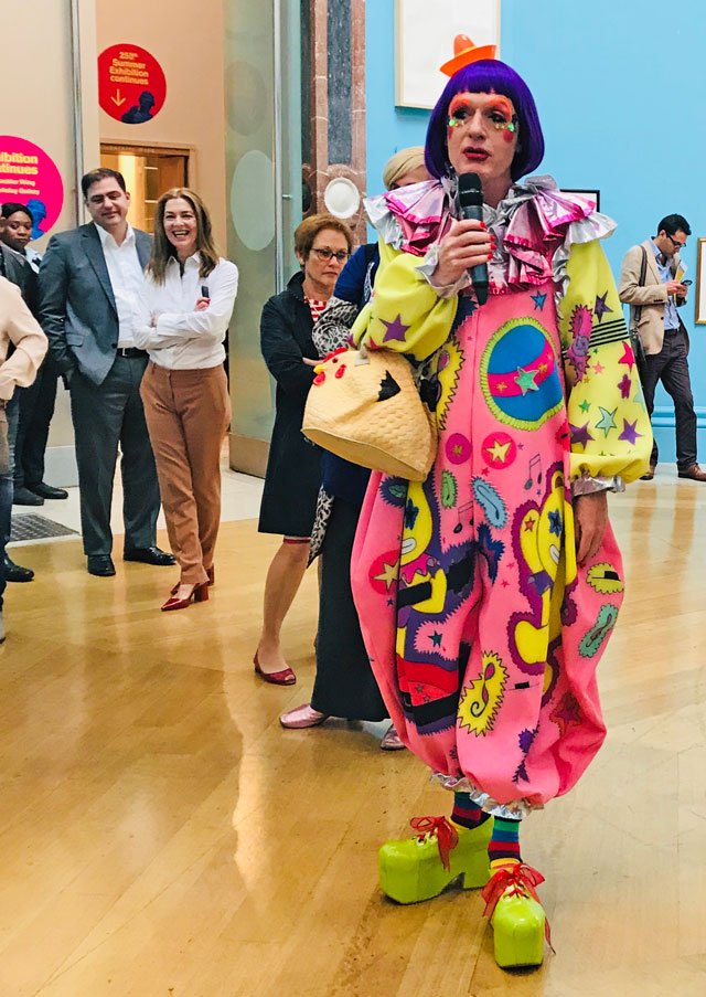
“This is not Documenta,” declares Grayson Perry cheerily to the assembled arts media at the show’s launch. “It’s just a bit of fun.” With that, Perry, the UK’s favourite, most flamboyant fine-art potter, throws down the gauntlet to anyone who thinks of the Royal Academy’s legendary summer exhibition as a forum for serious art. Invited to co-ordinate this, the 250th show since the RA was founded, Perry has come to the press launch dressed as his alter ego, Claire, in carnival clown costume: purple bobbed wig, diamanté dots adorning his cheekbones, in a kaleidoscopic costume of fuchsia, pink and lemon-yellow; it seems as if Perry has hung Gallery III precisely to match his outfit (or vice versa).
[image19]
This year’s hotchpotch amalgamation of amateurs, under-the-radar professionals and art-world stars are thrown against its lemon-yellow walls. Perry claims to have wasted no time pondering placements via themes, whether political or technical. Aided by his team of hard-working RA assistants and curators, “I stood at the top of a ladder and said: ‘I need something long and green there,’” he declares. Although he has, roughly, themed the colours in this particular room, moving through a spectrum from purples and pinks to the left of the gallery entrance, working round to reds and then blues.
[image18]
There is something joyous in this scattergun approach, the diversity of the offering sparking interesting relationships between unlikely adjacencies; and humour is liberally sprinkled throughout. My favourite wall in the show is the far (red) wall in this room, anchored by the darkly layered intensity of Idris Khan’s The Pain of Others (No 3), and Tony Bevan’s Tree No 2, its scratchy, vein-like branches bleeding into the huge white expanse of its canvas. The surrounding paintings seem to map out a constellation of every possible artistic and emotional response: from the sinister William Joyce and Friends by Mick O’Dea (a depiction of the Irish-American Joyce, known as Lord Haw-Haw, who broadcast Nazi propaganda to Britain during the second world war, and his black-shirted pals) to the joyously “V-flicking” old lady, Sandra AKA Nan, painted by Karl Rudziak; her forked gesture riffs beautifully off the bizarrely twin-pronged gun tank/house depicted to her left (The Joy of Melancholia, by Michael Sandle), and the scrawled declaration to her right, by Jordan McKenzie: Rich People Smell Funny. But amidst this ire, irreverence and intensity, Perry draws our attention to what he calls “possibly my favourite work in the whole show”, AC16 (2016) by Sarah Ball. This brooding portrait of a young black woman “became the still centre of the maelstrom of agitprop and slightly dubious works,” Perry says.
[image4]
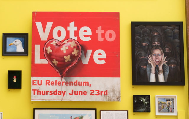
By way of example, he draws our attention to a “proper work” by Banksy: Vote to Love (2018) - a bastardisation of an EU-referendum leavers’ poster - which Perry says somehow validates the hanging of an eye-catching but possibly questionable work next to it (a gurning, unveiled white woman surrounded by burqa-wearing Persian women); Scream (2018) by Linda Sofie Jansson.
In this gallery, there are many overtly and quietly political works interwoven around the gags and more sombre painterly meditations: several directly reference the Grenfell Tower fire in London last year (which ripped through a public housing block, killing 72 residents). Many more reference Brexit (the UK’s impending exit from the EU), including a peculiar oil portrait by David Griffiths of Nigel Farage: the former Ukip leader, and trigger of the entire Brexit fiasco, wears an expression that wavers somewhere between smug and rueful.
[image20]
We can’t leave this gallery without mentioning the Pink Panther: Olga Lomaka’s sculpture, Infinity, is an elongated (3.5-metre wide) fibreglass rendition of the lovable cartoon sleuth, woven into a huge blue frame. Perry, in a video shown on the RA’s website declares: “I want people to go in here and say: ‘Wow. There’s a yellow room with a big Pink Panther in … And, ooh look, there’s Nigel Farage.’” He also declares, in a deliciously unfiltered essay that introduces the show’s catalogue, that he situated Lomaka’s work precisely where the President of the RA will be seated at the annual white-tie summer exhibition dinner.
The mammoth task of sorting through the 20,000 works that were submitted for the show by members of the public (upped from the usual cap of 13,000 in honour of the anniversary) and then hanging all the final 1,300-plus selected, including those of Royal Academicians, was undertaken in an astonishing three months, Perry tells us. To speed up the process, initial viewing was online. While it was easy, he says, to identify the works they loved or loathed, the vast terrain in the middle took a lot longer to sift through. “I’m still not sure if some of them are bad in a good way or good in a bad way,” he quips.
[image6]
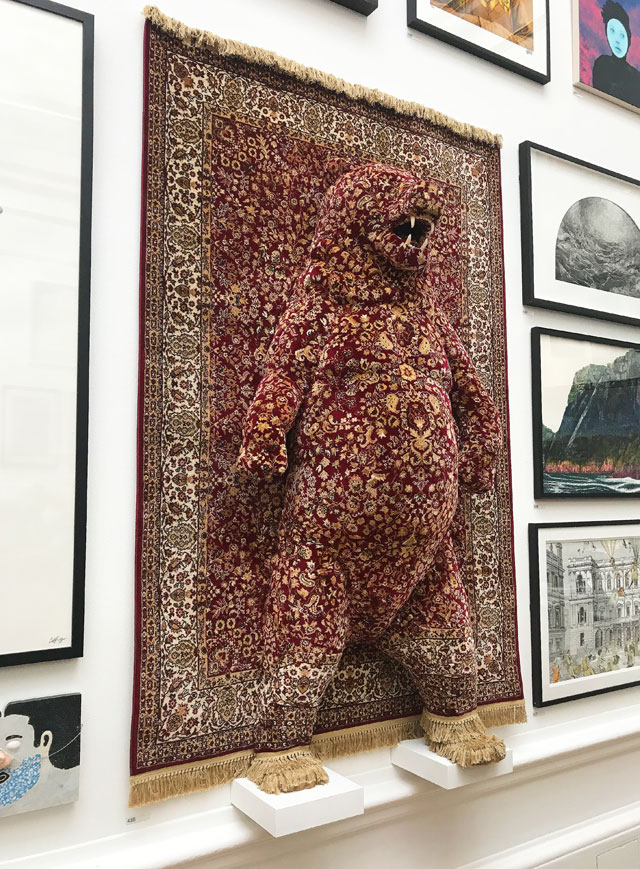
Perry and the RA team shared the selection process with a voluntary committee of Academicians, comprising Phyllida Barlow, Piers Gough, Allen Jones, David Mach, Humphrey Ocean, Chris Orr, Cornelia Parker, Tom Phillips, Conrad Shawcross and Emma Stibbon. Embracing the eclecticism of the process, Perry says that if just one person liked a work, it made it through to the shortlist. He admits the impulse to choose works with impact, such as Red Bear by Debbie Lawson. “We all thought, we’re definitely having that one,” he says. Unfortunately, the downside of going for the wow factor means that quieter works are often unfairly pushed into the background.
[image13]
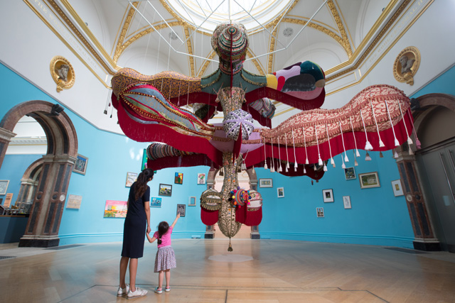
The biggest wow, however, comes right at the start of the exhibition – Royal Valkyrie, an enormous textile-draped inflatable by Joana Vasconcelos, hangs in the Wohl Central Hall (its dimensions 625 x 600 x 900cm). Covered in knitted, fringed, crocheted, patchworked and tasselled fabrics, the work trembles and shimmies like a multi-limbed belly dancer, almost entirely eclipsing the work around it.
[image8]
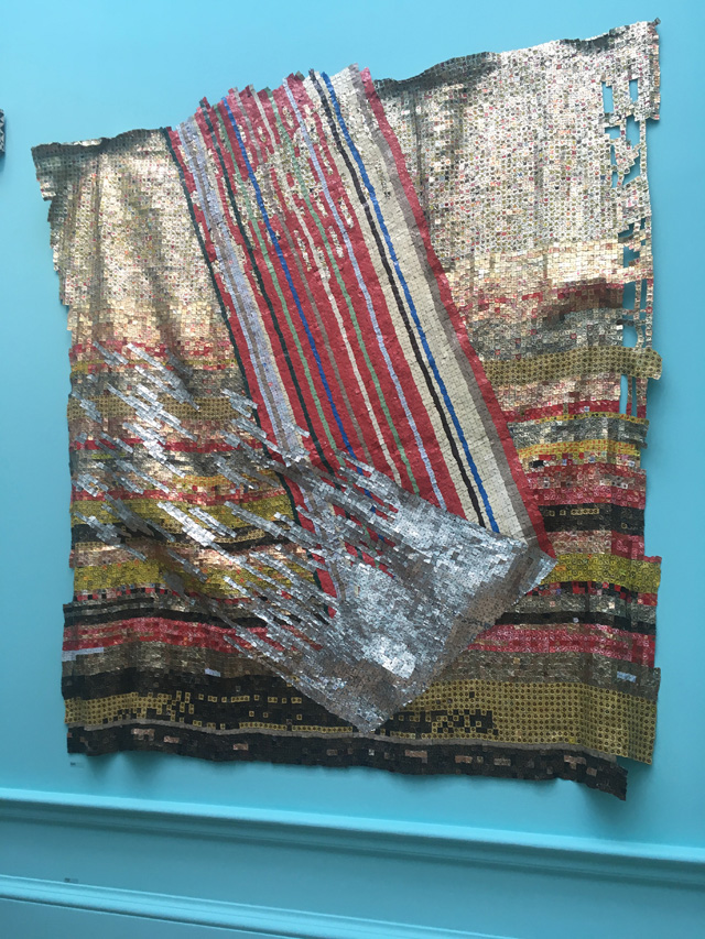
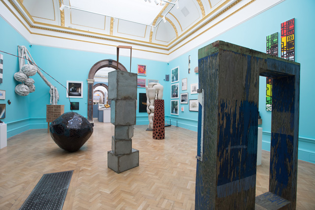
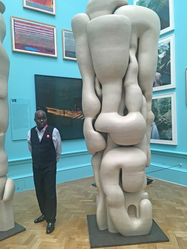
Perry’s original remit was to co-ordinate the hang over the entire complex of rooms across both the original Burlington House and the newly conjoined Burlington Gardens (refurbished, expanded and now linked, thanks to a David Chipperfield bridge). But other plans intervened and some committee members have taken charge of their own rooms. Phyllida Barlow’s blue-walled Gallery VII offers some wonderful moments, especially honorary Academician El Anatsui’s shimmering textile Change in Fortune and Tony Cragg’s two tree-like, melting statues Lost in Thought and Lost in Thoughts.
[image12]
David Mach has chosen a metallic-silver wall treatment for his Gallery V hang, which makes the generally smaller and often geometrically similar groupings appear more decorative, gemlike and collectively appealing rather than individually interesting. Interspersed sparsely across the entire wall, it is a shame to see Nicky Hirst’s wonderful New World (2017), (as seen in Studio International’s review of her solo exhibition at Domobaal last year) stuck right up against the ceiling, its simple, found-object eloquence barely discernible.
[image3]
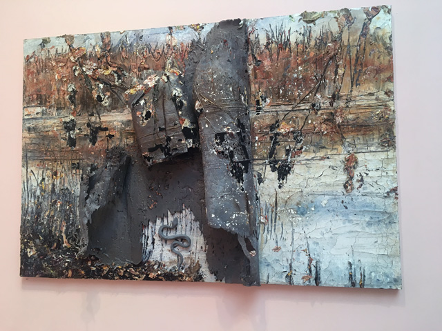
The Lecture Room has been hung by Tom Phillips and Allen Jones, with works grouped in a loosely colour-themed arrangement against pale, fleshy-pink walls. It is dominated by two large works by David Hockney, but the real revelation in the room is how much more intimate and disturbing Anselm Kiefer’s work Gehäutete Landschaft is, with its dreary greys and creams and rigor-mortis blues set against these pink cupcake tones; it adds a whole new realm of seediness. These tones, however, serve to make the radiant face of the pink-scalped, hairless woman painted by Samantha Parkhouse, in Fortitude, all the more powerful (it was painted in 2016, when Parkhouse undertook work with a charity called Look Good Feel Better, which helps women manage the visible effects of cancer treatment).
[image15]
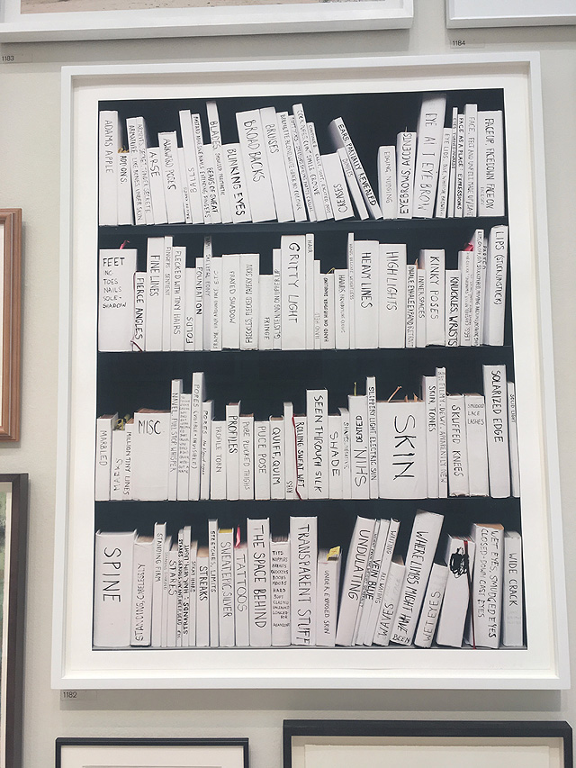
Prints – the most popular items among the art-buying public – are shown in the Sackler galleries, curated by Chris Orr and Emma Stibbon. Perry’s own two-metre wide woodblock print Selfie with Political Causes pulsates with puce-hued intensity and hashtag hubris, thankfully complementing and not dominating its largely monochrome neighbours. It occupies its own wall, as does Human Cargo (Triptych) by Paula Rego and a series by honorary Academician Jim Dine, Tools in a Puzzled Vessel (one-eight).
[image11]
Although there may be as many lesser knowns or unknowns exhibited in these rooms as famous names (Richard Long, Cornelia Parker, Fiona Banner et al), the quality suddenly seems to level out and cohere into something far more consistent and consistently interesting. There is a handful of sculptures, too, including one of a young girl, leaning forward with a tottering pile of books, by Yinka Shonibare, called Young Academician. The sculpture is a tribute to all the RA’s female members (there are currently only 26 female Royal Academicians out of 79, or 36 out of 125 in total when Senior Academicians are added into the mix.) but new Academicians can only be appointed when old ones die, so parity will inevitably take time).
[image16]
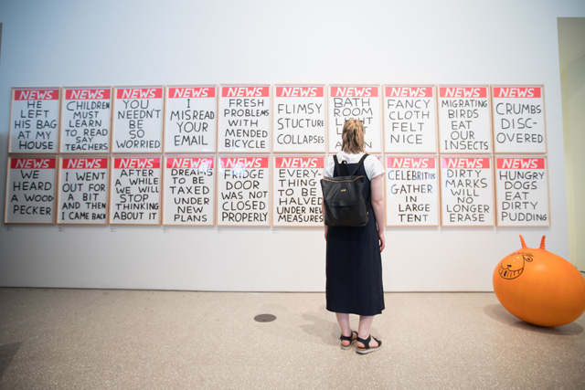
Across the bridge into the new Burlington Gardens spaces, the McAulay Gallery is Perry’s “room of fun”, although the fun feels strangely diluted thanks to its forced ubiquity, compared to the richness and contrasts of his main gallery curation. There is a titter-worthy wall of “news” by David Shrigley, and a shameless plug for Perry himself, in a selection of portraits that have been sent in of him by the public – such vanity! The architecture gallery (Gallery VI) also underwhelms via the relative uniformity – or impenetrability - of the architectural model to most non-architects; although Piers Gough has tried to make it more immersive by placing this surreal cityscape of speculative buildings at eye level.
[image7]
[image5]
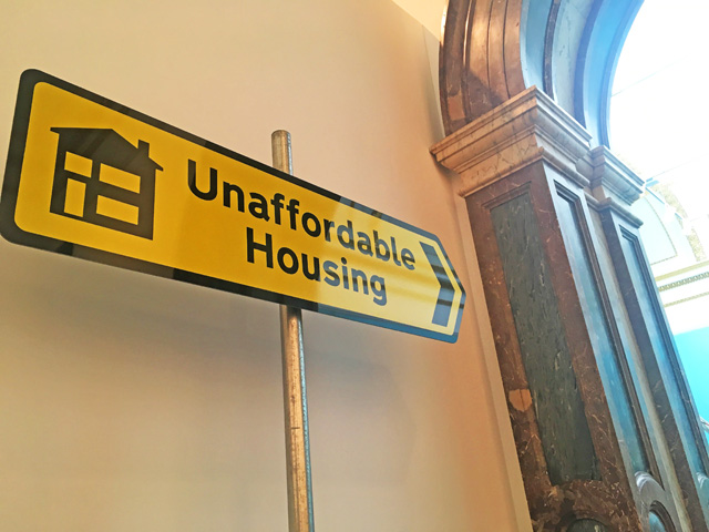
In a show that celebrates humour, the standout funniest moment for me is in the gallery beyond these miniature skyscrapers and sculptural towers: a seemingly generic, local council-style directional sign by Carl Godfrey, declaring “Unaffordable Housing” pointing firmly in their direction. A close second, however, was reading Perry’s tart comment in his catalogue essay at the “manspreading” of some of his fellow Academicians. Clearly infuriated by those who submitted often overscaled and “muddier output” late, Perry has christened their works “fatbergs” because, he says: “They blocked the process of hanging a fresh and uplifting show.” A genuine breath of fresh air is breezing through these hallowed halls. May that spirit of change persevere.
-VSimpson.jpg)
VSimpson.jpg)