by EMILY SPICER
“I sometimes think about a shadow. If you look at someone’s shadow, you can see their character or what mood they’re in,” Julian Opie (b1958, London) tells me, at the opening of his show at Lisson Gallery in London. How we interpret the world around us, how we see shapes and colours is a central concern of Opie’s work. “I’m not looking at you,” he says to make a point, “I’m looking at the light that is bouncing off you. Turn the lights off and you’re gone.”
All artists deal with our experience of reality, whether they are reimagining it, or trying to capture it in some specific way. Opie, however, questions it altogether. “I think it’s what’s in front of us that defines what we feel in ourselves, the fact that we’re alive, that we’ve woken up today and are experiencing what could be a virtual trip, as if we were watching the Matrix. We assume it’s real and that’s OK; that’s the best way to get on.”
Our recent experiences during this pandemic year may well have made many of us feel that we are living in someone else’s dystopic vision of the world, one in which we have to wait for the prime minister’s permission to hug our friends. But in a time of strangeness and isolation Opie’s bold images, which resemble everyday signage, are almost reassuring. His figures are usually mid-stride and dressed for action and, by grouping them together, he suggests the essence of a crowded street and so reminds us of life before Covid-19, a life we many soon be returning to.
Emily Spicer: Has lockdown changed the way you work, or the way you see your work?
Julian Opie: Yes. I employ 12 people with whom I work quite closely in two different studio buildings in the Shoreditch area of east London. We’ve followed the various waves of furlough and having no one there at all and then carefully some people back. That’s been a balancing act. With the quietest periods in the first lockdown, we basically shut down and I just used the building myself. There were some ways in which it was actually quite fantastic to feel like you had the whole day in front of you with no particular demands. I think it taught me quite a bit about what I enjoy and what I like and how to work. It’s slightly back to how it was, with my head spinning at the end of the day with all these different projects, so I don’t think things have changed in a permanent way, but maybe I’m mindful of that other way of working and how much I like the quietness.
[image3]
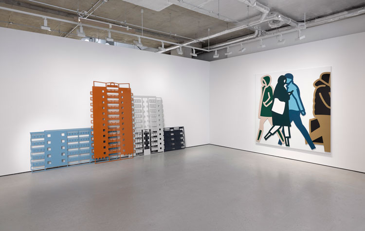
I was supposed to have done a show in Oslo and a show at the Pitzhanger Museum in London before this exhibition. It’s all been shifted back and forth. Now the Pitzhanger show is happening next month. For the show in Oslo, I was asked to draw Norwegian people and I don’t really like to be asked to do specific artworks, so my immediate reaction was no. But I wanted to respond to having been asked to do something and I’ve been making a series of works about historic buildings in London and Portugal, looking at them almost like a tourist. I thought I would do that in Oslo and maybe turn it on its head by looking at the most un-notable, suburban buildings. But, of course, I couldn’t go there, so I did what I never do and went on the internet and found it was easier. On Google Earth you get an aerial view of the building, whereas when you’re on the ground, photographing a tall tower, it’s a difficult perspective. I spent the darkest days of lockdown in Oslo, travelling around the suburbs, manoeuvring myself around the buildings and the tower blocks in this exhibition are the result. They are all of a certain type; they are suburban, European apartment buildings. I think they become something close to a hieroglyph, something close to the words “modern building”. I want them to act as a pictogram, something you can immediately place and relate to and scale yourself against.
ES: I know you have always been interested in figures, but with the lack of people to take inspiration from during lockdown, do you now find yourself hungry for crowds again?
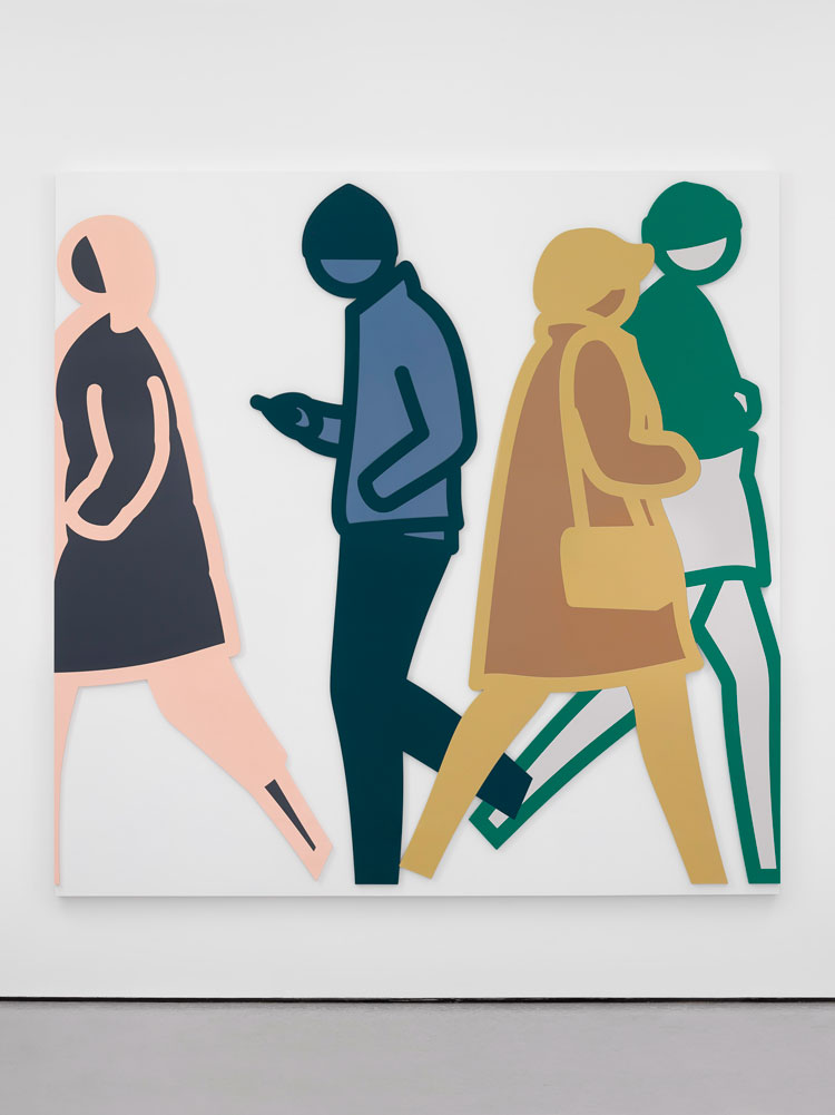
JO: There’s no shortage of figures. Even in the quietest of times. In the past, I tended to photograph people on the street and I’ve done that in Mumbai, Tokyo, Boston and recently in Belgium. But I don’t need many and I’ve come to the conclusion that I’m more interested in having an ongoing relationship with the people. I can photograph them, go back to the studio and draw for a bit, decide what I want. All I have to do is walk to the end of my street and that gives me the option of going back at different times in the day, in different weather, and at different times of the year.
[image2]
ES: And what do you look for? Presumably in London, where the streets are usually crowded, you have to be selective about the figures you choose.
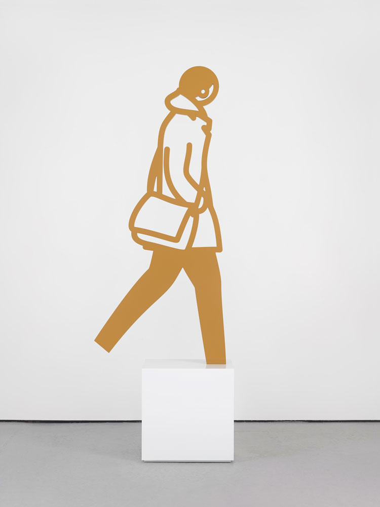
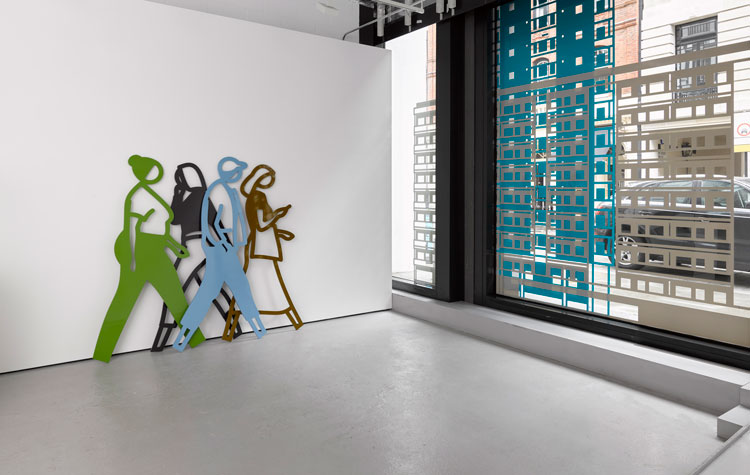
JO: I spend some time photographing people, but I spend longer choosing them. A photographer in Melbourne sent me thousands of photographs and the challenge then is to pare them down and I have various systems. There’s an awful lot of people you can’t draw because something is wrong with the picture – their feet are in the wrong place, or they’ve got a bag I can’t draw. Rucksacks are really difficult. They’re basically shapeless black forms on people’s backs. I need people to be in a certain moment in their stride, a moment that is balanced with their knees bent and their weight on one foot. So that rules out two-thirds of the photographs. I’ve got to feel like the figure would be great to draw with a good pose with clothes that are clear. From that group, I’ll draw all the people who are drawable and then I’ll play with them and mix and match them into groups.
ES: I find it interesting how much you can convey with just a few lines. The attitude of a head, for example, says so much.
JO: It interests me, too, and it’s not something I particularly set out to do, but it becomes clear very quickly that you don’t need much – just the tilt of the head, or one item of clothing. When those things are confounded or described, there is a certain excitement, I think, in joining in that recognition of the world, a reading of it. I think the work is about how we interpret and read the world, how it feels. I don’t want to draw anything particularly special and I don’t want you to get too involved in who these people are, or where the buildings were from, or what it means historically. That’s why I choose really standardised buildings. And you can view the people as a landscape and not get too involved in any specific story or meaning, but instead recognise the process of looking and the process of feeling what’s in front of you.
[image5]
I’m also interested in how you maybe respond and read not just the image, but the quality of the surface, whether it’s shiny or matt. You can see that the whole show is about the difference between a matt surface and a shiny surface and that’s kind of boring, the kind of thing that artists like to get involved in. But I think when you see it, it seems quite a potent and enjoyable thing. You can probably relate that to looking at water on a beach, the way the water moves up the sand. You’ve got this intermediate area that is going from gloss to matt, which is the wave hitting the sand and then sinking down again and it moves beautifully from a reflective surface to a fully matt surface. And that kind of play just makes you very aware of the process of looking and the process of being there and being alive.
ES: Why do your figures have no feet?
JO: People do quite often ask that. I do sometimes draw feet. I went through a whole phase of feet and at that point I also drew necks. But you have to decide on the level of detail. There’s a lovely sign about taking the fire stairs. It has a zig-zag hieroglyph to show you the stairs and a stick person walking down and that’s all you need to know.
[image4]
ES: We so rarely see a staircase in profile, yet we recognise the symbol.
JO: Yes, we certainly do, that’s a good point. You often don’t see that, but you can read it. And they don’t show the feet and they don’t show the necks, because if you want to give information quickly and make it readable as you open the door, you don’t want to have more information than is necessary. There’s a whole conversation that goes on down at the feet, but that’s not the way this picture works. Many of my pictures function with the different colours and actions of each figure, which I think would be lessened if your eye was flicking down to the feet. It would take the painting somewhere else and disallow me from playing the kind of games that I’m playing. The depth of the coloured Perspex, which is about 2cm, creates a very strong hieroglyphic, almost like an Egyptian carved frieze, all of which I think would maybe not work so well if I included the feet.
ES: How do you choose your colours?
JO: I’m glad you asked me that because there’s a good answer! I think Andy Warhol said, if you have to make a decision, something’s wrong. We used to quote that to each other as art students all the time. There shouldn’t be that question; it should be that only one thing is possible.
The colours I use come from a period when I was drawing people in full colour; their shoes were brown, their trousers were blue. But, technically, that is a hell of a lot of colours to try to define and follow and check and the fact that I’m really quite colour blind makes that a pain. So I looked at each person and tried to imagine I was pushing down Oxford Street and seeing the people coming past me only in terms of a colour each. I think if you kind of phase out a little bit, you can do that.
ES: It is interesting that you see your work slightly differently from how most people see it, based on the fact you have a degree of colour blindness.
JO: You can only assume that everyone sees things slightly differently, but colour blindness is quite a specific thing that comes from a lack of a certain set of cones in the eye. My teacher, Michael Craig Martin, was colour blind and we used to wonder whether someone like Fernand Léger might have been colour blind, too. To separate colours out and make a very clear language is helpful. My son has been teaching me the Rubik’s Cube and I can’t even begin to play with most Rubik’s Cubes – they just annoy me too much because I can’t tell the difference between the colours. So it can be frustrating, but at the same time, it gives me a certain ability to play with colours. Maybe someone else would feel more overwhelmed, but I see less of a range
• Julian Opie’s exhibition at the Lisson Gallery, Cork Street, London, runs until 12 June 2020. His show at Pitzhanger, London, will run from 25 June to 24 October 2021
.jpg)