Marlborough Fine Art, London
6 March–5 April 2013
by MICHAEL SPENS
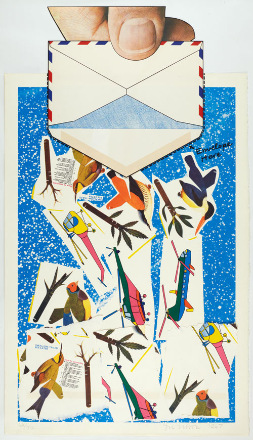
Reviewing the paintings first, one is reminded of the part played by Tilson in the explosive and effervescent year of the Royal College of Art, that galactic sky burst of talent which included Frank Auerbach, Leon Kossof, R. B. Kitaj, Peter Blake, Allen Jones, Patrick Caulfield and David Hockney. Tilson scooped up the Rome Prize that year, 1954, and took off for Italy, a life-transforming move. Fortunately this was also a great period for the Phoenix-like Marlborough Gallery, which as the Marlborough New London Gallery gave him a first solo exhibition in 1962, followed by a second show in 1964.
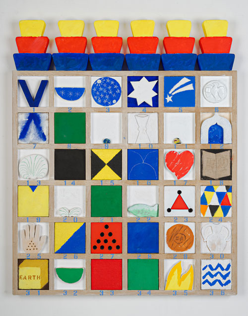
Of Tilson, this Editor’s first experience, while still a Cambridge architectural student was of that emblazoning show of 1964. With a small windfall that came my way I managed to acquire there a superb painted construction, Geometry? 4, executed following: Geometry 3? (1964). It is now with Aberdeen City Art Gallery. It is a salutary reminder now to see on the wall, the latter work, in oil and acrylic on wood relief. Typically the wood-frame assembly (nine panels) is an immaculate piece of joinery, providing a versatile frame for the dramatic red/yellow/black and whited composition, behind which also evident is Tilson’s personal exploration of the time, into numerological theory, “layered with meaning” as Marco Livingston says in his catalogue essay. The years that followed Joe Tilson’s debut period have, over six decades (also virtually the span of his long and productive marriage) shown nothing less than an enhancing trajectory of works of diverse content with always the background of his experimental research into ways and means.
As Hannah Rothschild (in her graphics essay explains), Tilson was in 1965 invited to join the Manhattan gravy train, understandably encouraged and on occasion accompanied by Frank Lloyd of Marlborough, who realised his potential early. The New York teaching period further focused Tilson’s awareness of the expanding possibilities of screen-printing. Back in London he linked up successfully with Chris Prater’s Kelpra Print Studio. What is significant however is that Tilson the painter was already so to say embedded in Italy: Milan, Rome and then Venice. The exhibition of original works charts this development of an inspirational subject matter. Italy was indeed to prove to be a kind of Utopia, and America (or Manhattan) a rejected, if once admired, Consumer Dystopia.
In the work through the 1980s and 1990s the work is explicit in that rejection. In the Conjunction series this consolidates. The print medium allows Tilson to express his sympathy for the Czech martyr Jan Palach and his revulsion at Soviet oppression. The paintings later involving several Venetian church facades seem to focus the whole dilemma or summation of the Renaissance church façade, its meaning or not, the subject of volumes of verbiage over two centuries and more. A painter’s forensic insight is today perhaps more valuable than that of architects. So Tilson’s explorations raise valid questions, beguilingly expressed in paint, more usefully since the buildings are not much on the tourist trail, in the Tilson’s neighborhood. Thus the intellectual composition of the paintings, and their compelling attraction notwithstanding, validated the painter’s stance.
This exhibition, and its documentation by Marlborough, stand to as a salutation to continuity. To Marlborough, to Joe and Jos Tilson, and dare one say it, to a solid critical following and long-term marketing base.