by CASSIE DAVIES
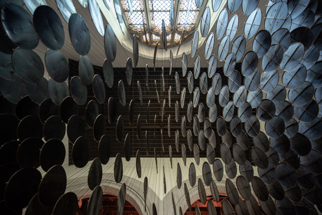
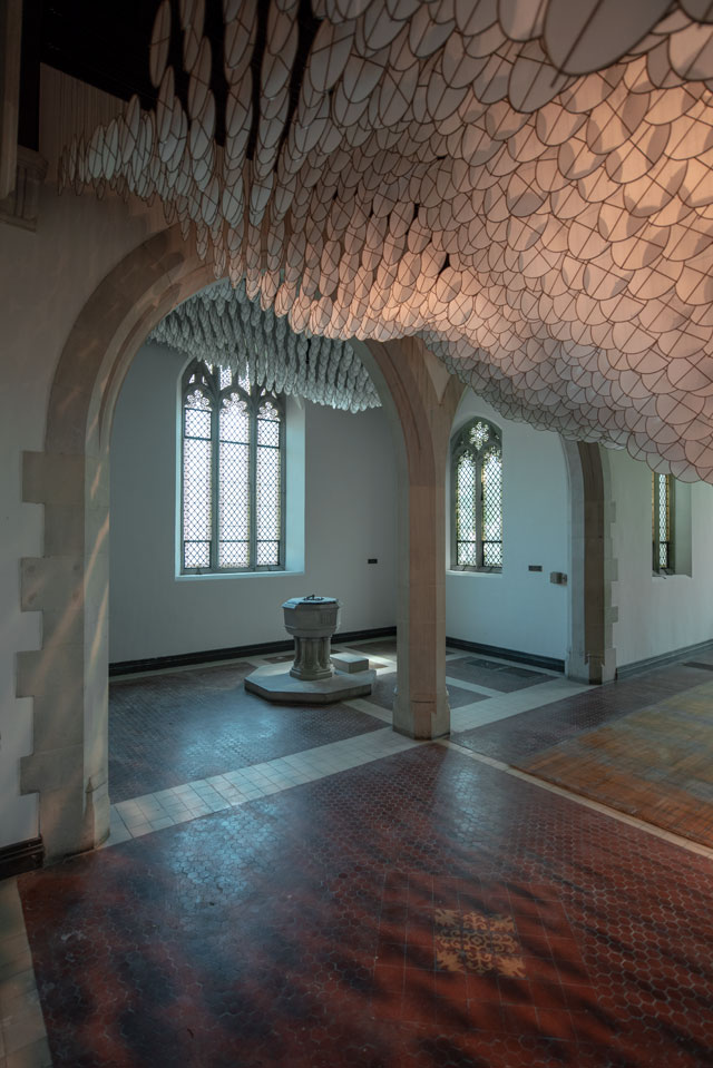
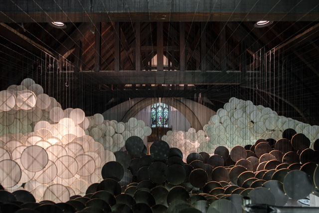
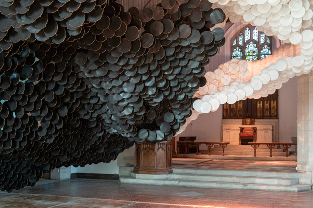
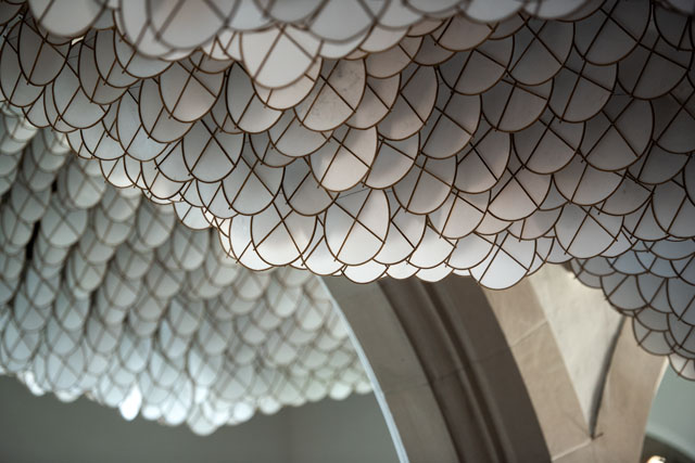
Jacob Hashimoto (b1973, Greeley, Colorado) is known for his large-scale installations composed of thousands of hand-crafted paper and wood kites. The Eclipse (2017-18), currently on show in St Cornelius Chapel on Governors Island, a short ferry-ride from Lower Manhattan, is exactly this: more than 15,000 circular black and white kites hang from the ceiling, taking the shape of a tornado. Printed on the black kites, and only seen in certain lights, is the American flag. The piece, as Hashimoto explained to me during our interview, was made after Donald Trump’s election in 2016. It was first presented at last year’s Venice Biennale, then at the Leila Heller Gallery in Dubai, before making its way to Governors Island.
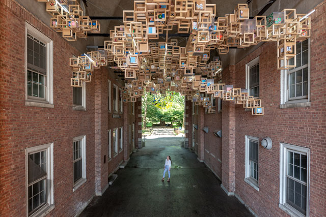
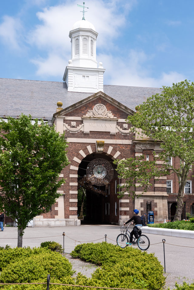
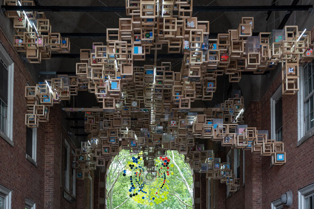
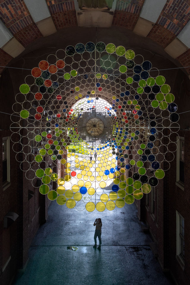
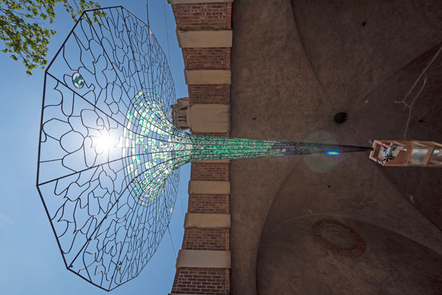
Presented nearby The Eclipse is a second installation, Never Comes Tomorrow (2015-18), suspended in the archway of Liggett Hall, the largest military building in the US until the Pentagon was constructed. The piece consists of hundreds of small wooden cubes and two large steel funnels, a vortex-like design that references Hashimoto’s interest in cosmology and history. Like The Eclipse, Never Comes Tomorrow also has its say on Trump: encasing the wooden cubes are hundreds of stickers that Hashimoto made and collected from the Women’s March and the inauguration protest.
I spoke to Hashimoto via Skype to find out more about his work and ideas.
[image10]
Cassie Davies: I would love to hear about your creative process. The paper kites of The Eclipse are so delicate, and I imagine they require a lot of care to put together. How do you make them?
Jacob Hashimoto: We source all the round kites from a dragon-kite manufacturer in China. About 15 years ago, I was interested in making circular kites and taught myself to do it. You have to heat form bamboo and bend it, then lash it together. At the time, I was working with one assistant and it was taking about 10 minutes to make one kite, which is too long. I knew that the circular kite traditionally came from China, so I started looking for manufacturers in the city of Weifang, the historical centre of Chinese kite-making. I found a company doing hi-tech kites, but the father was still making traditional kites, and he had been working for several fashion houses in New York and had also worked with international companies. So, I reached out to him to start building these round kites for us, and we took that kite and made it so heavy that it couldn’t fly. I just wanted the bamboo ring with the two cross-sticks, and I told them I would do everything else. I convinced them to put this together, and we had those frames sent here and we did all the paperwork on them.
[image9]
The paper comes from Japan. It’s a type of rayon paper that we use as the foundation for everything; it’s traditionally used for archival document repair and other forms of restoration work. We buy rolls of it from a manufacturer in Japan, and then soak sheets of it in acrylic primer, drape them over the frames, and then they dry in the studio. Once they’re dried, we sit around for days and cut them out. That becomes the first layer. In the case of Eclipse, the white kites are made from this rayon paper and the black kites we had screenprinted, and then we added a second layer of black paper.
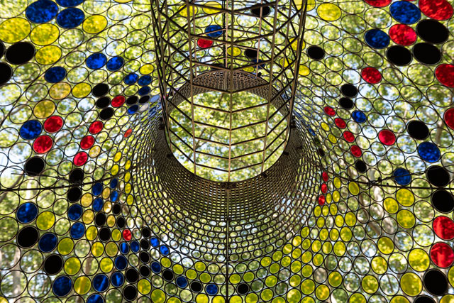
CD: I wanted to ask you about the American flag on the black kites. You can only see them in certain lights, and I wasn’t sure if they were an act of patriotism. Does this have a particular meaning for you?
JH: The piece was originally made for a palazzo show, at Palazzo Flangini, during the 57th Venice Biennale. Then, later that year, it was shown at Leila Heller Gallery in Dubai, UAE. Trump had been elected in November 2016, and I knew I had this show coming up in Venice, and I was having this debate with myself, because it’s a big international venue and, as an American artist, it felt it would be tone-deaf of me not to at least acknowledge what was going on in the country.
[image8]
The American flag in the piece is a blood-red screenprint on black paper. When it dries down it looks very much like an Ad Reinhardt painting, with two tones of black, and I thought it was nice to have this art-historical reference. In its original configuration, the piece looked like a tornado, so it was also this storm that was coming. The Eclipse is, in some ways, the eclipse of the last 30 years of progress in this country, and the potential eclipse of even more. It is patriotic in the sense that I believe we can do better; it is patriotic to talk about what you feel is happening in your country. It’s been interesting having it on Governors Island because it’s a non-art crowd there, so you’re dealing with a lot of people around all the boroughs. Staten Island is right across the water, and it’s the one borough of New York City that voted for Trump.
You can feel the tension when people start seeing the American flag. Since 9/11, the right has had a relationship to the American flag that is a little scary. Somebody on the radio the other day was talking about how, if he’s looking for a place to live, if he sees more than two American flags outside the houses on the block, he doesn’t want to live there. It’s a certain political group of people who are using the flag in a very specific way.
When we did the piece in Venice, it felt very Nosferatu, a single point of clouds that could be bats in the sky, like a horror movie, and when we brought it to the church on Governors Island, the big concession I ended up making was to not have it starting in the pulpit, because it just felt like a vampire movie, and I didn’t want it to do that. If you have this cyclone of black swirling out of the centre of the church, it looks like some 80s horror film.
[image3]
CD: That leads me to another question. I’m interested in the way this installation affects the sites in which it is presented. Governors Island has a particularly interesting military history. The building in which Never Comes Tomorrow is shown was, until the Pentagon, the largest military building in the US. How much do these places influence your work?
JH: In this case, because both pieces existed before we came to the site, there was an effort to understand their relationship with the location, and understanding what that means.
For example, if we had a stack of cards with pictures on them and we picked one with a picture of a car on it and another with a picture of a leaf, if you’re the artist and you made one of those cards, and someone gave you the other, you need to understand what narratives that audience could generate out of those two images. If you have a skull and a baseball bat, what does that mean?
[image4]
There was a lot of discussion about what Never Comes Tomorrow means in this context, and how the location might change the meaning, and whether it is effective for the socio-ecological and political mission of the island. I had to think about how people who aren’t accustomed to seeing art might relate to it, how artworld people relate to it, and then consider how the piece changes in the context of this archway in a row of former military houses, with the food court and the hammock park on the other side. Understanding what that piece was going to do hinged on understanding the components that would make up the narrative for the people seeing it. Once it goes outside the gallery, you’re dealing with the world.
[image5]
The consideration on Governors Island was in large part the audience. I had some concerns about Never Comes Tomorrow because there’s a whole bunch of political stickers all over it. Originally, you could walk up to the piece at eye level, but now it’s so high up that you can’t really see them. I created some of these stickers in the studio, but there are also bicycle stickers, political bumper stickers that we picked up when we went to the Women’s March, “Not My President” bumper stickers that my father and I had when we went and protested at Trump’s inauguration, and “Refugees Are Welcome Here” stickers that I ordered from this guy in Germany. All of these are tucked away in Never Comes Tomorrow. I don’t think anyone has seen them yet. I was a little nervous about putting the piece up because I was worried someone would get up in arms about it, but, unfortunately in some ways, the piece is so high up that you can’t see them.
CD: I read that Never Comes Tomorrow also references your interest in cosmology. Could you tell me more about this?
JH: I consider the piece to be a self-portrait. When I was building it for the show in Italy, I was doing a bunch of paintings about exoplanets in collaboration with an astrophysicist at the Museum of Natural History in New York. She and I had been working on these paintings, and these really influenced the piece.
[image6]
But I was also thinking about other things I was interested in. I had been out at the Queens Museum, and they had a room full of Tiffany lamps, and I was interested in the way Tiffany had taken this generic, Asian, decorative language and co-opted it into these classically New York, classically American, art objects. As Americans, we do that all the time – we take language that’s not really ours and we steal it. It’s something artists used to do more, and now they’re getting into trouble for cultural appropriation, but Tiffany did it without any problems and so did Matisse. The history of art is full of cultural appropriators, and I do it, too. So, I wanted to see if I could tie some of that language up with this piece. I had this notion that I could build these giant black holes that look like Tiffany lamps, and I had all the parts of a Minecraft sculpture I had built years before in Sweden – I had appropriated it – and I wanted to find a way to use it. If you look at the green funnel, it’s completely clad in translucent green icons from Minecraft; then, the black hole stuff is coming from another body of work, and then it has all these stickers. I was interested in all of these things.
[image7]
CD: I like the way that you referred to this piece as a self-portrait. We have spoken about your work in relation to politics, history and cosmology, but it also seems to have a personal, autobiographical story behind it. Deep in the Gravity Well, My Own Lost Romance, The Dark Isn’t the Thing to Worry About. Could you tell me more about how you want your viewers to understand these titles?
JH: I felt people used to approach my work in a really predictable way. As critics started writing about it, there was a lot of discussion of the meditative quality of it, the zen-like characteristics, framing the work with all these stereotypical Japanese connotations. I realised that the more you let the work sit by itself, the more you allow people to take on this narrative. But if you take something that’s a minimal, zen piece and you put a psychosexual, crazy title on it, some sort of narrative title that’s long and complicated, it makes people step back and ask questions about the meaning of the work. It makes people think about their relationship with the narrative and the object in front of them, and the artist. I wasn’t getting this for a long time, but when I started giving my work more poetic and evocative titles, it made people ask more questions about what it meant. Especially when you pair a beautiful, fragile, ethereal piece with a dark, heavy, ponderous title, these juxtapositions force people to second-guess their assumptions. It makes people curious.
CD: Finally, you work with a lot of colour and pattern. Some, such as those in Light, Like Static Vanished into Shadows, have a festive, almost joyous, feel to them; while others, like the black and white of The Eclipse, feel more solemn and meditative. How do you think of the relationship between colour and mood? Is this something you think about when you’re composing your work?
JH: Years ago, I was at a show in Chicago and I was standing next to a graduate student, and he told me he thought my work was about colour, but, really, it’s about value. I thought that was very insightful. I’m not really a colourist, not in the sense of Joseph Albers, I’m not trying to use any system to create specific moods. Colour is a great entry point for people and, when I was starting out as an artist, I was thinking about how to get people to look at my work and to understand the language of it. Colour was a device that got people to look and attempt to decode the language of my artwork.
I definitely deal with colour more intuitively depending on how I’m feeling, and often I’m looking for awkward colour situations. With pieces up until Gas Giant, I was focused on creating work that was colourful, more celebratory, creating a sense of optimism and possibility. But this was also interesting and healing for me to work on. Making artwork is hard, showing artwork in the world is hard, being a human is hard, so sometimes it’s therapeutic to make these artworks that are hopeful and have a powerful sense of potential. I think that’s why colour is really important, because it has the ability to drive the energy of the artwork.
• Jacob Hashimoto’s The Eclipse is at St Cornelius Chapel and his installation Never Comes Tomorrow is at Liggett Hall, on Governors Island, New York, until 31 October 2018.