
David Batchelor, Concreto 5.0/01, 2012. Courtesy © the artist and Compton Verney.
Compton Verney, Warwickshire
25 June – 2 October 2022
by DAVID TRIGG
Writing in his famous Confessions, Saint Augustine claimed that he understood time – until, that is, he was asked to define it. The same could be said of colour, which, like time, is also a headache to explain. As the Scottish artist David Batchelor has said: “Colour is universal, but at the same time no one really knows what it is; it’s very familiar yet also entirely strange.” Batchelor (b1955) has been concerned with the slippery nature of colour since the early 1990s, exploring its richness and complexity through sculpture, painting, video, drawing and the handful of books he has written on the subject. This long overdue survey at Compton Verney covers 40-plus years of work, charting his sustained interest in the way that colour is experienced in the urban realm while revealing preoccupations ranging from pattern and geometric abstraction to time and analogue materiality.

David Batchelor, Colour Is, 2022. Installation view. Courtesy © Compton Verney. Photo: Jamie Woodley.
At the exhibition’s entrance is Chromodisc (2019), a glowing halo that resembles an electronic bug zapper but is, in fact, a chromatic clock. Over the course of an hour, it cycles through the entire visible spectrum, tracking the minutes via tiny gradations of colour. Reflecting Batchelor’s interest in the relationship between colour and time, it reminds us that colour is always a temporary phenomenon, occurring under particular conditions and perceived only with the presence of reflected light, the varying wavelength of which determines its hue. Chromodisc’s practicality as a clock, however, is limited: whether it is a quarter past blue or half past yellow, there is no way of knowing what the actual time is.

David Batchelor, Colour Is, 2022. Installation view. Courtesy © Compton Verney. Photo: Jamie Woodley.
Attracted to the unnatural intensity of artificial hues, Batchelor responds to colour as it is experienced in the city. His best-known series, I Love King’s Cross and King’s Cross Loves Me (1997–2009), sees acrylic panels painted with bright enamel fixed to small dollies of the sort commonly used in warehouses and factories. These monochromes on wheels, which can be arranged in endless configurations, gently prod at the formal reductionism of late modernism while referencing the industrial production of modern pigments. There is also the suggestion of motion, which is subtly echoed elsewhere by the large balls of scrap computer cable in Dog Days (2006-12), a series of coloured spheres that evoke lightning speed data transfer and the millions of digitally generated colours that fill our screens in an increasingly interconnected world.

David Batchelor, Colour Is, 2022. Installation view. Courtesy © Compton Verney. Photo: Jamie Woodley.
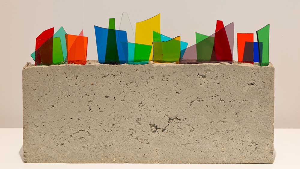
Synthetic household paint is the main ingredient of Colour Chart paintings. Each one is made by pouring the sticky substance on to a white panel to form an imperfect ovoid: then, while the painting is still wet, it is gently tilted to encourage the formation of wrinkled patterns. To these intense hits of colour, Batchelor adds rectangular plinth-like bases, giving them an appearance more like proposals for improbable sculptures than hard-edged abstractions. In this, they are echoed by the artist’s Concreto sculptures, in which small blocks of concrete become supports for a motley collection of vividly coloured found objects. The earliest Concretos feature shards of coloured glass, an alluring yet slightly menacing material that has since given way to studio leftovers, Perspex offcuts, assorted stationery and sundry bric-a-brac.

David Batchelor, Colour Is, 2022. Installation view. Courtesy © Compton Verney. Photo: Jamie Woodley.
If Batchelor’s Concretos have a celebratory air, this is even more evident in the larger Inter-Concretos (2019 – ongoing), in which shards of acid-hued Perspex explode from raw concrete blocks. Batchelor likens their jagged, patterned forms to artificial floral bouquets, but they rather evoke fizzing roman candles or birthday cake sparklers. Similarly cheery are the Covid Variation paintings, though on closer inspection these felt-tip-hued compositions of zigzagging lines speak to the context of their making. Painted with thin, watery paint and looking like tentative Frank Stellas, their unfinished, even fragile, quality reflects the uncertainty and anxiety of the pandemic. Conversely, the enormous Corona Shuffle 10 (2022) displays more confidence; its repeating patterns of black and coloured isosceles triangles bringing to mind the hard-edge abstractions of Karl Benjamin as well as the monotony of lockdown.

David Batchelor, Corona Shuffle 10, 2022. Courtesy © the artist and Compton Verney.
Batchelor’s Chromodisc is one of several works the artist has made with illuminated colour. Another is Magic Hour (2004/7), which suffuses a darkened room with a vivid cloud of rainbow light. Inspired by London’s streets after dark, the sculpture comprises an irregular grid of salvaged commercial lightboxes, each one overlaid with a differently coloured acrylic sheet and turned to face the wall. Standing as a metaphor for the contradictory character of city life – at once glitzy and seamy – the work evokes the colourful signage of city shops, takeaways and bars, contrasting seductive reflected light with the dull mass of wires and electronics that usually remain hidden from view, but here become an important formal element.

David Batchelor, Magic Hour, 2004-07. Found steel and aluminium light boxes, found steel support. Courtesy © the artist and Compton Verney.
Sometimes, it is the absence of colour that excites Batchelor’s eye, such as in his ongoing series of Found Monochromes (1997 – present), which track the enduring presence of empty billboards, sun-bleached posters, blank signs and other white voids in the city. Though stemming from a concern with abstract art’s relationship to modernity, the growing collection of photographs (presented here as a two-channel video) reveals an interest in the built environment’s manifold colours, textures and structures. Each monochrome is framed by its immediate context, foregrounding its relationship to the urban setting, and drawing attention to the physical qualities of gratings, windows, fences, brick walls and the like.

David Batchelor, Colour Is, 2022. Installation view. Courtesy © Compton Verney. Photo: Jamie Woodley.
The decision to conclude the exhibition with a largely achromatic selection of early work is curious for an artist obsessed with colour. Taking us back in time, the final room covers the period from 1980 to 1997 and features pen and ink drawings based on old master paintings, pared-down abstractions on asymmetrical canvases, and a series of abnormally shaped picture frames. Eclipsing almost everything else in the room with a shock of pink is Shelf-Like 06 (1997), a simple collection of fluorescent panels resting on a long, thin shelf. The juxtaposition allows connections to be made between Batchelor’s different modes of working, both here and across the exhibition. Colour might be the headline at Compton Verney, but beneath this lies a fascination with the overlooked, the under-appreciated and the possibilities of abstract art as it pertains to quotidian experience.

David Batchelor, Colour Is, 2022. Installation view. Courtesy © Compton Verney. Photo: Jamie Woodley.