Tate Liverpool, 20 May–13 September 2009
by PHILIPPA LEWIS
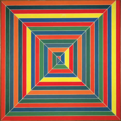
Organised by the Museum of Modern Art, New York, Colour Chart tracks - charts - how the medium and question of colour has been taken up by modern artists in the face of significant changes in commerce, industry and ideas about art. The exhibition begins in the 1950s with Ellsworth Kelly’s randomly painted colour grids and an accompanying selection of paintings by Frank Stella, Gerhard Richter and François Morellet, all of which clearly evoke the commercial colour chart referred to in the exhibition title. This immediately confronts the viewer with what is, for Colour Chart, the crux of the colour matter. The problem with these colour charts is that they are instantly appealing, but somehow, after that initial response, un-giving: looking at the works we see immediately that there it is – colour – but it’s hard to formulate a response further than that. But this is, in part, what the works in Colour Chart are seeking to do. In the nineteenth century, long before the remit of the exhibition, Baudelaire’s appreciation of Delacroix was based largely on his rich and harmonious use of colour: for Baudelaire, a true colourist was like an ‘epic poet’.1 This is indicative of the Romantic and, similarly, Expressionistic treatment of colour: for the Romantic, colour is a personal language, where shades represent emotions, a tool for expression, creativity and communication. The dictionaries of colour on display throughout the exhibition are in part a sign of the mass production of commercial paint in the twentieth century and subsequent need to standardise it, but they also suggest that these long-held theories of colour are no less categorical.
Colour doesn’t represent in Ellsworth Kelly’s paintings, it just is. It is colour, liberated. The first room of the exhibition displays Marcel Duchamp’s The Box in a Valise, c.1943, and it is Duchamp’s use of the ‘readymade’ which, Colour Chart suggests, gave birth to the idea of using paint as paint, not as representation. Frank Stella uses commercial paint straight from the tin, and Kelly plays on this idea too: there is no shading or tonal variation in his work, he is using the tools of the trade as they are. Away from any emotive figurative scene the little coloured cubes, randomly positioned and juxtaposed, don’t create emotion: red isn’t fiery, dangerous or passionate, green isn’t sickly or envious, black isn’t dramatic or gloomy. The shades have no conventional or historical force and the viewer is forced to reassess them themselves. The colours we come into contact with today are very much like this: rows of nail polish in a shop, colours on a television screen, road signs and street maps, real but also blank and artificial. This modern response to colour is brought out further in Warhol’s Electric Chair prints from 1971. Art – and especially now, technology – can change colour instantly and in doing so, change mood. By deliberately flaunting this and revealing contrasting colour effects side by side, Warhol detracts from the emotive power of paint and cancels the effect out: we are left cold, no one colour in his sequence expressing more than another.
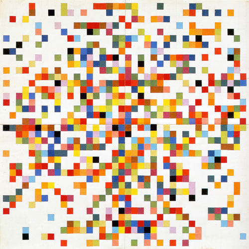
Another dimension of colour subtly explored in Colour Chart is the relationship between language and art. The random, self-generating processes used by Kelly, Morellet and Richter which begin the exhibition are striking in their similarity to the work of the OuLiPo writers. Raymond Queneau and Georges Perec’s short stories and novels (Queneau’s Exercises in Style, 1947, for example or Zazie dans le métro, 1959) are worlds where the words write themselves and where elaborate formulae and patterns generate the plot, much like how Richter’s 4096 Colours, 1974, is created from colour multiples of four, orlike Morellet’s 1954 Random Distribution of 40,000 Squares Using the Odd and Even Numbers of a Telephone Directory. Colour charts categorise like alphabets, and Jim Dine’s colour chart, The Studio (Red Devil Color Chart No.1), 1963, includes words too: billiard green, red coral, biege, spelt wrongly. The names evoke colours and the colours evoke names, showing how ingrained our language is with colour and the way we see and represent the world around us. As children we learn what colours are when we learn the words for them. Moving into the third room, words come back in Lawrence Weiner’s text With a touch of pink, with a bit of violet, with a hint of green from 1976. Weiner’s word art suggests, then instantly qualifies, leaving it to the viewer to imagine and fabricate colour from language.
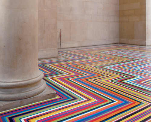
The self-generating, almost mechanical techniques behind the paintings in the first few rooms find resonance as the exhibition goes on. The colour chart is a commercial tool and in this way lends itself to an exploration of the uneasy balance between art and industry which has always existed, even more so now in the age of the art installation and conceptual art. It’s an uneasy fact that many of the colour chart works on display in the exhibition could nowadays be successfully reproduced on wrapping paper or wallpaper, and this is brought to life in room five where Jim Lambie’s Zobop, 1999, forms a psychedelic, eye-popping floor, and where John Baldessari’s 1977 video Six Colourful Inside Jobs, shows an assistant painting and repainting the four walls of his studio over the course of a week. This isn’t delicate, subtle, painstaking painting, with oils or watercolours, but a heavy, labour-intensive lathering-on of commercial emulsions. Which is less work? Which takes less skill?
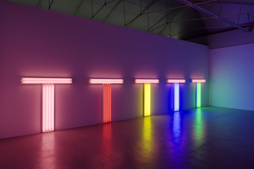
Strangely, despite the questions raised and the depersonalisation aimed at by many of the Colour Chart artists, their works do create strong emotional responses. Colour is cheerful, it reminds us of childhood and a time when we painted in colour straight from the tube. While the colour charts on display are hard to read, they are also bright and playful, engaging, like André Cadere’s performance piece prop Round Wooden Stick, 1975, Jim Lambie’s Zobop, Dan Flavin and Angela Bulloch’s light boxes (1987 and 2003 respectively) and David Batchelor’s I Love King’s Cross and King’s Cross Loves Me, 2007. Although hidden, there is also pain and awkwardness in the exhibition, in Walid Raad’s Let’s be honest, the weather helped, 1984–2007, where shell tips littering the streets of Beirut are the inspiration for Raad’s choice of colours, and Byron Kim’s Synecdoche, 1991–today, where cubes in shades of brown, pale pink and beige suggest ambiguous skin tones and unsettling identities.
Although many of the artists here try to isolate colour and rob it of its symbolic elements, Colour Chart: Reinventing Colour nevertheless highlights the power it has. Seeing Gerhard Richter’s 4096 Colours after a recent trip to his retrospective at the National Portrait Gallery is striking: from his black and white, smudged photographic reproductions to these little coloured cubes there is some distance. The lure of colour is strong, and while playing on and luxuriating in this, Colour Chart succeeds by showing how much more there is to colour than meets the eye.
Reference
1. Baudelaire, ‘Salon de 1946’ chapter III: ‘De la couleur’.