Whitney Museum of American Art, New York
12 November 2018 – 31 March 2019
by JILL SPALDING
Soup cans, Brillo boxes, dollar bills, Jackie, Marilyn, guns, skulls – pop, crash, disaster. There’s nothing you don’t know about Andy Warhol, right? You know that he was born in 1928 in Pittsburg to Andrej and Julia Warhola, studied at Carnegie, moved to the Big Apple, trimmed Warhola of its ethnic “a” and his nose of excess flesh to take up the “swish” life as a tentatively gay, graphic artist working first in fashion and then on ads for conglomerates.
[image10]
You may even remember his first attempts to break through to “fine art”: that 1961 display in Bonwit Teller’s display window that sold nothing and, a year later, a solo show in Los Angeles lining up 32 Campbell’s soup cans on ledges at Irving Blum’s Ferus Gallery which sold only four and was staged so under the radar that Warhol himself – known to show up at the opening of even an envelope – didn’t attend. You may have gone, as I did, to the silver-slathered Factory on East 47th Street as much to feel hip as to view the new work. If you were drawn in by the portraits staged strategically by the door and had $25,000 to spare – or twice that for your likeness doubled – you may have ordered up one. Even millennials, reared on an ad-scape of T-shirts, skateboards and Calvin Klein underwear appropriating Warhol’s appropriations are sure that they know him.
[image7]
The genius of the Whitney Museum’s current stunning survey, the art star’s first full retrospective since 1987, is to show us that we didn’t know Warhol at all. I don’t mean in the socially revisionist sense of the long-dismissed epithets of “faggot”, “fraud”, “creep” et al slung at him by the day’s eminent art critics, but in the emotional intelligence sense of not having understood how Warhol’s distillation to its essence of tabloid consumerism opened his eye to a wider vision it never again shut on and took the definition of art to a ledge there was no stepping back from.
[image16]
True, the full range of Warhol’s investigations was not then in plain sight. Revisited here, those early com-hither-shoe seductions were a front for a shy homosexual who posed as sexually neutral – more than once saying, “Sex is so abstract” – while secreting away his intimate drawings of men’s feet and all that they dangled from.
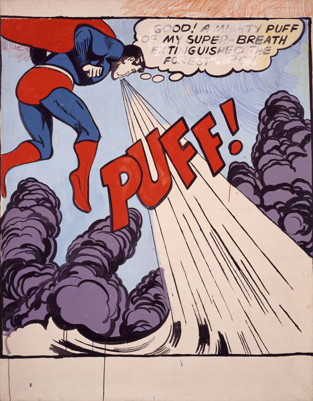
Nor was Warhol’s genius a pioneering one – Robert Rauschenberg had already scavenged headlines and blurred edges, Jasper Johns had drawn the socially unacceptable penis, Roy Lichtenstein had wrested “fine art” from comics, and Alex Katz had reduced the human visage to the flat planes of a Kazimir Malevich. Rather, the impressive achievement of this tightly edited survey is to show how Warhol combined appropriation, process and persona to introduce an entirely new visual vocabulary, a new way of seeing and inhabiting our world.
To convey his perception of a new social order born of the factory line and branded by marketing, Warhol took a tape recorder and Polaroid Big Shot camera, showed up everywhere that made headlines, documented the subculture, and developed a technique to rebrand it. Abjuring the reigning abstract expressionism, he worked out a method of serial reproduction from clashing colour rhythms blotted in wet ink on paper, which moved his foundational drawings of everyday objects to the photo-silkscreened repetitions that raised products to archaeological artefacts and scenesters to secular icons.
[image3]
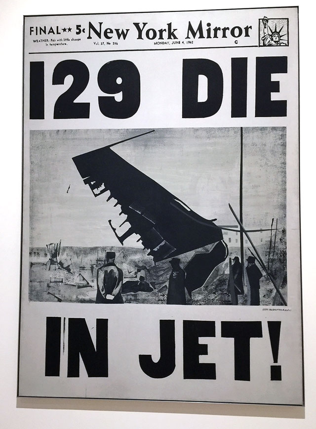
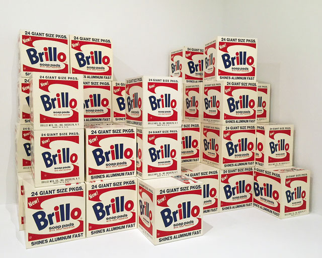
Staged as loosely as Renzo Piano’s girded galleries permit, the hit parade marches past the starting line with the storied silkscreened dollar bills, Brillo boxes, Coca-Cola bottles and auction-darling Dick Tracy (c1961) to the 129 Die in Jet! headline – painstakingly hand-painted to replicate the printing press process – that triggered his growing obsession with mortality.
[image12]
[image18]
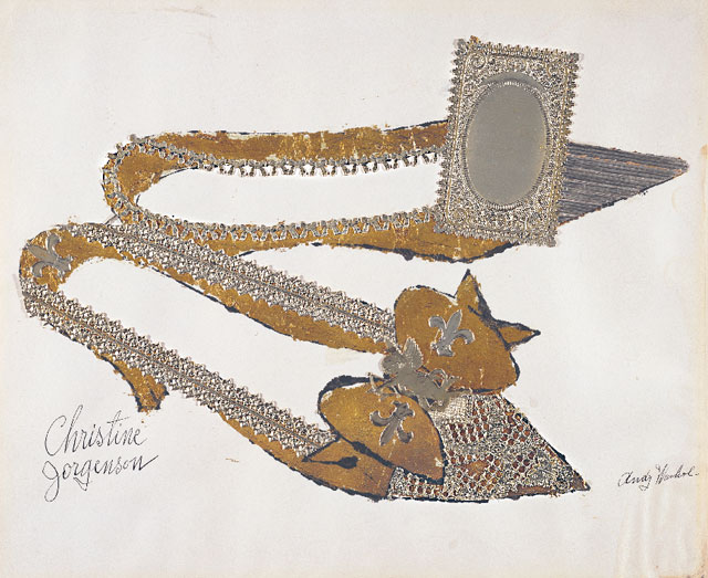
The following gallery backtracks to the hand work that built to them; 1956 “Success is a job in New York” graphic ads moment, mid-gesture sketches of friends, and the barely coded gilded shoes that lifted drag artists, Mae West and Diana Vreeland alike to American royalty.
[image17]
The last wall opens to the signature process of no precedent process – the critical transition from established tools and materials to the photo-screened vocabulary of bold outlines, stripped surfaces, repeated images and granular transpositions of tabloid photographs, conveyed here sequentially by the hilarious Before and After, 4 (1962) nose job, Marlon Brando on that motorbike and – swoon – Elvis in triplicate, plus one.
[image20]
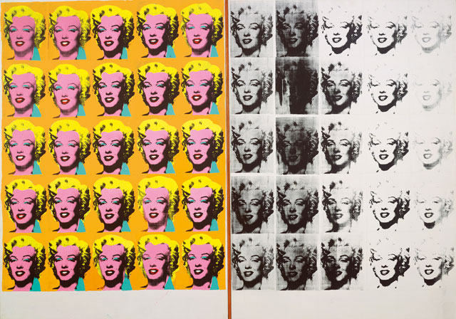
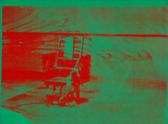
Turn right and you face the first fully developed serial, gridded celebrity altars, the charcoal Mona Lisa reproduced 30 times and close by, but replicated to a different end, 40 gold-to-grey Marilyns – her life ebbing away. Fate leads to fatality – the smudged, streaked luridly coloured malaise of racial violence (Mustard Race Riot, 1963), suicide, homicide, hideous car crashes and frightening death (Lavender Disaster, 1963 and Big Electric Chair, 1967-68).
[image9]
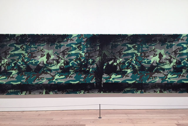
Lest you succumb to the deepening despair manifested here with the Shadow paintings, chronology injects the palate cleanser of Warhol’s sassy collaboration with Jean-Michel Basquiat. I may not be alone in finding the effort a comedown of sorts, but, although the friendship was real, the alliance may have been engaged as a comeback. Following the infamous 1968 assassination attempt and self-inflicted bad press reaction to the aggressively solicited bread-and-butter society portraits, Warhol had taken time out to launch Interview magazine, assemble a flotsam of ephemera, helm a TV show, produce another round of lucrative advertising material, and turn out more than 650 films (several of the short ones play throughout the galleries, with a few longer ones to be screened through the run of the show). The magazine took off, the memorabilia furbished his time capsules, the ads paid his assistants and the films went into storage (who could sit through his “eight-hour hard-on” of the Empire State Building?), but all honed Warhol’s vision of numbing-down-as-apocalypse that sprang back in the 80s with a hail of tough drawings as his world fell to Aids – the word itself scrawled under the bleached-out tabloid headline, The Big C (for cancer) under Christ – and erupted with stupendous force in his outsize silk-screened paeans to icons of this world and the next. Worked out in a studio affording large walls, and now facing each other on the Whitney Museum’s huge ones, a hallucinatory 35ft-long 1979 plaster-white faux frieze fade-out of 63 Mona Lisas and an anguished 25ft-long 1986 Camouflage Last Supper homage to Leonardo da Vinci (1986) speak to the vulnerability of both the secular and religious and to the gradual obliteration of the western canon of art.
[image15]
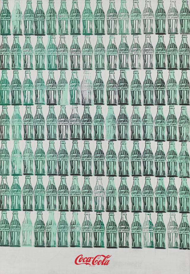
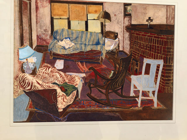
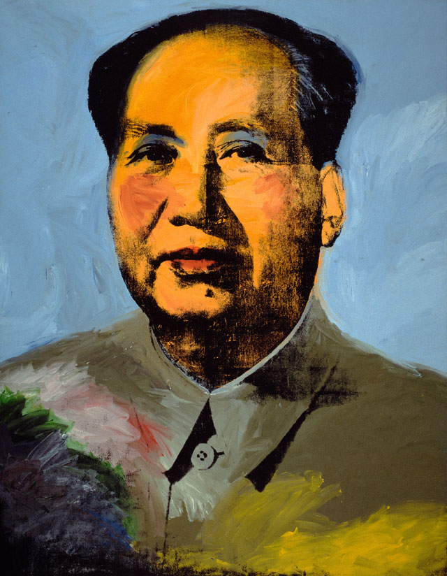
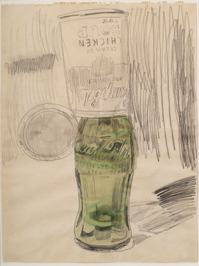
Focusing in on the work I had thought to know well, all seemed deeply familiar and yet not. I was startled by the monumental dimensions of misremembered Coke bottles and painted green stamps. And that 1973 yellow Mao – it’s 15 feet high! Some I never saw – that charming early oil painting of his childhood working-class living room, whose chairs channel Van Gogh and foreshadow David Hockney, and the encased metallic wallpaper rolls that so clearly spoke to Jeff Koons.
[image4]
And I was stopped in my tracks by that movie still of Large Sleep (1965) suspended for eternity in acrylic. Most unexpected was the discovery of a fully dimensional Warhol sprung from the blackened palate of foreboding. Countering what might have manifested as a top of pops recap, curatorial brilliance reserves a full third of the show for the deeper, darker, potentially less crowd-pleasing work, prophetic as much for Warhol’s larger vision as for his early death, as much for the fragile future of art itself as for the road of instant gratification we are now headed down behind a frightening Pied Piper. Beware, they seem to caution, of senses once alive to virginal art-making that now are stocking private view-by appointment collections with identical, digitally rendered multiples, in editions of however many the market will bear.
[image14]
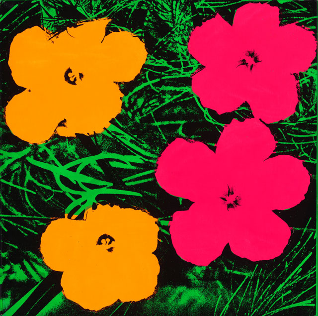
Happy the detour to a room entirely wallpapered in Andy’s vivid yellow-pink cow-portraits gazing at blow-ups of his crowd-pleasing Flowers. Wise, the removal of the formulaic 40 by 40 portrait commissions to a throbbing ground floor installation. Revisionist history may have placed these electric images on the pedestal of modern portraiture, but seeing 86 all together, perhaps culled less for quality than availability, they present as Polaroid screen-tests that manufacture their own energy without draining the battery powering the exhibition’s true engine. Only one that was not self-commissioned climbed to the big-time – Ethel Scull 36 Times (1963), an embarrassingly girlie photo-booth mashup of an ageing patron that must have sustained the Factory for months.
[image13]
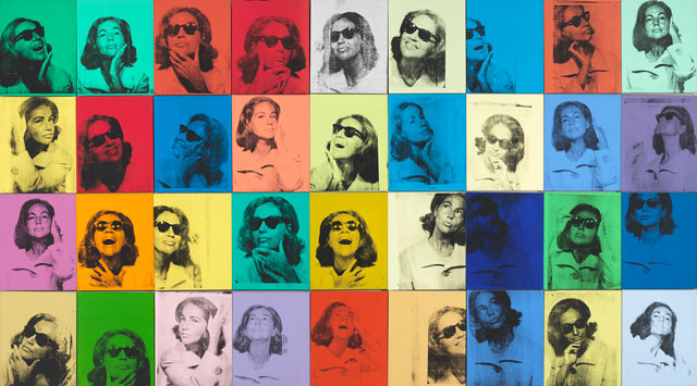
There is much else to admire about Donna de Salvo’s installation. Welcome, the decision to omit Warhol’s Polaroids; essentially drafts, notes in the margins, they would have had to have been crowded into megaframes or laid out in vitrines to hold their own in the majestic proportions of these galleries; and, in any case, they were shown in September – 130,000 of them – at Stanford University. More daring, the resolve to represent Warhol’s signature works in the singular so as to frame them as icons. That the gold Marilyn stands in alone for those billionaire-owned rainbow ones suggests – pun on name maybe intended – the people’s Virgin Mary, and a very small flower painting, hung oddly high above nine Jackies thrust into in mourning – posits a call to the natural world to redeem man’s inhumanity to man. The plea seems less far-fetched as you follow on past Lavender Disaster (1963), and a reflective self-portrait to a wrenching juxtaposition of hammer and sickle and handgun pointed at a Ku Klux Klan cross, to the looming finality of four painted Skulls.
[image11]
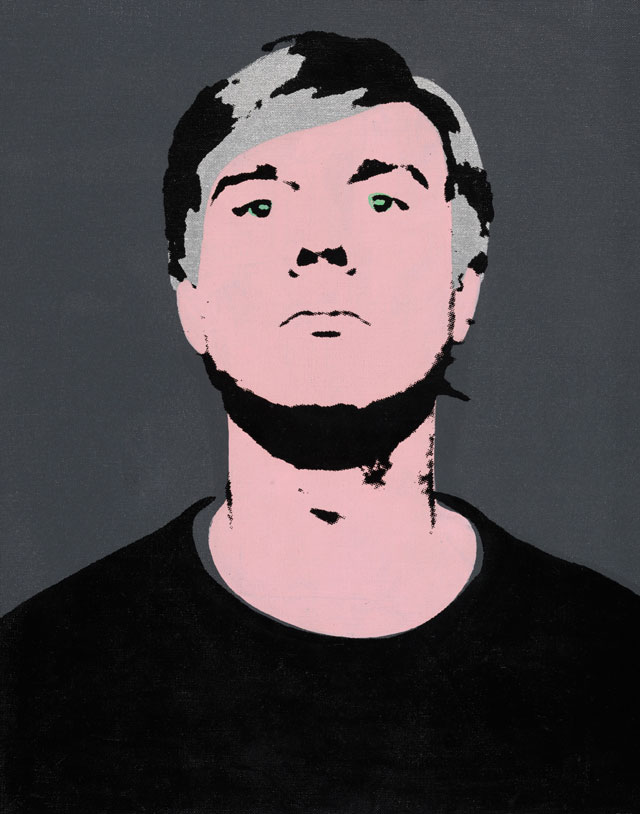
Warhol was no slouch at self-promotion; his carefully honed childlike vocabulary, his vapid wonderment at the silliest pronouncement and his passive voyeurism were cultivated and expedient and, together with his fright wig, filled in arriviste-artist bald spots to fashion a uniquely inscrutable aura. Ironically for an artist who clocked fame at 15 seconds, time measured in decades has been Warhol’s greatest promoter. His best drawings can now be seen to hold their own with Jean Cocteau, Gustave Klimt and even Henri Matisse. More impactful (pace Katz, who thought Warhol a good graphic designer but not “a ‘fine’ artist”), his better portraits advance the traditional language of portraiture. Installed here together, for both better and worse (ad hoc lines or excessive blurring leach the lesser ones of personality and, unless his assistants let him down on those days, he clearly loved Debbie Harry over Dolly Parton and sports guys over businessmen, the standouts are rendered with washes, swerves and garish contrasts of colour that give their flatness the mock-dimensionality of an Édouard Manet, and the colour interventions (viz Douglas Cramer) the boogie-woogie oscillation of a Piet Mondrian. All stand as commissions, but some read as something apart – exercises in collusion but also in a slightly unnerving intimacy – voyeur as Pygmalion. Elizabeth Taylor could stand up to her lurid makeover, but Pia Zadora was by her telling then a “shy kid from Queens”, Pat Hearn was profiled nude and Berkeley Reinhold was 10 when Warhol rouged her lips.
[image19]
There are very few missed opportunities, although I should have liked to see the original dollar-sign painting that so overtly first signed Business Art and – more of a question than a criticism – why is the Whitney’s famed aha elevator moment surrendered to an anodyne 1986, 25ft-long Camouflage? It’s a long wall, of course, so it may have been a design decision akin to which painting fits best over the sofa. Nit-picking, given that De Salvo’s overall installation is sublime. Even the camouflage painting, looked at another way, constitutes a sophisticated metaphor for the permeating meme that Warhol has become.
The overarching takeaway gives lie to the show’s cryptic From A to B and Back Again (drawn from a book holding Warhol’s musings). Thrown anew into the manipulated repetitions that we understood from the outset as his signature, with the passing of time we now understand what he was signing. Warhol may not have been the first to try this or do that but in documenting our culture of obsessive consumerism with manipulations that stripped objects of their personality to infuse them with his own, he leapt ahead to the millennial conception of identity art – of object (and by extension, subject) as selfie. Already the premier artist of the second half of the last century, his vision become meme still so infuses our culture as to arguably make him the premier artist of the first quarter of this one.
“There was art before him and there was art after him,” the influential art critic Robert Hughes rightly said of Caravaggio: he cavalierly dismissed the Factory’s output, but was wrong. Warhol may not have been a great painter, but there was no going back, no à rebours. Before leaving, I re-read the artist’s observation on a wall text about the 1978 opening night doings planned for his Diamond Dust Shadow paintings: “The show like all the others will be bad – my reviews always are. But the reviews of the party will be terrific.” Think of the Whitney’s brilliant hommage to Warhol as a y’all-come-party – there’s plenty to ingest and your review will be terrific.