
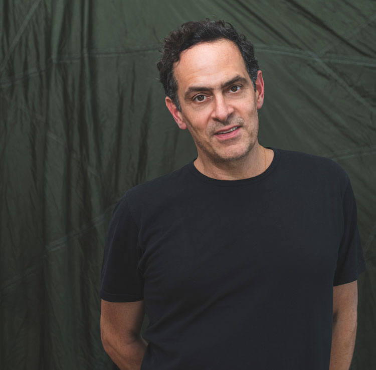
by DAVID TRIGG
Concrete mixers, mops, wheelbarrows, walking sticks, paving stones, umbrellas, tiles and coconuts are among the sundry objects that Alexandre da Cunha incorporates into the elegant sculptures on show at Thomas Dane Gallery, Naples, Italy. The playful transformation of found objects forms the cornerstone of the London-based Brazilian artist’s practice, which fuses European and Brazilian modernism with a distinctly Latin American sensibility. All of Da Cunha’s works, whether diminutive plinth-based sculptures or monumental outdoor installations, carefully balance aesthetic concerns with an interest in the social and cultural histories of his materials.
[image10]
Da Cunha’s sculptures are rooted in the quotidian, from the familiar workaday objects he uses to the simple way he combines them – a reference to the Brazilian penchant for improvisation. The artist’s appropriations mirror the fact that Brazil’s cultural identity is itself a patchwork of elements derived largely from other cultures and many of his works incorporate stereotypical iconography to comment on the cliches of tropical or “exotic” countries. Yet they are also soaked with art-historical references, particularly to the history of modernist sculpture.
[image2]
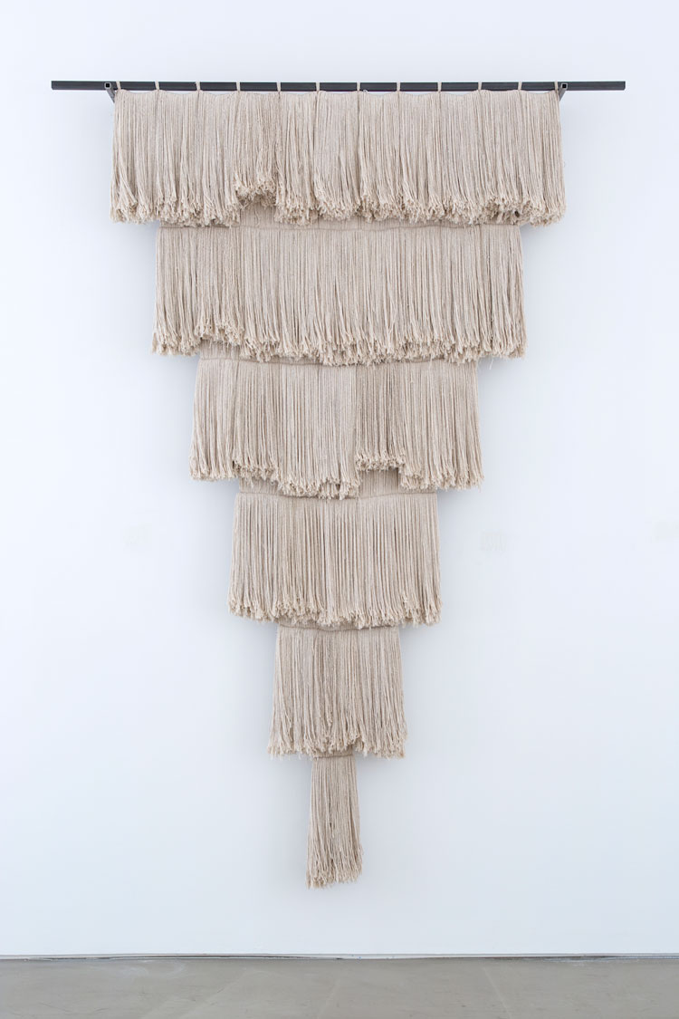
In Da Cunha’s work, an object’s original design and function are rarely disguised. His mop head works, for instance, initially appear as tapestries, although closer inspection reveals the everyday cleaning product, inviting readings that contemplate hidden labour and mass consumerism. Notions of labour are also addressed in the artist’s Mix (2012-17) and Full Catastrophe series (2012-13), which feature works made with concrete mixer drums. Although Da Cunha retains much of the drums’ original character, he can spend days removing caked-on concrete and scrubbing their surfaces. In contrast to these hulking sculptures are his small Ikebana works (2018-), in which two or three elements are carefully combined in delicately balanced compositions. A hand scythe might be elegantly joined to a wooden mallet (Ikebana (relief I), 2020), or a small drum, walking stick and brass scoop precisely arranged to form an enigmatic wall hanging (Ikebana (relief III), 2020).
[image4]
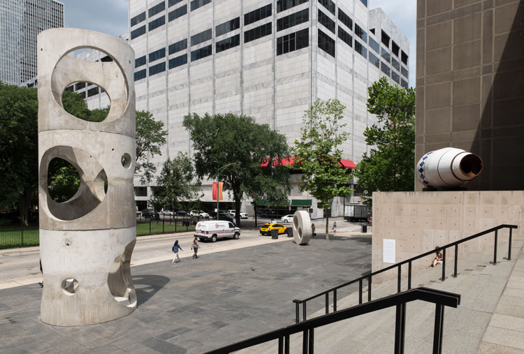
Concrete is a recurring element in Da Cunha’s practice and many of his works either incorporate the material or are made entirely from it, such as the outdoor installation Figurehead (2015), created for the Museum of Contemporary Art Chicago. Made with precast concrete sewer pipes, this monumental sculpture speaks again to notions of labour and construction, while placing the artist’s work in dialogue with the modernist concrete architecture of his native Brazil, especially the streets of Rio de Janeiro where he grew up.
[image5]
For Da Cunha, the ideals and aesthetics of modernism are intrinsic to concrete, and his works reveal the material’s potential for elegance as well as function and utility. Currently on display at The Box in Plymouth is the concrete sculpture Figurehead II (2020), which comprises four stacked sections of industrial drainage pipe. Standing six metres tall and sited in the historic building’s foyer, the sculpture makes reference to Brazil’s architecture and the utilitarian nature of Plymouth’s postwar concrete buildings.
[image6]
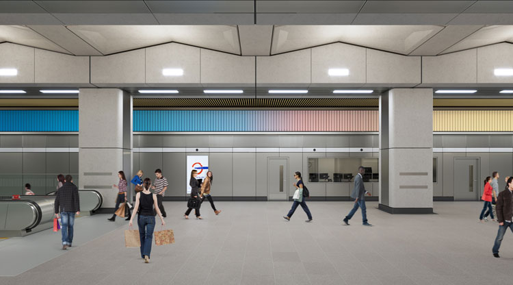
Next year will see the unveiling of Da Cunha’s most ambitious work to date, a monumental kinetic sculpture commissioned by Art on the Underground for the new London underground station at Battersea Power Station. The permanent artwork uses old-fashioned rotating billboards to create two colourful friezes that stretch the length of the ticket hall. Using colours extracted from photographs of sunsets and sunrises, more than 3,500 individual panels will rotate, displaying different combinations. The installation, which reflects on quotidian cycles and the passing of time, will create an ever-changing environment within the station as well as continuing Da Cunha’s subtle critique of contemporary life.
Studio International spoke to the artist on the eve of his exhibition in Naples.
David Trigg: What has it been like preparing for your new exhibition during the coronavirus pandemic?
Alexandre da Cunha: I’ve been working on this show for more than a year. It was initially planned to open in March, but obviously had to be postponed due to the virus. It’s been strange for everyone involved because everything has been affected – the shipping, the photography and the installation. After all the anticipation, there was a really strange feeling of not knowing what was going to happen next. The main challenge for me is to not let that uncertainty contaminate the show or the reading of the work too much.
[image11]
DT: You once described your way of working as “pointing” rather than making. Is this still the case?
AdC: Yes, it’s always been the case, although there is still a lot of labour involved. When I talk about pointing, I’m not saying that I don’t make much, because even the works that look very simple and straightforward require a lot of work – the rendering of surfaces, for example, making decisions about which stains I want to keep and which ones I want to remove. That tension is always there, which I like and try to make a part of the work. To me, the idea of pointing is similar to a theatre director – I have these different elements, which are like actors, and I place them in a situation where they have a natural way of interacting.
DT: What was it about the notion of the readymade that first attracted you?
AdC: It was a very natural development. I just started making work with things that intrigued me, things that already existed. I became less interested in sculpting something out of a material than in trying to establish dialogues between existing objects. All my work is about combining things and making them have a conversation, or sometimes an argument.
[image12]
DT: It is interesting to hear you talk about conversations. You have previously likened your approach to putting together words like a writer, an idiosyncratic visual language made up of pre-existing objects. But what attracts you to certain objects?
AdC: I start by collecting objects that intrigue me, that make me question why they exist and how they are made. I have many collections of objects in my studio. Again, I liken it to casting actors, to seeing people in the street who you think might have the potential to perform something. Some, however, are never turned into anything.
DT: Is your choice of object primarily an aesthetic decision or are cultural associations also an important consideration?
AdC: It’s both, it’s never just one or the other. I’m very interested in the cultural history of objects, but if the attraction is purely aesthetic, it tends to be a dead end.
DT: Where do you source your objects?
AdC: Everywhere. I find a lot of the objects while travelling. Many come from Brazil, where I spend a lot of time, but it could be anywhere – in markets, pound shops, or just found on the street. I do buy some things on eBay, but it usually starts by observation, as I’m walking around.
[image16]
DT: Do you go walking around the city looking for objects?
AdC: It’s rare that I go on a mission specifically to find things. They usually come to me while I’m on my way, which is exciting but also irritating because sometimes I feel I want to switch off, but things just keep appearing.
DT: So serendipity plays quite a large part?
AdC: Yes, it is quite unpredictable.
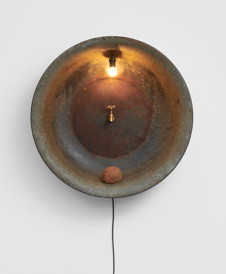
DT: Your new “relief” works incorporate disparate elements; Ikebana (relief III) (2020), for instance, comprises a hand drum, a walking stick and a brass scoop filled with sand. What was the starting point for this work?
AdC: It is part of a series called Ikebanas, most of which have been tabletop objects, but more recently I’ve been making variations called Ikebana Reliefs, which hang on the wall. They reference the traditional Japanese art of flower arranging, where elements are very subtly put together with balance and harmony; sometimes, they have only two or three elements that are very precariously combined. When I was in Japan, I spoke with someone who had a bit of an issue with me calling the series Ikebana, saying it was irresponsible to use that word.
[image3]
DT: Was your use of the term meant in a humorous way?
AdC: There is space for it to be read as humorous, but there is also something quite serious about the idea of referring to another culture and, in a respectful way, it is also about embracing the beauty of those things.
DT: You have said that you consider these pieces to be like figures, referencing the human form. Was that intentional?
AdC: It came out very naturally and fluidly as I was making them. This is something that often happens in the process of making my work – I come up with an idea and have a set of self-imposed rules that I follow, but then the work surprises me; there is this conversation and it’s almost like the work is saying, “I don’t want to be this, I want to be that”, and then I have to negotiate and listen to what the work is saying.
[image7]
DT: A recurring motif in your practice is that of the mop, an object associated with labour. Do your mop works, such as Kentucky (Napoli) (2020),carry a social message?
AdC: Yes, they do, though it is something I try to be careful with. I have no intention of making a political statement or anything like that, and I never want the social aspect to be the first thing you see because it would simplify the work too much, but it is there. I like the idea of viewers encountering something beautiful with a reference to textiles and crafts and then, after recognising the object as a mop, considering notions of cleaning, labour and global trade – how these things come from other countries and how we use them.
DT: There are also formal concerns to do with texture and you have introduced colour into the mops through the use of dyes.
AdC: Colour has always been a really important element in my work and my early work was even more colourful. As I’ve said, I tend to think about my works in relation to human figures and I’ve always felt that adding colour is like adding character or mood to my “figures”. I often use warm colours that have a very specific connotation, perhaps something to do with nature, a reference to sunlight, or to make you think about a specific place. The colours I chose for Kentucky (Napoli), for instance, are inspired by the city of Napoli, the architecture and the colours I saw there.
[image8]
DT: The smaller mop work, Kentucky (Arlecchino) (2020), contains many different colours. How did you arrive at those?
AdC: This is my most recent mop work and is the first time I have mixed so many colours into one piece. Usually, I combine two or three colours to create a pattern, but for this work the combination is more random. I wanted to challenge the work, to disobey my own rules and see what came out. I am very pleased with this as it has taken the series in another direction. My main concern about using so many colours was to avoid ending up with a decorative piece where the reference to textiles became too overt. I didn’t want it to look like I was weaving a rug. But that’s also the exciting part of making art, you have to take risks and get close to failure.
DT: You have lived in the UK since 1999, although you travel back to Brazil regularly. A lot of your work references your Brazilian heritage and your latest works feature tropical references, such as coconuts, Brazil nuts, sun-bleached parasols and hand drums. What role does autobiography play in your work?
AdC: I’ve been here for 20 years and although I really feel a part of London, I’m a foreigner for ever. But I’ve been in the UK for so long that, whenever I go to Brazil, I don’t fully feel like I am part of Brazil either. The elements you mentioned, those tropical cliches, are very autobiographical. It is about celebrating my home, but also about how we often imagine different countries and cultures as “exotic”. I’m not offering an angry critique: it just reflects my feelings of displacement in both countries.
DT: It seems as if those references are perhaps tinged with melancholy?
AdC: Yes, I think so. But, also, they are about ideas of escape, the idea of wanting to be somewhere else or wishing for something else. You recognise these exotic elements as coming from somewhere far away, so the work causes you to mentally travel somewhere, to think about another place, perhaps a more magical place, or perhaps sometimes even a darker one.
DT: Concrete is another recurring material in your work, one that is closely associated with modern Brazil, especially the architecture of Rio and Brasília. What first drew you to this material?
AdC: For me, concrete is a very “natural” material. I grew up in Rio and the relationship we have with concrete in Brazil is very different from that in the UK, which is usually to do with tower blocks, not necessarily pleasant or beautiful places.
DT: It is more utilitarian here.
AdC: Yes, and in Brazil, especially in Rio, it is seen as something quite elegant, part of a nice environment.
DT: Is the concrete you use always found, or do you sometimes have it fabricated?
AdC: Both. I often buy precast concrete, but I also mix my own in the studio. I love experimenting with adding more sand or water to achieve different effects, colours and textures.
[image9]
DT: You also reference concrete, construction and anonymous labour in your series of sculptures using the drums from concrete mixers. These found objects are often slightly altered, perhaps upended or painted a different colour in order to emphasise their formal qualities. It is not always clear, however, how much you have altered them.
AdC: With this series, I remove the blades from inside the drums and disconnect them from their mechanisms. This simple gesture changes so much. They become like classical urns, something similar to what you might see at the British Museum, but in fact was found abandoned in a backyard. For some, I just remove the blades and leave them; for others, I spend hours and days working on them, removing all the concrete residue or using acid to make them rust. I once had a show with all of them together and you couldn’t tell how much I’d worked on each one: they just all become these beautiful formal things.
DT: For Urn V (2013) you have scrubbed away all the concrete from the exterior.
AdC: Yes, and I removed all the colour from the original drum, so it’s gone back to the metal. Urn V looks quite polished now, but it will change over time as it’s almost impossible to keep the surface as it is. You can slow the process, but it will eventually rust. I’ve used oils and various substances and even talked with restorers, but I like the idea of not having total control over a surface.
[image18]
DT: Figurehead II, commissioned for The Box in Plymouth, is a new six-metre high sculpture made from stacked concrete sewer pipes. What was the starting point for this work?
AdC: It’s a development of the first Figurehead sculpture that I made in 2016 and installed outside the Museum of Contemporary Art Chicago. When The Box invited me to make something, I was really interested in exploring that tension between public and private space, outdoors and indoors. Figurehead II, which will be shown inside, will be like showing an outdoor monument in an interior space. I’m interested to see how very similar works can behave in completely different ways.
DT: The first Figurehead sculpture looked very tactile. Did you find that people wanted to touch it?
AdC: Yes, there is something very tactile about it, though it was never my idea to make the work interactive – that’s something I have always found problematic. But because it was shown in a large public place, it became almost a social space. People were using it for performances and yoga classes.
[image19]
DT: And you cut additional holes in the pipes?
AdC: Yes, I’m using prefabricated pipes, but I added extra perforations. I got in touch with the factories producing the pipes to try to understand how they are made. I have used standard perforation sizes, but placed them differently; they wouldn’t work as pipes because the holes are placed too close together and they would break if filled with water.
DT: So the holes would normally be there for junctions in the pipework?
AdC: Yes, and they would normally have a couple or maybe three holes, but not five as I sometimes might use.
DT: Some people might not be aware that you have cut those holes, assuming that is how the pipes have been fabricated.
AdC: Some people don’t even see that they are pipes. A lot of people just assume that it’s cast concrete and that I have designed everything. Some who are more into engineering might recognise it as a pipe, but then just assume it is a found object.
[image20]
DT: You mentioned earlier that you are often drawn to objects because of their cultural history. Is there something specific that drew you to these pipes?
AdC: The main theme is the idea of flux – the flow of water, yes, but also of communication.
DT: Communication is a theme of Sunset, Sunrise, Sunset, your forthcoming installation for the new Battersea Power Station underground station in London, which opens next year. How did you approach the commission?
AdC: It has been the most challenging thing I’ve ever done, because of the scale and because of the public context. It is so different from installing something in a museum or in a space designed for artworks. It uses mechanical advertising boards, but there are no words or images, just colours. And it moves; the movement is the key element in the work.
[image17]
DT: Colour seems integral also.
AdC: Yes, but colour is not what I’m primarily interested in. It’s almost like I’m using the colour as an excuse to talk about something else. The main idea is the notion of time passing, the cycling of days and seasons, and of waiting, waiting for the next day to arrive. The work was conceived well before Covid, but it has become more topical now because we suddenly began thinking about time differently.
DT: The use of rotating billboards, an antiquated technology, seems quite subversive in a state-of-the-art transport hub. What was the thinking behind this?
AdC: At a very early stage in the project, I was interested in referencing the history of the site. When I started researching Battersea Power Station itself, I became fascinated by the old computers and the former control rooms filled with all this really old-school technology. So it’s partly to do with nostalgia – going back to analogue forms of communication and going completely against the way we experience information these days. It is basically two large panels, each one of which displays three variations of a gradient. The colours and the title reference landscape and the idea of sunrise and sunset, but they are horizontal, so it won’t be visually identified as a window to the outdoors.
DT: What was the response from Transport for London?
AdC: They really liked the proposal, but then I had to go through the many levels of bureaucracy involved with installing a large-scale work in a public space and, of course, the various health and safety considerations, which has been really challenging. It’s been a very complicated negotiation, dealing with the architecture, because the work is really integral to the space. It could have been a flush wall, which may have been more beautiful, but it was important to me to have the mechanism of the billboards exposed. This was difficult to negotiate, to find the balance between not compromising the work, but finding a way for it to sit comfortably in the building and respect the beauty of the station. It’s a big interference.
DT: And a big blast of colour. From the pictures I’ve seen, the station looks very monochrome.
AdC: It’s a really beautiful station and the colours will be a big feature – it feels very monumental and architectural. Some people could find it really pleasing while others might find the finish almost too aggressive, but I won’t know until it is installed and open to the public. It is like a beautiful new museum: at some point, you have to be able to place pictures on the wall. I am learning lots of things about this work, which is somehow petrifying, but I think that’s the best part as well, to throw myself into this, trusting that it will work. I won’t know until it is installed in the station. And it’s a big space!
• Alexandre da Cunha: Arena is at Thomas Dane Gallery, Naples, Italy from 29 September to 12 December 2020.
Alexandre da Cunha: Figurehead II is at The Box, Plymouth, from 29 September to January 2021 (closing date to be confirmed).
Sunset, Sunrise, Sunset will be unveiled at the new Battersea Power Station underground station in autumn 2021.
-TDA_1112_-041.jpg)
-(2000px).jpg)
.jpg)
_5.jpg)
-(3)-(1200px).jpg)
.jpg)
-(1200px).jpg)
.jpg)
-(1200px).jpg)
-(1)-(1200px).jpg)